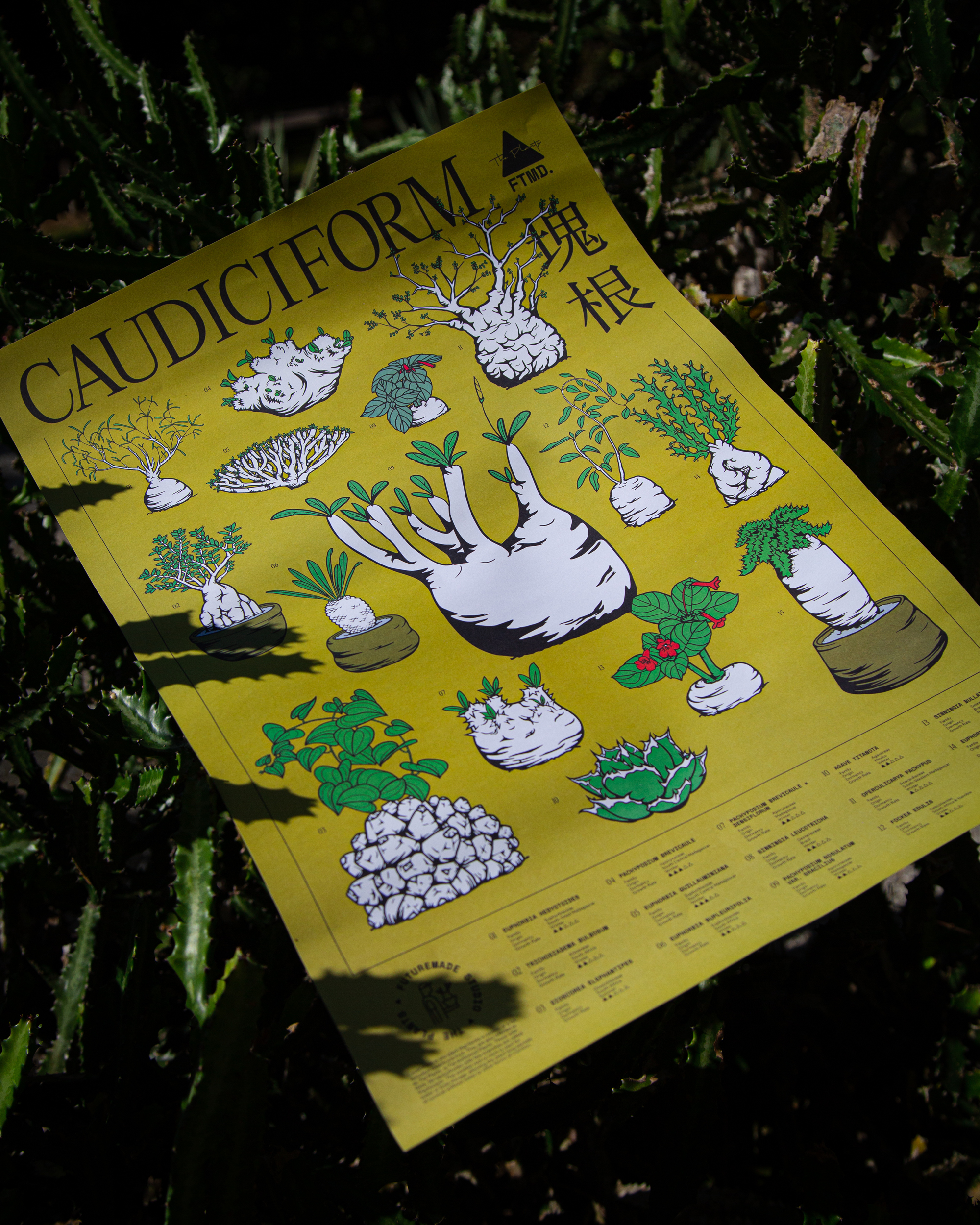
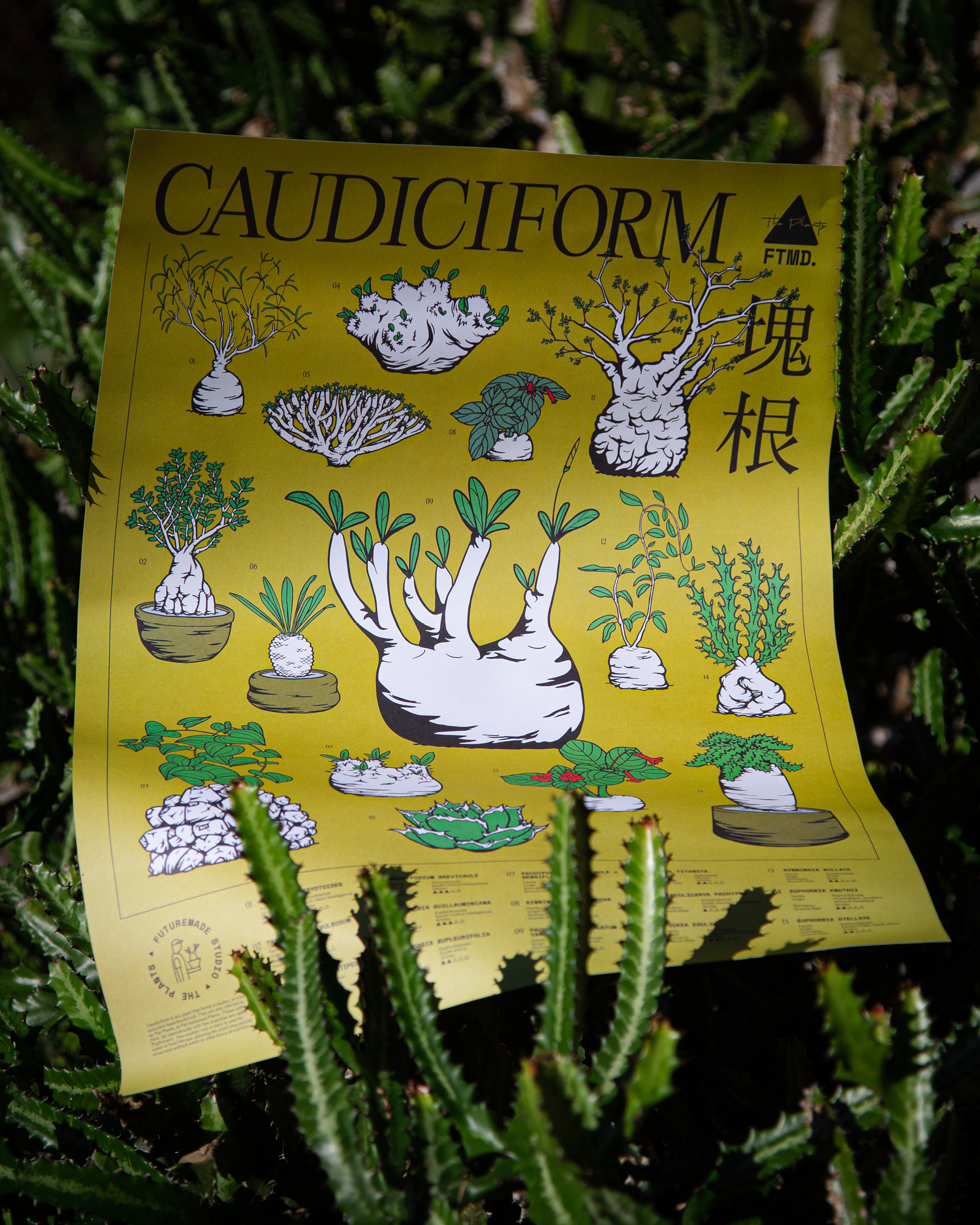
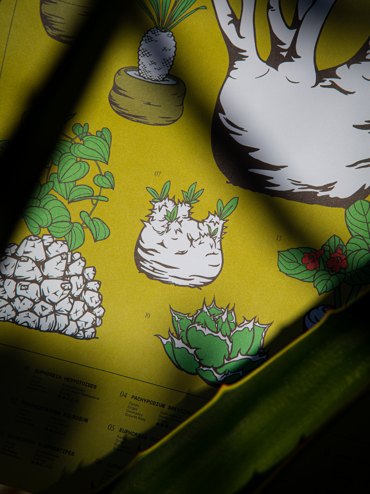
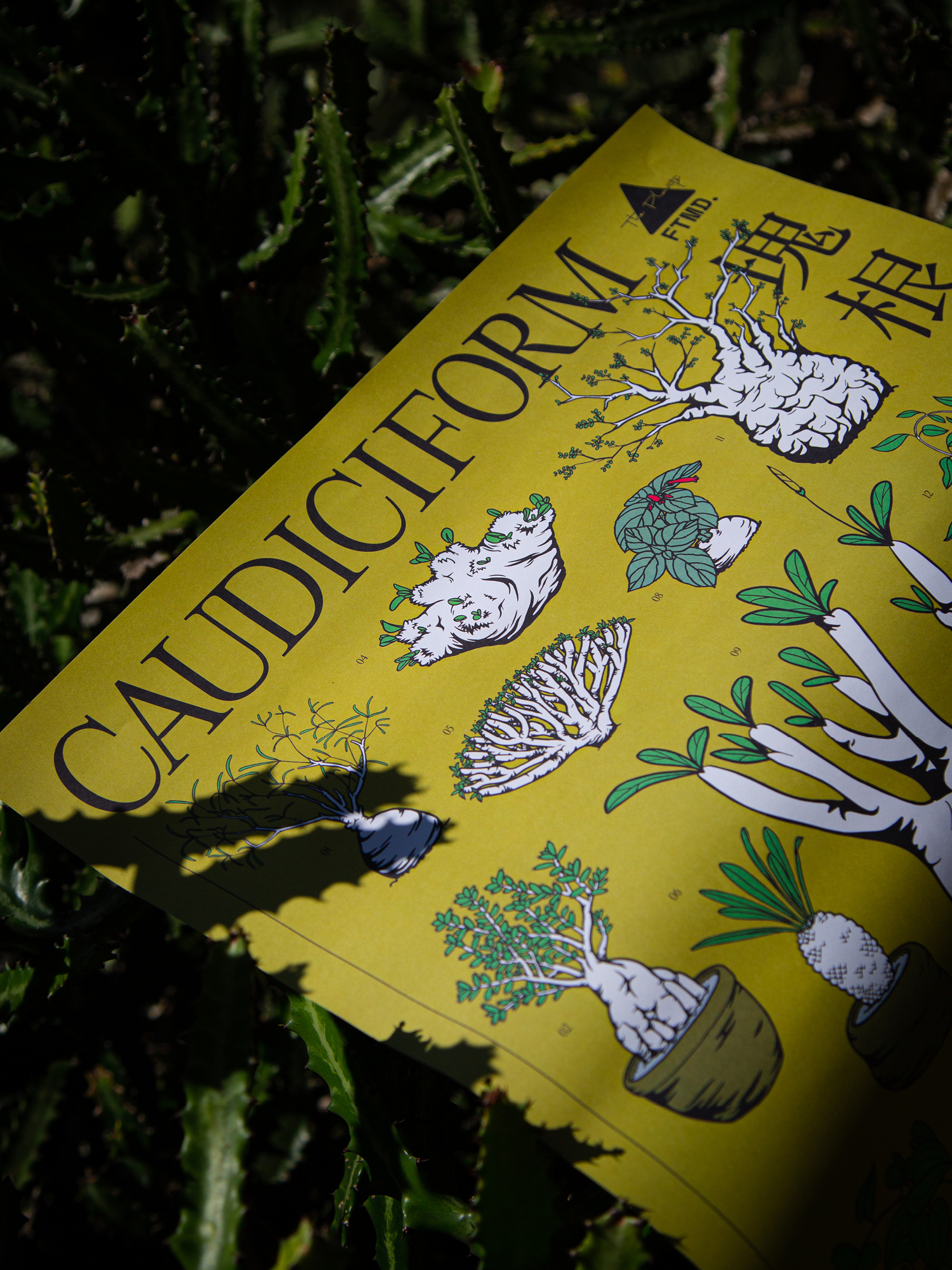
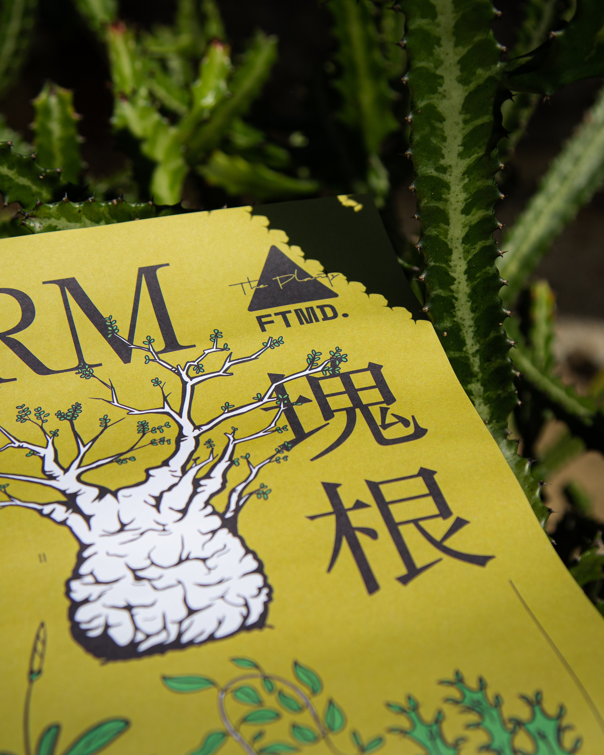
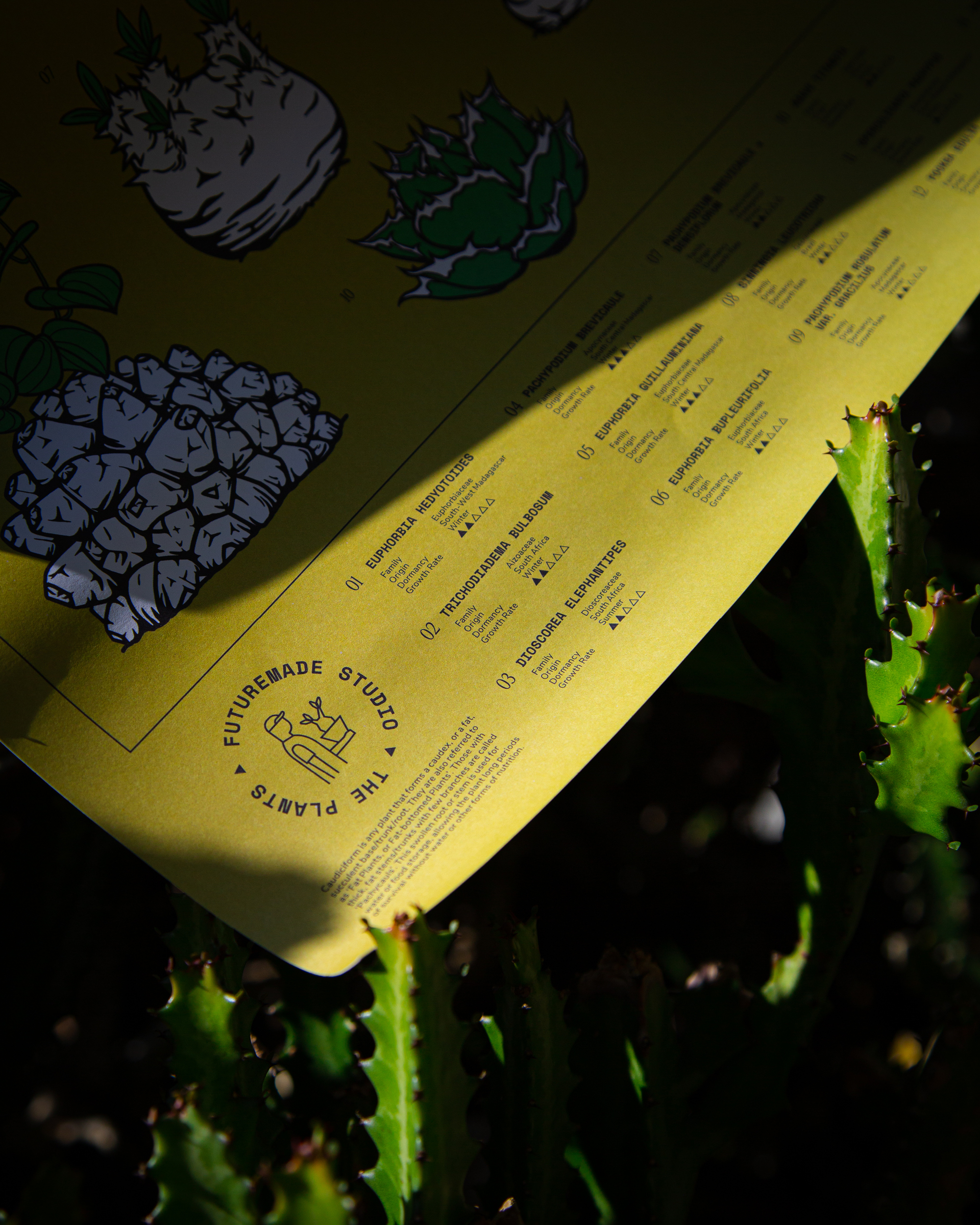
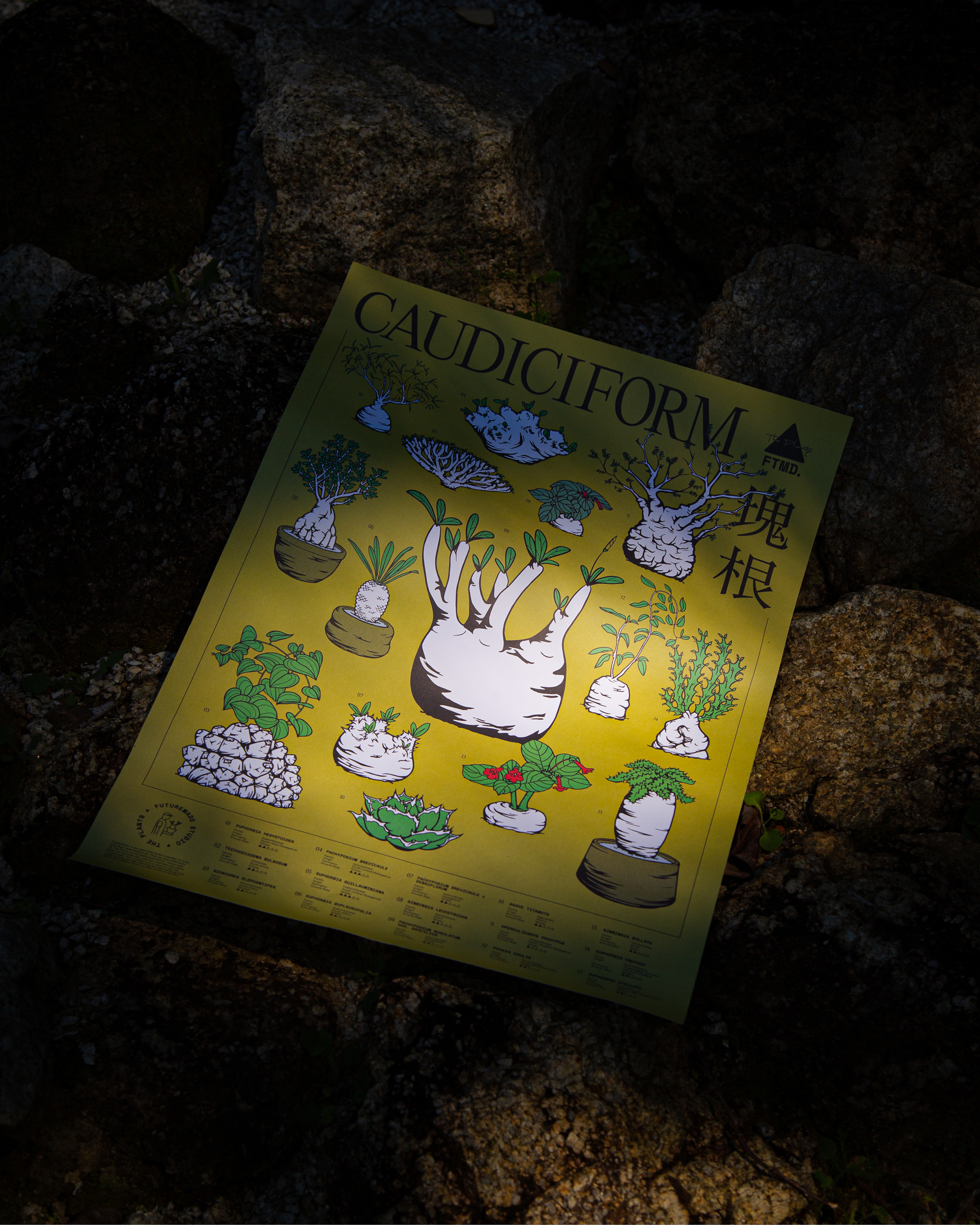
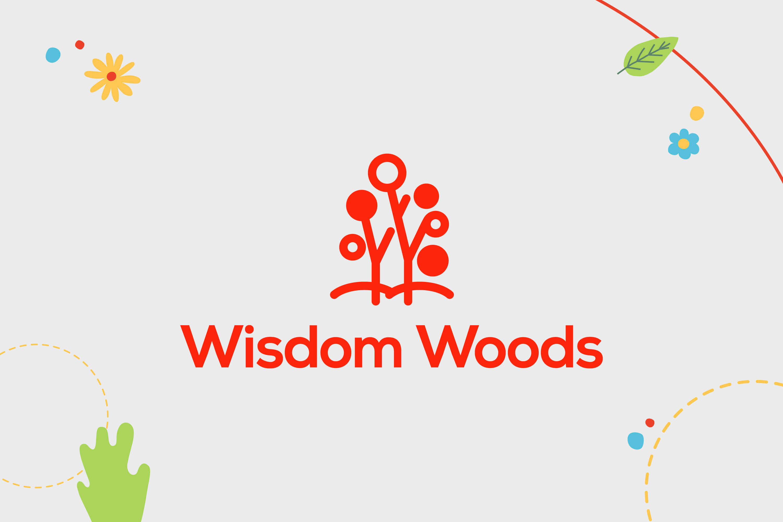
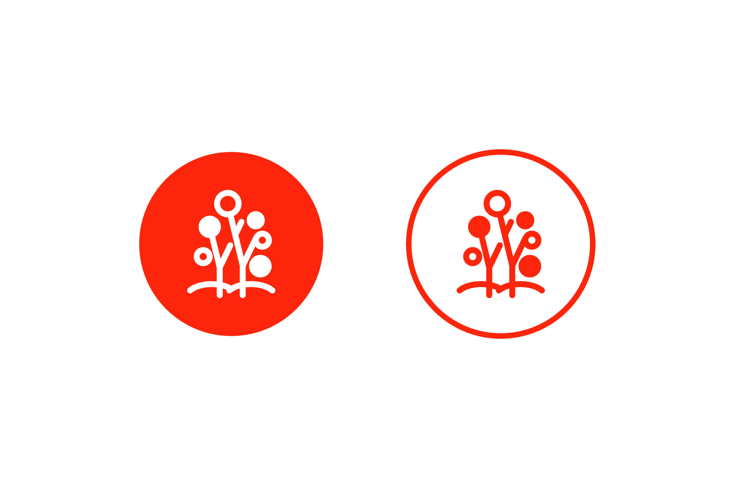
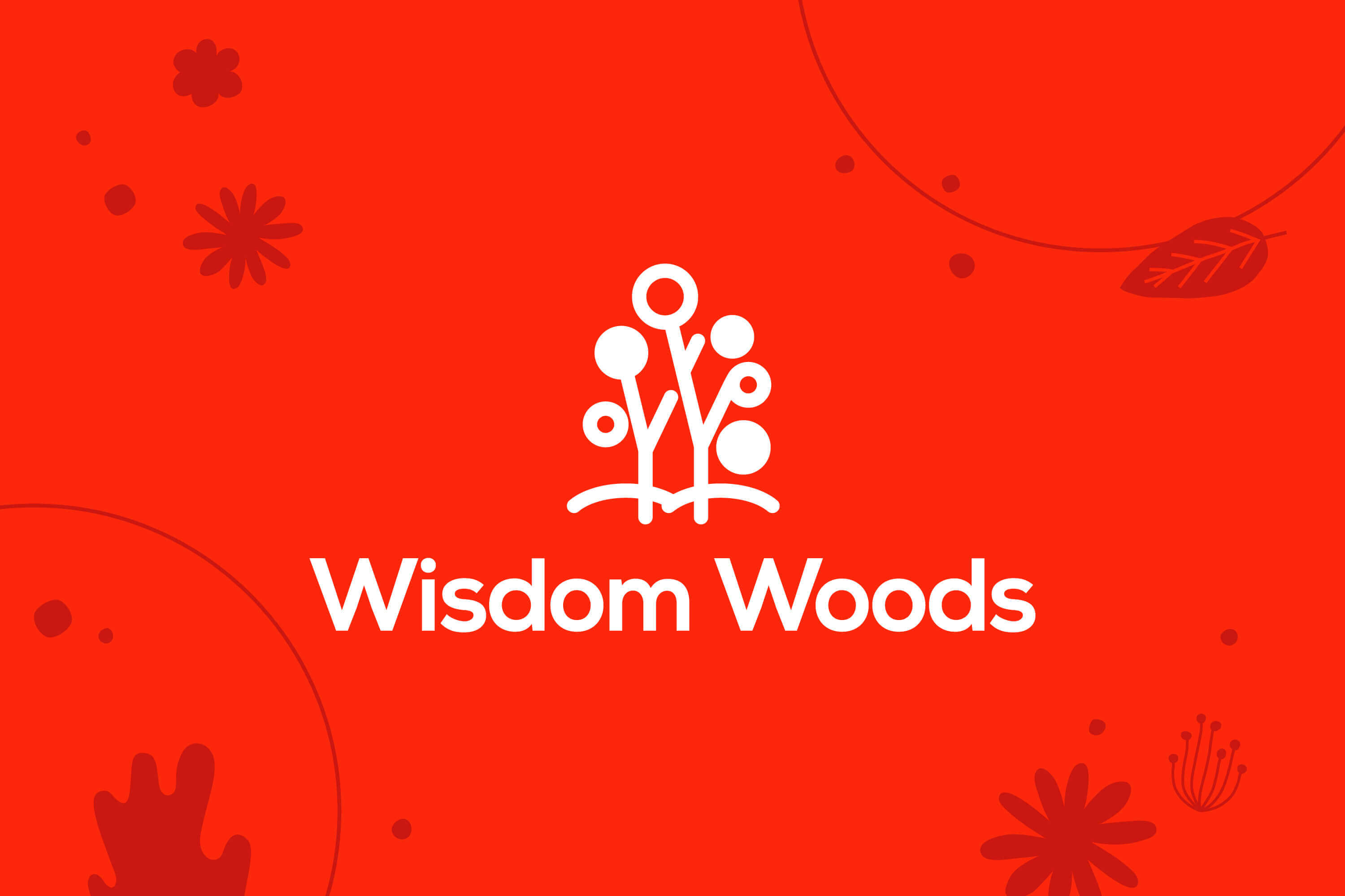
Night Mode Day Mode Highlight Night Mode Highlight Day Mode
INFO
CORE SERVICES
Brand strategy
Brand identity
Social media content
Art direction
Website design
Graphic design

CAUDEX POSTER

Poster design for FTMD. x The Plants 塊根.展 Kuàigēn Exhibition.
Caudiciforms are water-retaining plants adapted to arid climate or soil conditions. These plants are wonderful curiosities and are very popular among those plant collectors and growers that like exotic or peculiar plants.
Task: Product Design
Category: Fashion & Lifestyle
Team:
TE PERSPECTIVE
Ted
May Kim

ONEHR

OneHR is a HR shared service company that aspires to be the leading HR services provider in Singapore and Southeast Asia by leveraging technology and human knowledge to enable small-to-medium (SME) enterprises succeed.
TE PERSPECTIVE’s challenge is to help create an identity that stood out in the category that has a reputation for being serious and frigid.
As we met with OneHR’s founder to understand what he looked for in HR services, we noticed that he is very passionate and hopeful about the work that he is doing. He and his team are constantly learning and upgrading their skills so that they can provide superior HR services to their customers.
We wanted the company’s visual identity to reflect the founder’s optimism and good nature. This led to a raw, hand-drawn illustrations and pop colours that captures the founder’s sincerity, positivism, and the company’s mission—assisting businesses in process optimization and cost reduction so they can focus on growing their business.
Task: Brand Identity
Category: Corporate
Art direction: TE PERSPECTIVE
Design: TE
Motion graphic: Jwohan Lim

HATCH ASIA

Hatch Asia is an award winning executive search and leadership consulting company that combines talent acquisition and management strategies to help brands identify, assess and integrate most befitting talents into their organization. As part of repositioning the company, and trying to reach new avenues and digital lifestyle platforms, TE PERSPECTIVE updated the visual identity of Hatch Asia to reflect their positioning and the true breadth of their offerings.
The new logo opts for a more minimalistic design. The geometric and half curved shape inspired by the philosophy of the company—resilience yet versatile. It gives the logo a professional and refined appearance in line with their quality service.
The unique shapes of the wordmark becomes a design element for the branding, where the shapes can be used to create icons that can represent a broad range of subjects.
To create clarity for customers and align the messaging with new brand identity, we simplified the visual language into a modular system that allows the grid to change depending on the content and media. In contrast to the logo, the visual language maintains an editorial feel, and photography plays an important role by featuring the people, partners and candidates.
The new brand identity perfectly matches Hatch Asia’s positioning and industry experiences, helping both current and future customers feel confident in its business offer.
Task: Brand Identity
Category: Corporate
Art direction: TE PERSPECTIVE
Design: TE
Motion graphic: Jwohan Lim

SICK

TE PERSPECTIVE has created the brand identity for SICK, a nu metal band that embodies the concept of ‘human rights’. Through their music, it encourages people to stand up against hate and injustice, and against racism.
Nu metal was established in the 1990’s but conquered the mainstream in the early 2000’s. It combined rap and scream vocals with mid-tempo downtrend guitars, arguably laying the foundation for most of the modern metal we listen to today. Although the genre died in 2003 but it never really went away. 4 teenagers whom grew up listening to nu metal were becoming young adults, they met each other by chance and decided to form a band and make music of their own — SICK. Naturally, elements of nu metal began seeping into their creations, they twisted the music into their original take, making something solid yet disparate — something more than mere nostalgia.
Our work with them focuses on how to translate the band’s music and concept into visual, and extend that across all touchpoints — from the logo, to social media, to album cover, to photography, and to merchandise. The visual for their first album Fakta System is inspired by the historical moment from the Black Live Matters protesters in Bristol that have pulled down a statue of the slave trader Edward Colston. It was a very significant moment that shows our standing solidarity against inequality.
Task: Brand Identity
Category: Music
Art direction: TE PERSPECTIVE
Design: TE, May Kim
Photography: George Chong, Freeman Chin
Album cover photo: Harry Pugsley

BREAD LADY

Bread Lady is a modern bakery based in Penang. With the opening of their first store in an area that has large number of tuition centres, they hope to attract parents and children by offering breads with modern twist on traditional classics.
The brand’s visual language is inspired by the limitless imagination of children. By just looking at any breads, children often can imagine a world where breads are living things, breads that can go surfing, traveling, dancing or even baking more breads. The contrasting mix of blue and pink colours are used to layer a pop treatment and youthful appeal to the brand. The interior design continues the visual language of Bread Lady to further express their story and values.
Task: Brand Identity
Category: Food & Beverage
Art direction: TE PERSPECTIVE
Design: TE
Illustration: Yimin Heng
Motion graphic: Jwohan Lim
Interior design: Empt Studio
TE PERSPECTIVE
TE PERSPECTIVE
TE PERSPECTIVE
TE PERSPECTIVE
TE PERSPECTIVE
TE PERSPECTIVE

BONDWITH

Bondwith engaged with TE PERSPECTIVE early on, to build a brand strategy in parallel with product development that address the rapid changes happening in fashion and retail.
The goal is to stay away from fast fashion market and into a more premium position and timeless expression. By introducing a design system that is minimal and grid system based, we established a strong foundation that enable the smooth development of every part of the brand experience — from labels, packaging, photography and website to their social media. The resulting visual system celebrates the core inspirations at play: between Malaysian culture and American heritage, Japanese precision and German innovation, the distinct design and the implied functionality.
Task: Brand Identity
Category: Fashion & Lifestyle
Art direction: TE PERSPECTIVE
Design: TE
Photography: TW Freeman
Styling: TE PERSPECTIVE
Jacket calligraphy: Yimin Heng
Model: Alex, Stephen, Huichjin
TE PERSPECTIVE
TE PERSPECTIVE
TE PERSPECTIVE
TE PERSPECTIVE
TE PERSPECTIVE
TE PERSPECTIVE
TE PERSPECTIVE
TE PERSPECTIVE
TE PERSPECTIVE
TE PERSPECTIVE
TE PERSPECTIVE
TE PERSPECTIVE

AGAINST LAB

As a multidisciplinary creative entity, AGAINST LAB have delved into clothing, footwear, accessories, sculptures, music & photography. The themes that guide the work is often unconventional, forcing the audience through a thought process that challenges their perspective on “streetwear” and beyond. dasdadasd asdasdsad asdasdsad asdasdsad asd asdasdas asd
We have designed a desk calendar for the brand. From papers to acrylics, various materials were explored, the result is an offline calendar that portrays the brand’s unconventional backgrounds.
Task: Product Design
Category: Fashion & Lifestyle
Design: TE PERSPECTIVE
Photography: Nelson Chong
Product photography: TW Freeman
TE PERSPECTIVE
TE PERSPECTIVE
TE PERSPECTIVE
TE PERSPECTIVE
TE PERSPECTIVE
TE PERSPECTIVE
TE PERSPECTIVE

WISDOM WOODS

Two established individuals at the C-suite level of the corporate world, has given up their corporate lifestyle to establish a relatively smaller venture with the aim to realise their dreams. They are passionate in learning and coaching, hoping to create a world where everyone can learn and hence the birth of Wisdom Woods.
Wisdom Woods believe that learning nurtures wisdom hence learning brings a better world, through continuous development and harmonious living.
Their mission is to create an environment where everyone wants to and able to continuously learn and let learn, through the practice of their philosophies.
Task: Brand Identity
Category: Education
Art direction: TE PERSPECTIVE
Design: TE
Wordings: Wisdom Woods
TE PERSPECTIVE
TE PERSPECTIVE
TE PERSPECTIVE
The motif of the logo is clearly intended to symbolise the term ‘Woods’, represented by trees standing together. The ‘Woods’, or forest, is a mysterious place, yet full of vibrant and diverse living creatures and flora, with hidden intelligence gifted by nature. The very name of ‘Wisdom Woods’ embodies the hope to offer a place, both tangible and intangible, where everyone has the the opportunities to uncover all types of knowledge and treasure of the mind, to feed and nurture the growth of wisdom from within every individuals.
Diversity
The images of the trees are created to be deliberately different from each other, representing the distinctive nature of every individual, yet standing and living together in harmony. It is our belief that the diversity in people should be recognised and celebrated because it is essential in ensuring the co-existence and continuous development of human civilisations; much like in the woods, where the very existence of different life forms living collaboratively hence ensuring the circle of life is complete and sustainable.
Roots
The trees are rooted and the roots from different trees are intertwined with each other, which by nature allows the trees to stand strong together and to have the capacity to withstand all types natural environmental pressures and even disasters. They hope to instils this century-old value of teamwork in people, allowing people to understand the importance of collaborative living and the journey towards it. Furthermore, the roots were also deliberately illustrated to be strong and steady, representing the significance of having a strong and steady foundation in life, and in fact, in most things the company do and pursue.
Neural Circuits
If you put on a pair of new eyes, you will discover that the logo can also exhibit the neural circuits of our nervous system, where the circles represent the neurons whilst the stems represent the synapses. Scientifically, the more developed and the more connected the neural circuits in our brain are can be associated with better intelligence. Wisdom Woods aspire to offer and inspire learnings that not only improves intelligence but more importantly that cultivates wisdoms. The incomplete connectivity and the differences in size illustrate the point that we are not perfect and continuous learning is a never ending journey.
TE PERSPECTIVE
TE PERSPECTIVE
TE PERSPECTIVE
TE PERSPECTIVE
TE PERSPECTIVE
TE PERSPECTIVE
TE PERSPECTIVE
TE PERSPECTIVE
TE PERSPECTIVE
TE PERSPECTIVE

FUKU EATERY & DESSERTS

Fuku Eatery & Desserts is a Japanese cafe restaurant located in the central business district of George Town, Penang.
Maneki Neko (the Japanese lucky cat that is believed to attract good luck and fortune for its owners) plays an important role as the key visual element for the logo and brand identity. By infusing Japanese indigo color and the simplified version of The Great Wave off Kanagawa, we have created a brand identity that convey Japanese foods and culture in a sophisticated and distinctive way.
Task: Brand Identity
Category: Food & Beverage
Art direction: TE PERSPECTIVE
Design: TE
Photography: TW Freeman
Motion graphic: Jwohan Lim
Poker cards illustration: Yi Hong Heng
Operation and brand consultation: Foci Collective
TE PERSPECTIVE
TE PERSPECTIVE
TE PERSPECTIVE
TE PERSPECTIVE
TE PERSPECTIVE
TE PERSPECTIVE

SIN BEE CONFECTIONERY

The products of Sin Bee Confectionery are all done by hand, from scratch, in small batches and with only the finest ingredients by the Kok sisters who are passionate in baking.
By combining the illustrations of traditional baking elements with bold colour, we have created a modern yet compelling packaging design that act as a presentable and appealing gift for festive season.
Task: Brand Identity
Category: Food & Beverage
Art direction: TE PERSPECTIVE
Design: TE
Illustration: Yimin Heng
Photography: TW Freeman
TE PERSPECTIVE
TE PERSPECTIVE
TE PERSPECTIVE
TE PERSPECTIVE
TE PERSPECTIVE
TE PERSPECTIVE
TE PERSPECTIVE
TE PERSPECTIVE
TE PERSPECTIVE
TE PERSPECTIVE
TE PERSPECTIVE