TE PERSPECTIVE is the design practice and creative consultancy of Malaysia designer Ted Lim. He work with brands from all over the world to develop solutions that focus on usability, clarity and creativity.
At TEP, we believe design can open up all sorts of possibilities that can be used to define a preferable future for companies, cities, and societies. With a dedicated approach to each project at hand, we offer new perspectives and create purpose-built solutions that function for your goals and connect with the right audiences.
CORE SERVICES
Brand strategy
Brand identity
Social media content
Art direction
Website design
Graphic design
Author: admin
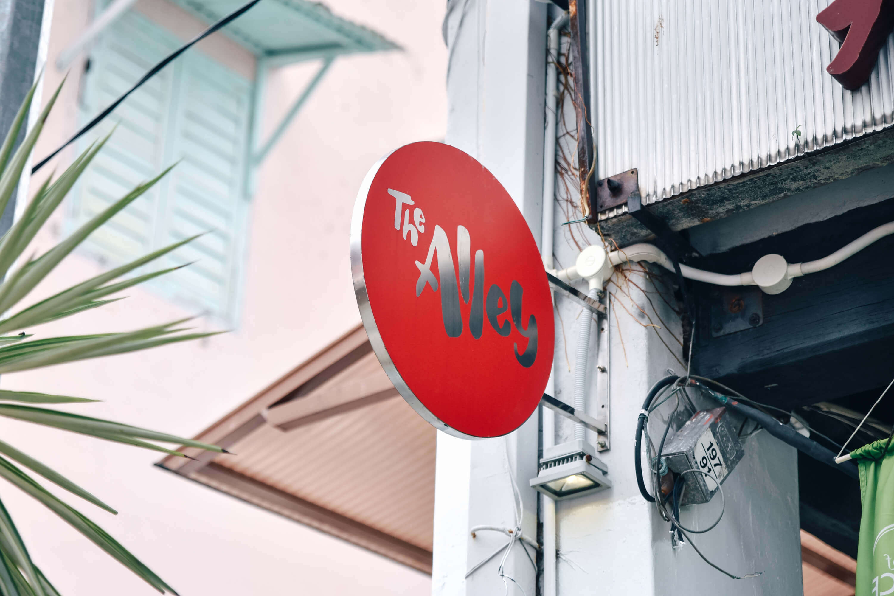
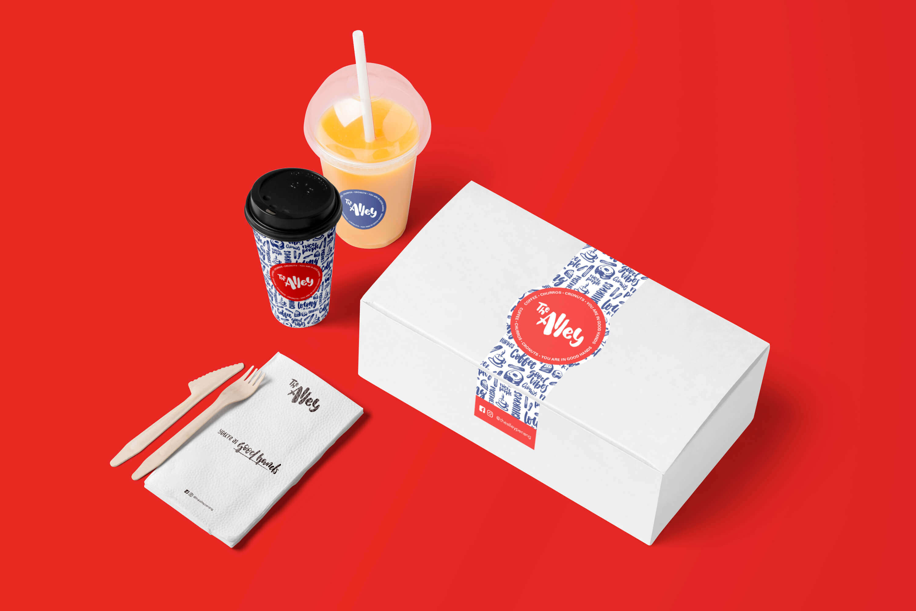
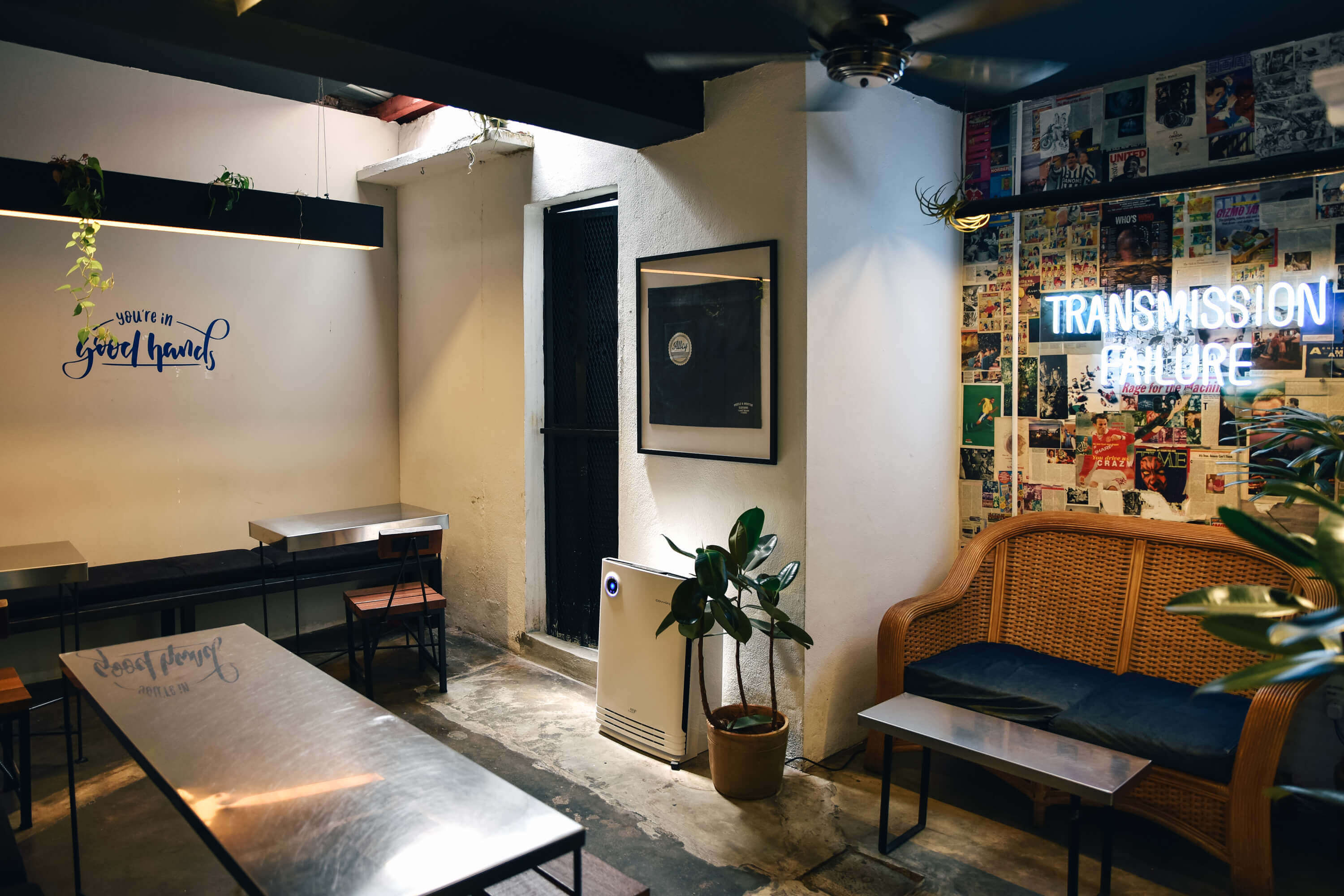
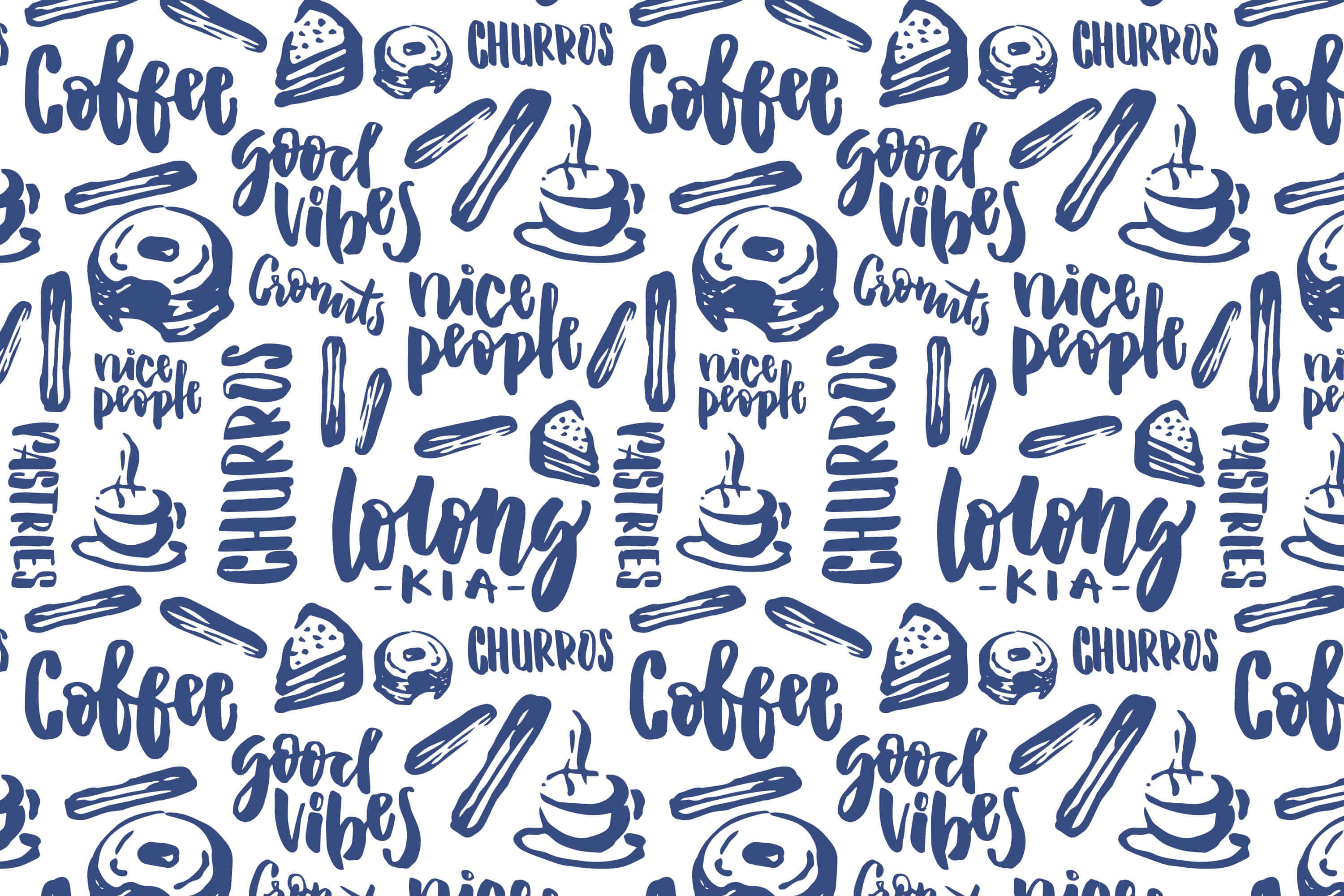
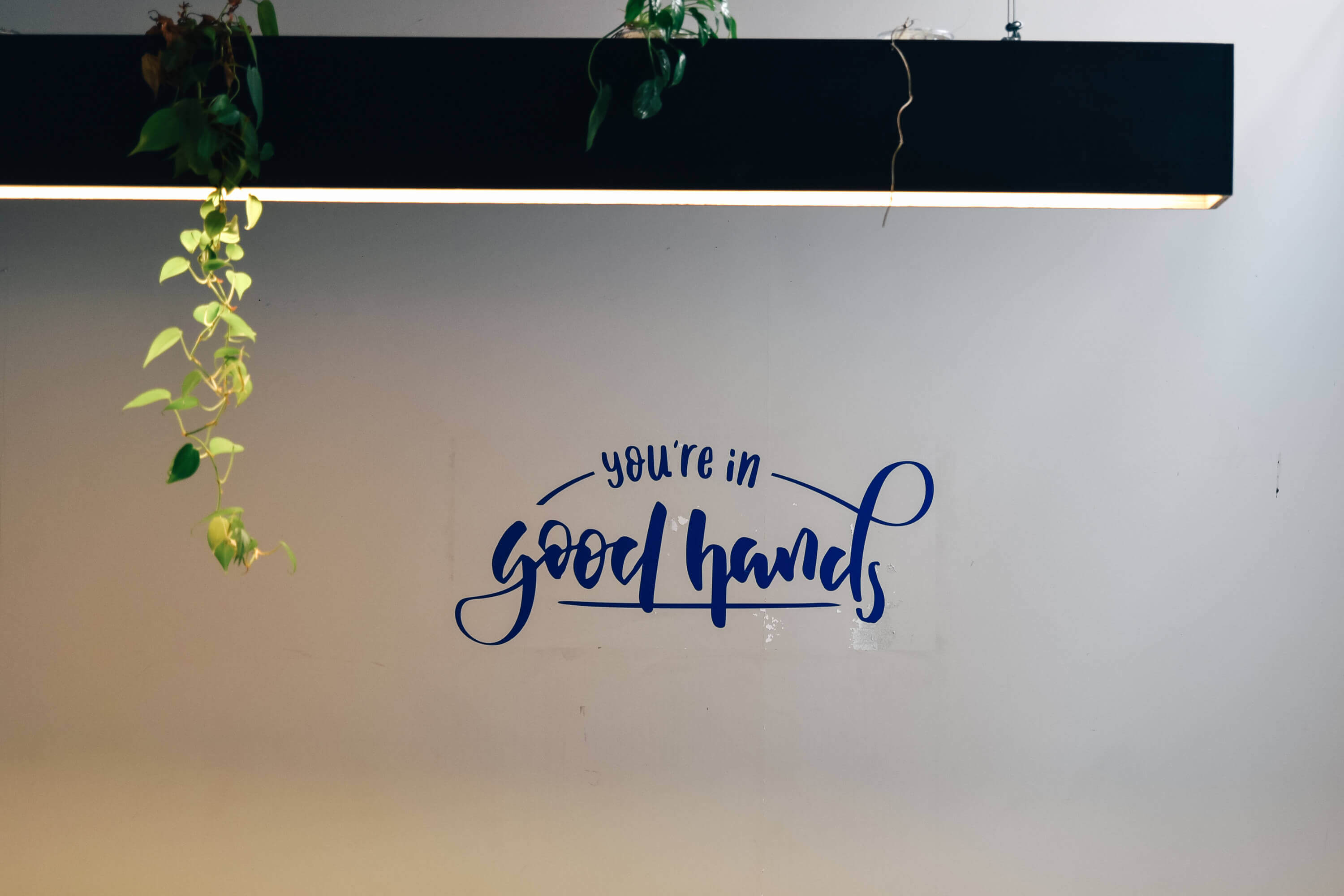
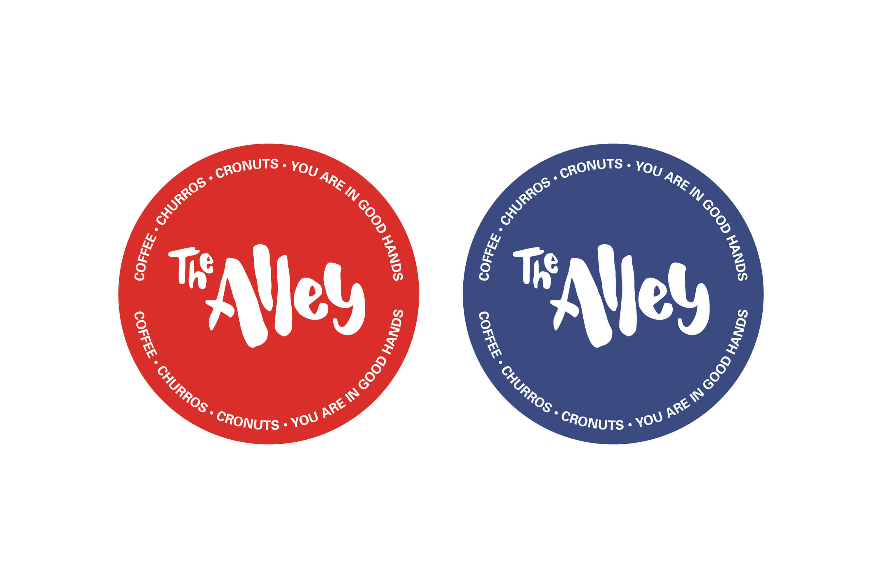
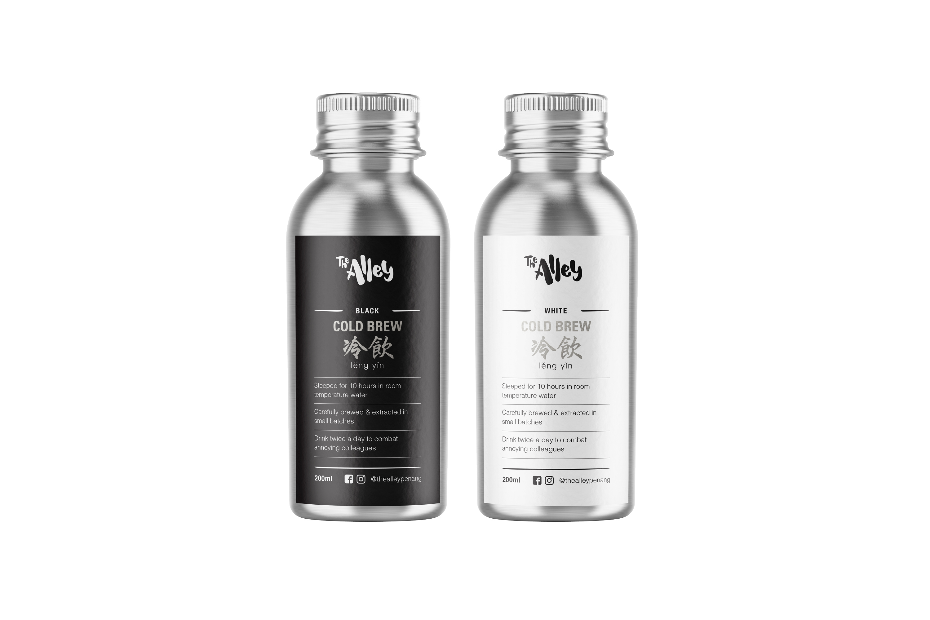
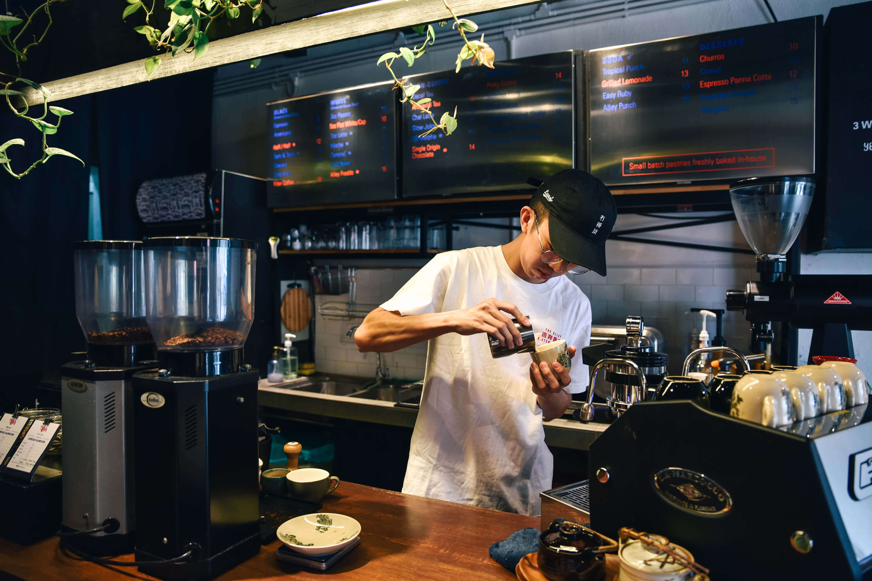
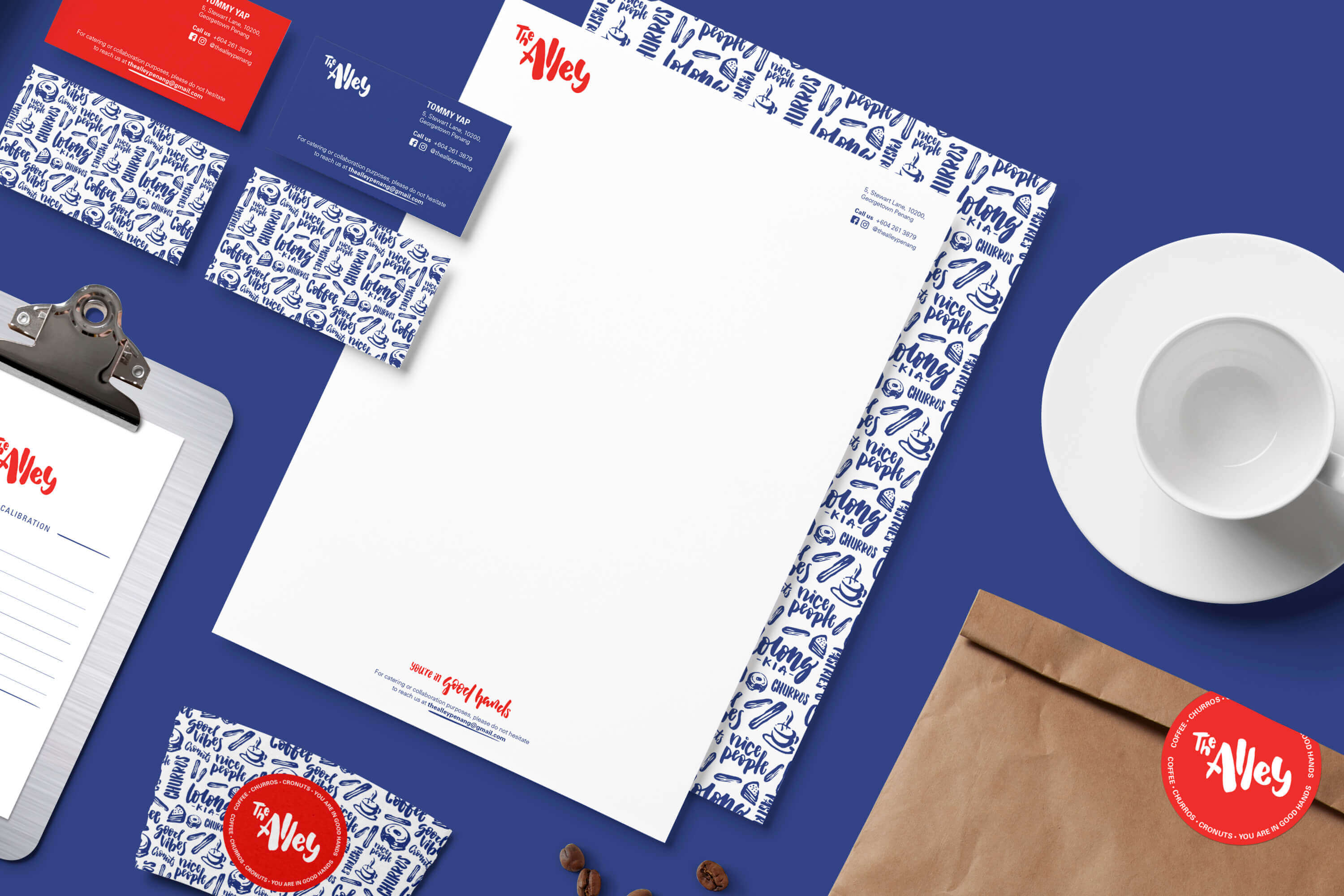
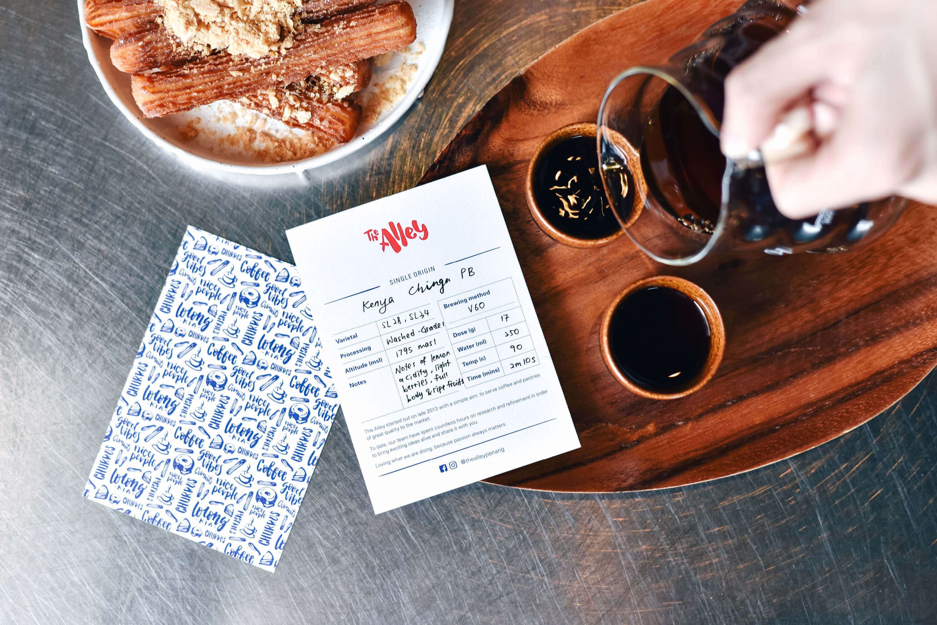
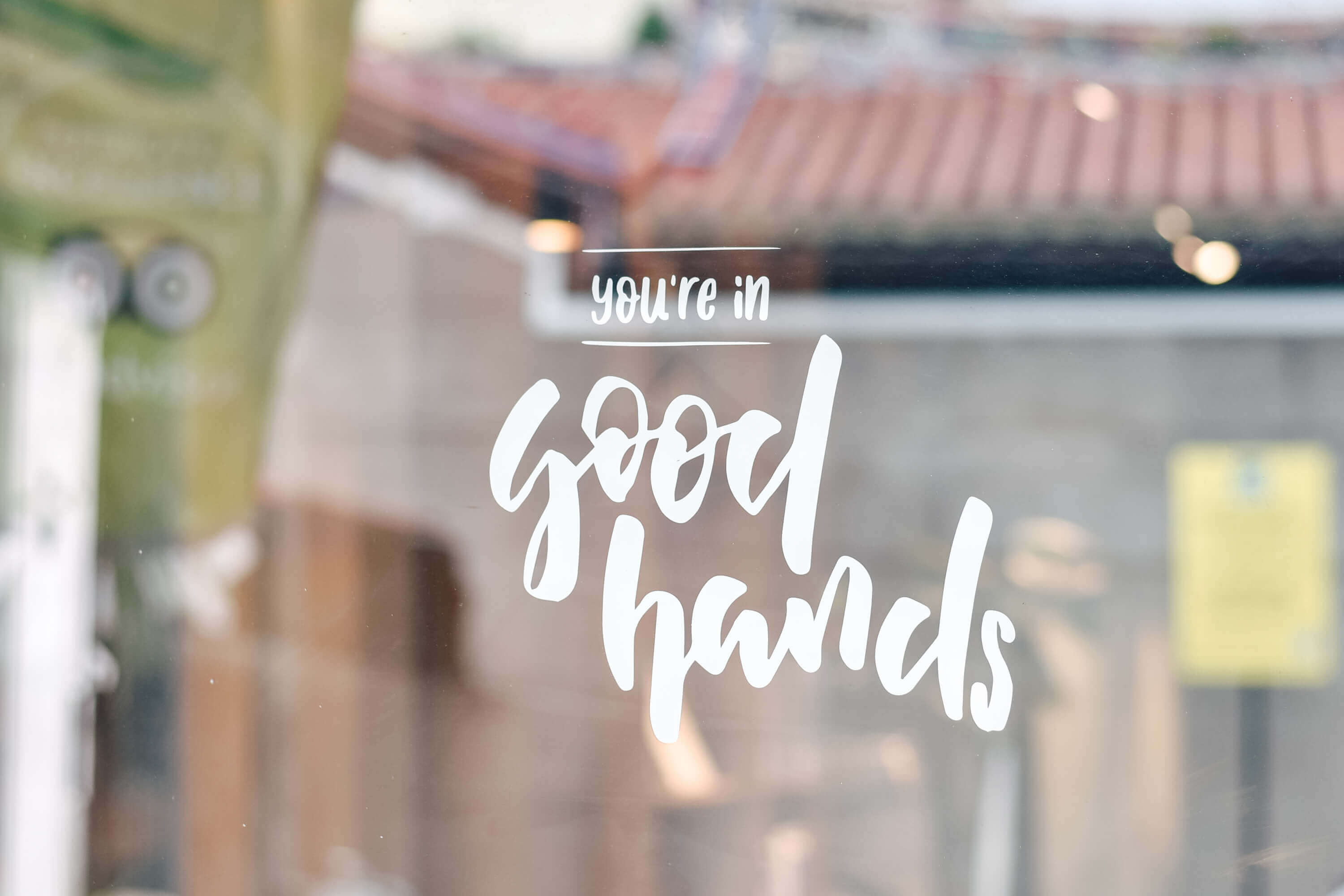
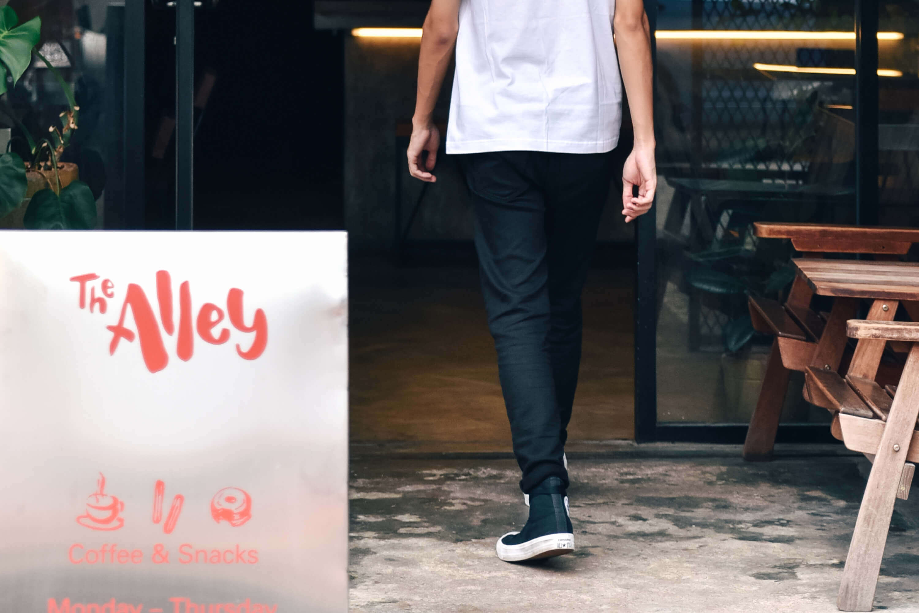
THE ALLEY
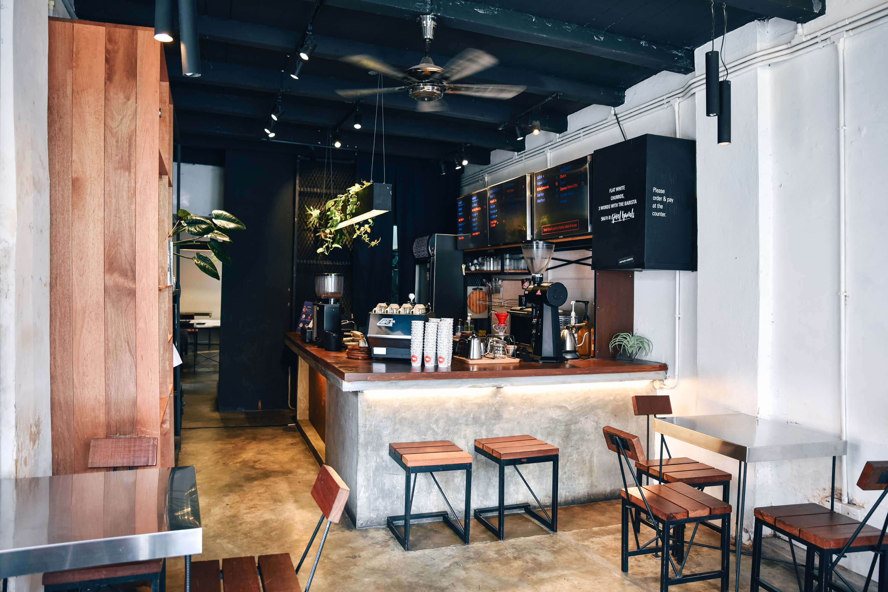
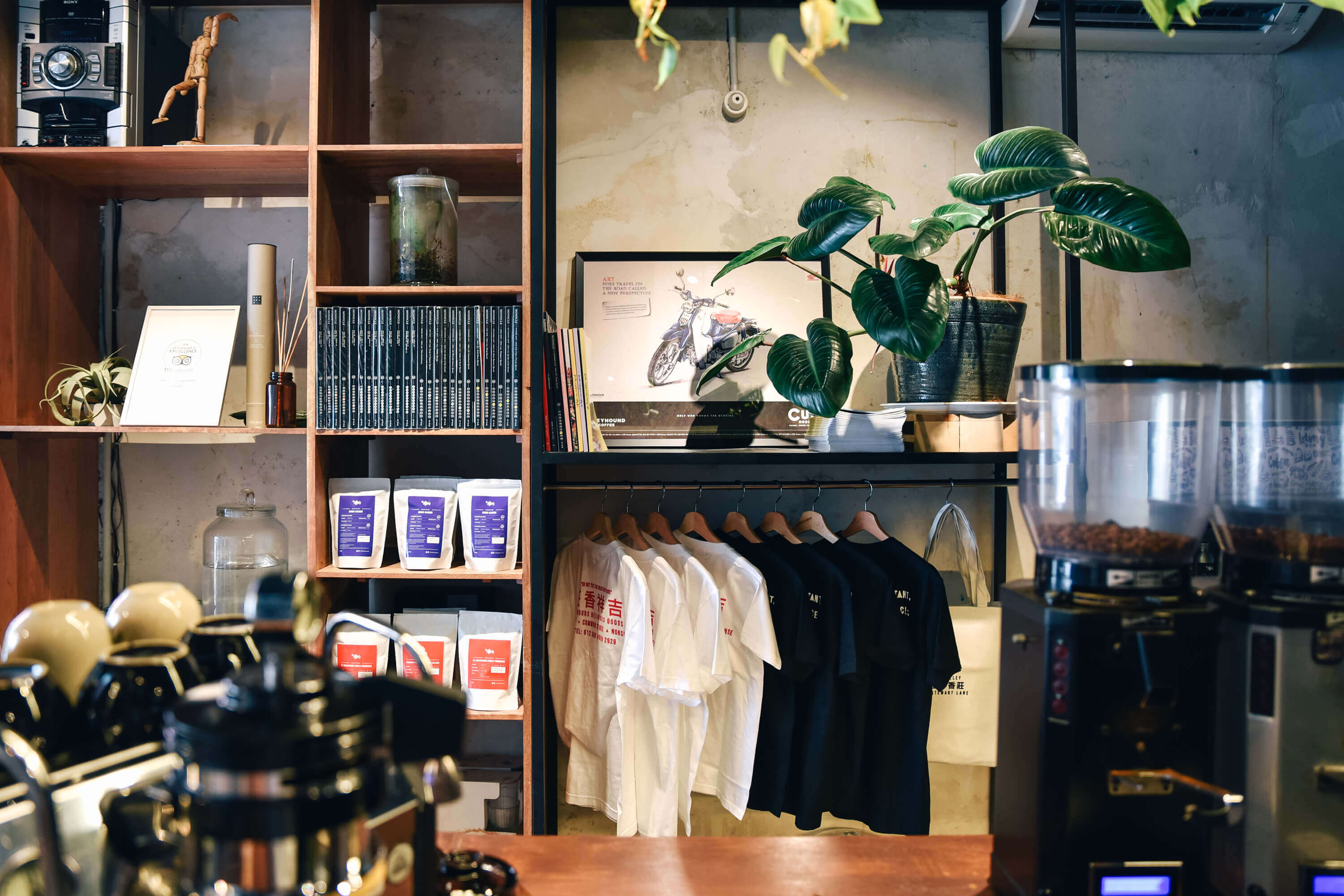
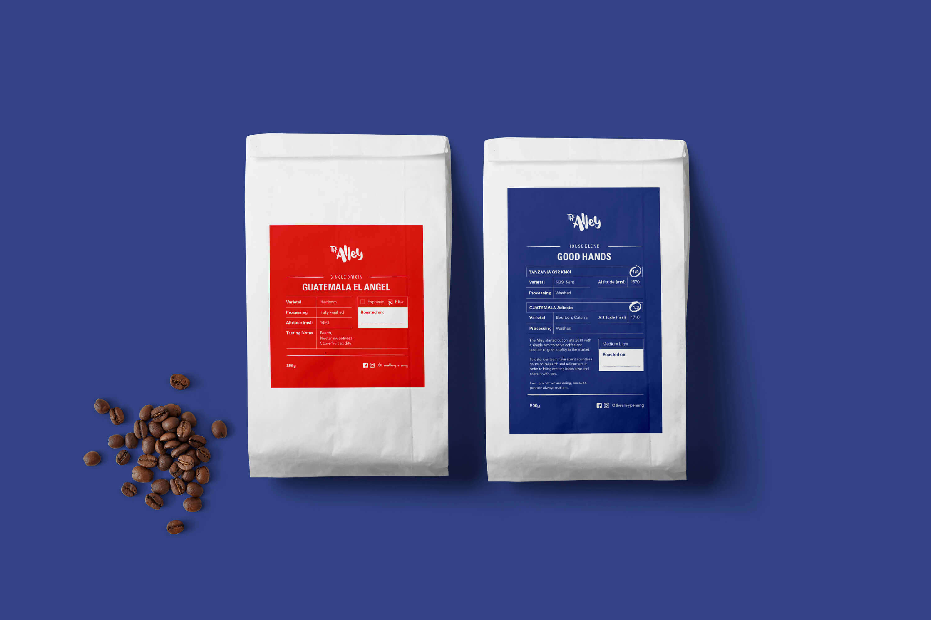
Located along the narrow lane next to the Goddess of Mercy Temple, a famous tourist hot spot – there is a building with the sign ‘Kedai Gaharu Keat Seang’ (once an incense shop) where you will find The Alley cafe housed within. The cafe is famous for their specialty coffee and snacks.
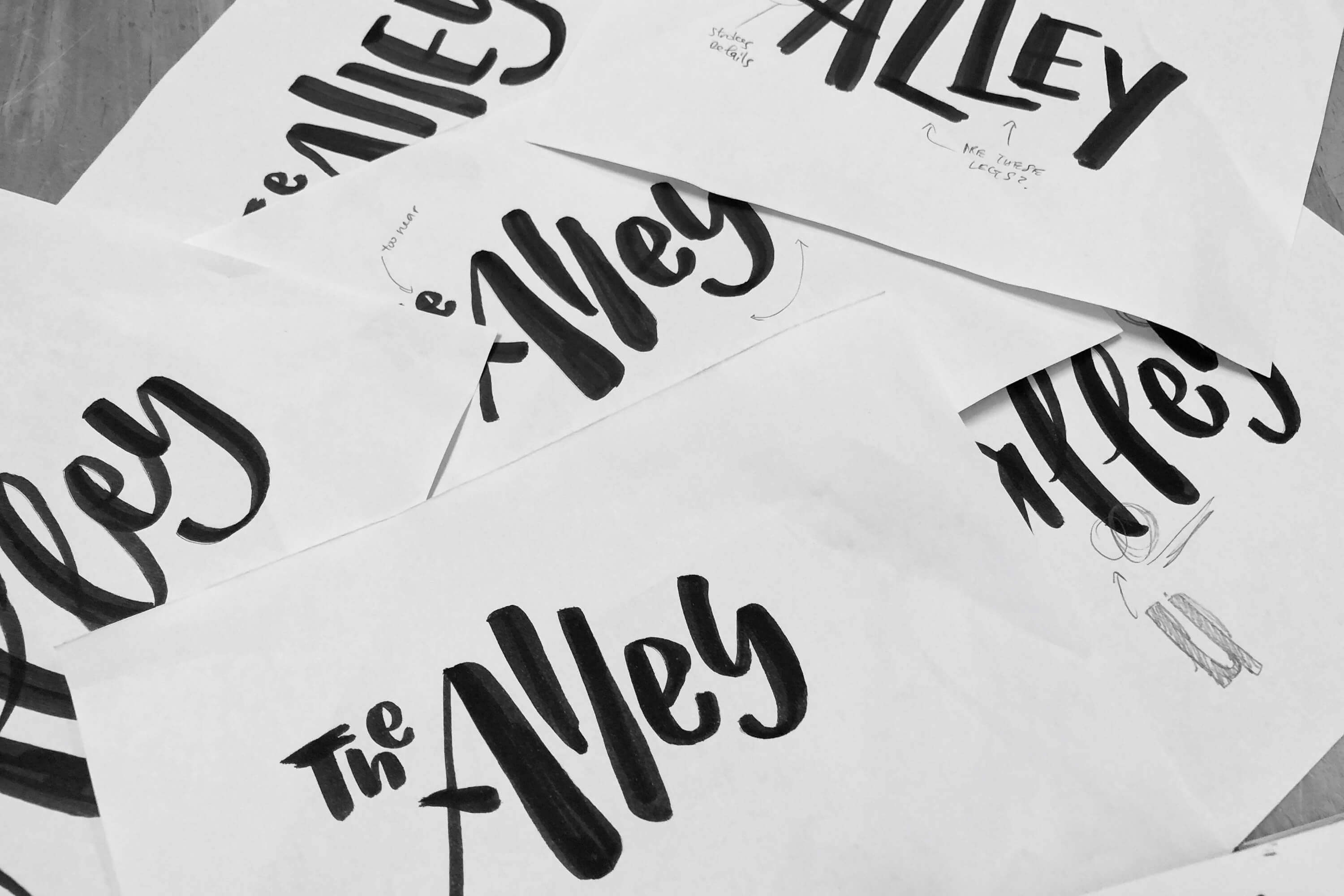
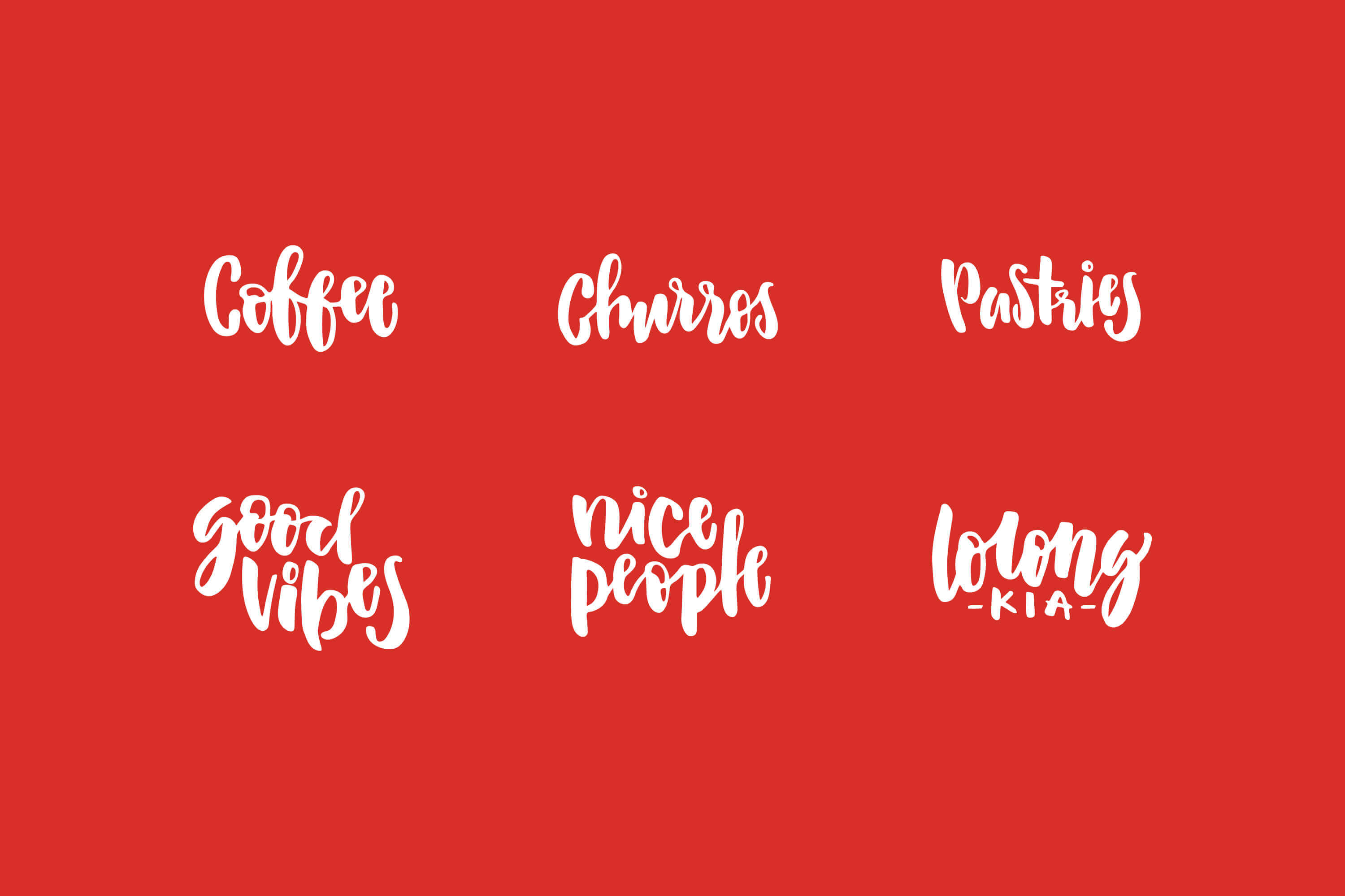
The visual direction was created to reflect the youthful and mischievous spirit of the cafe’s crew – as seen in the hand drawn logo and illustrations of their signature churros, cheesecakes and coffees that are applied across the collaterals.
Task: Brand Identity
Category: Food & Beverage
Art direction: TE PERSPECTIVE
Design: TE, Yimin Heng
Calligraphy: Yimin Heng
Photography: TW Freeman
Operation and brand consultation: Foci Collective
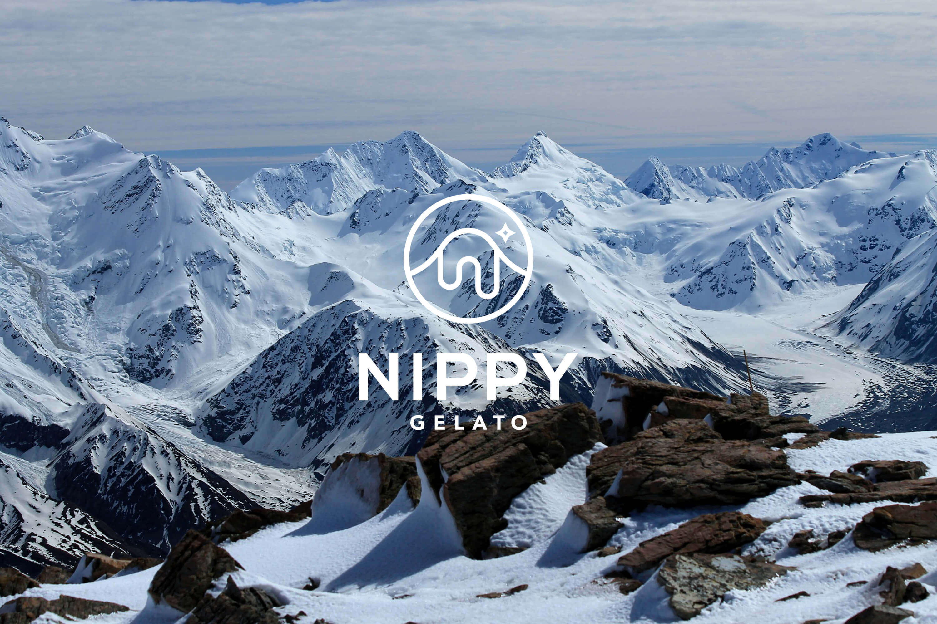
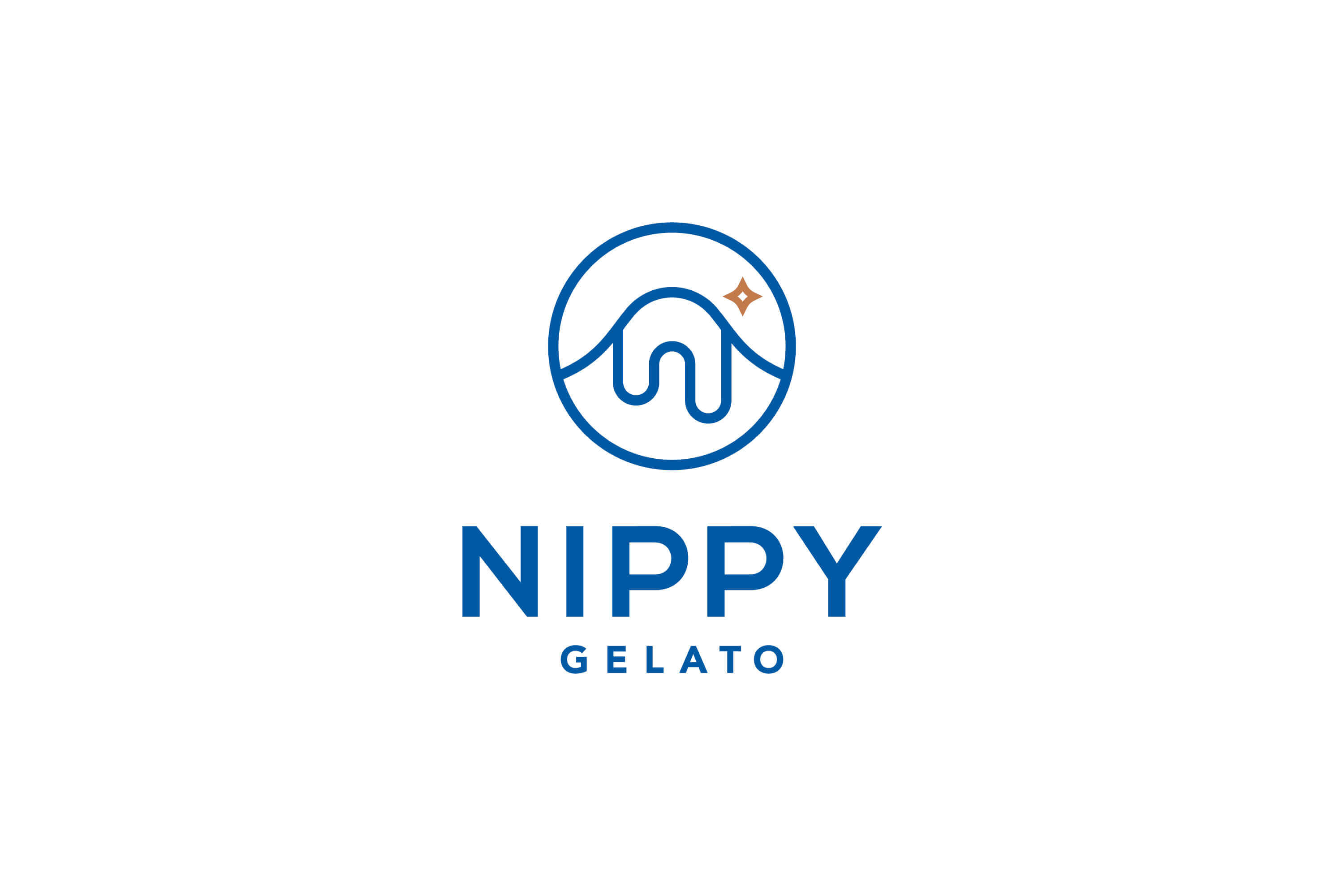
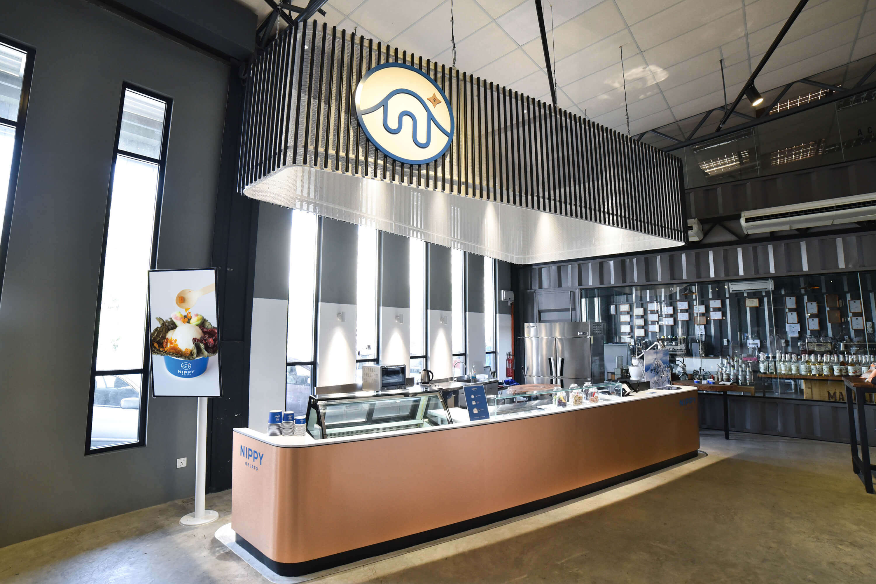
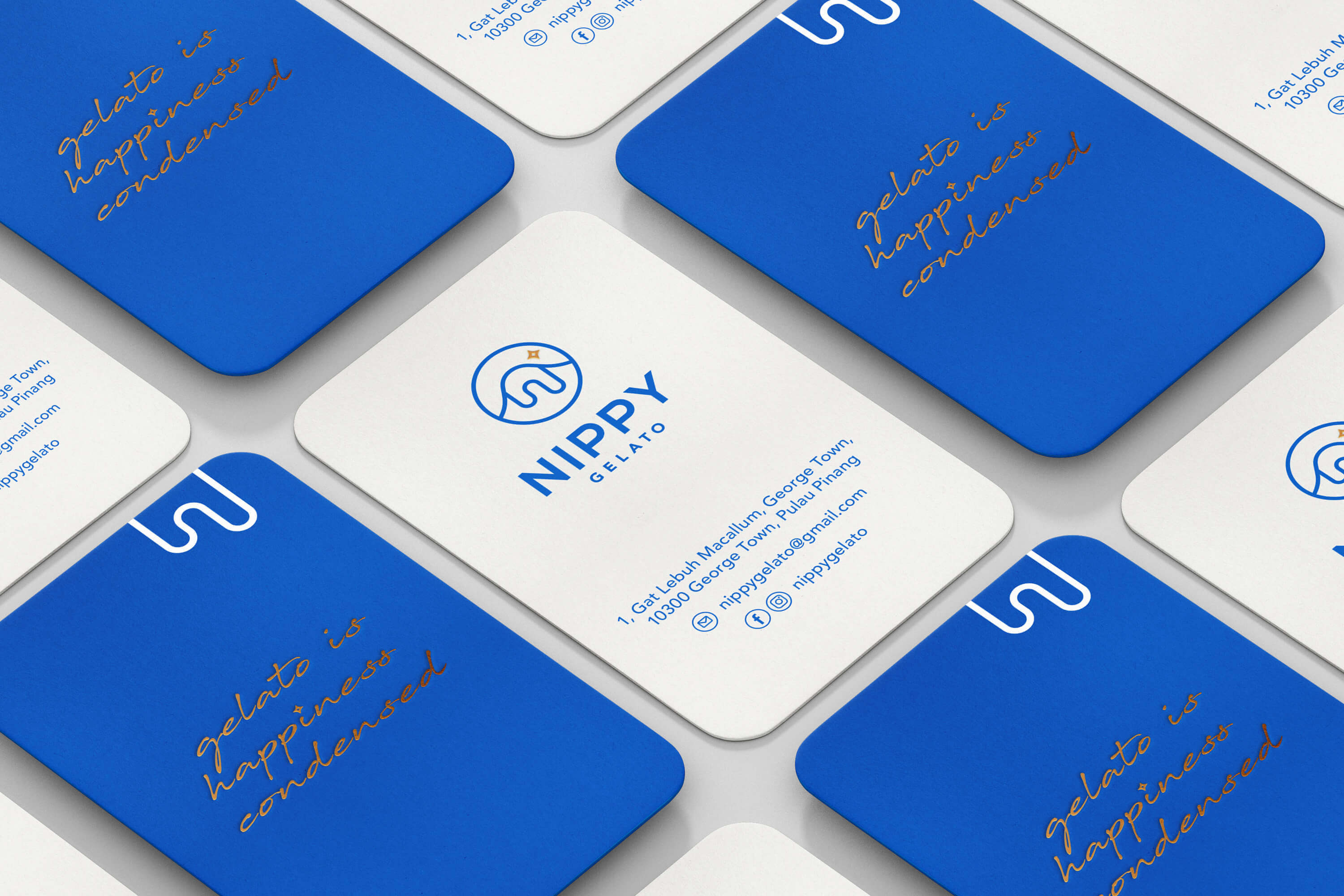
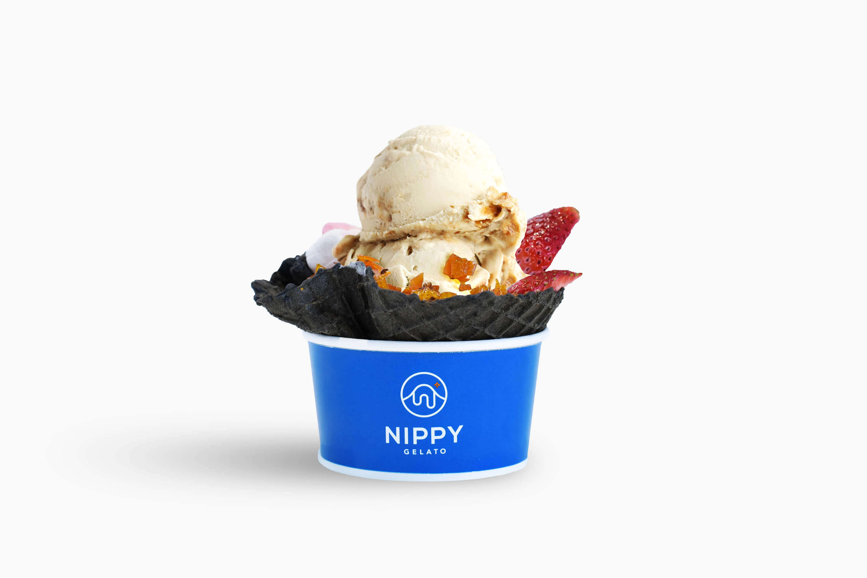
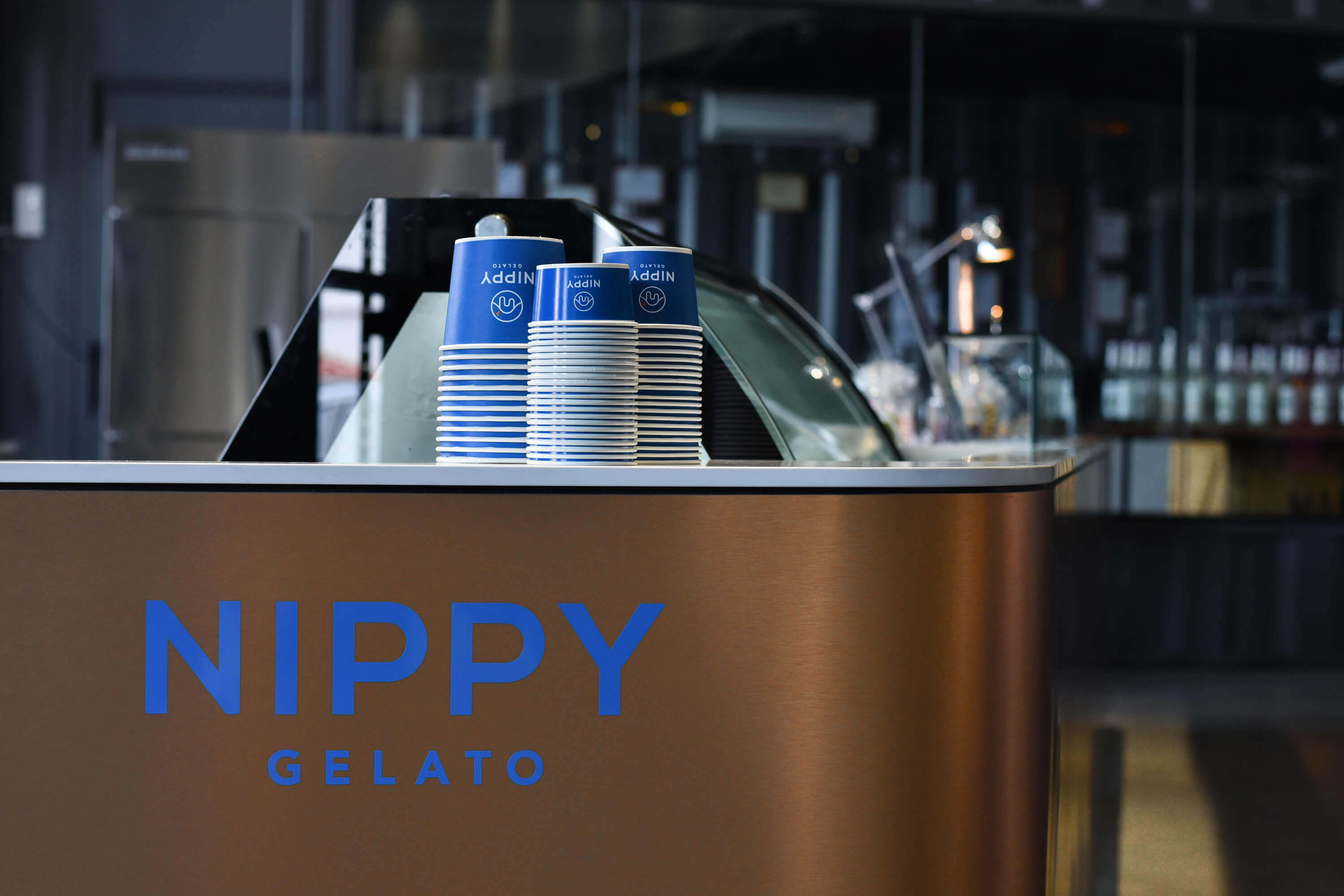
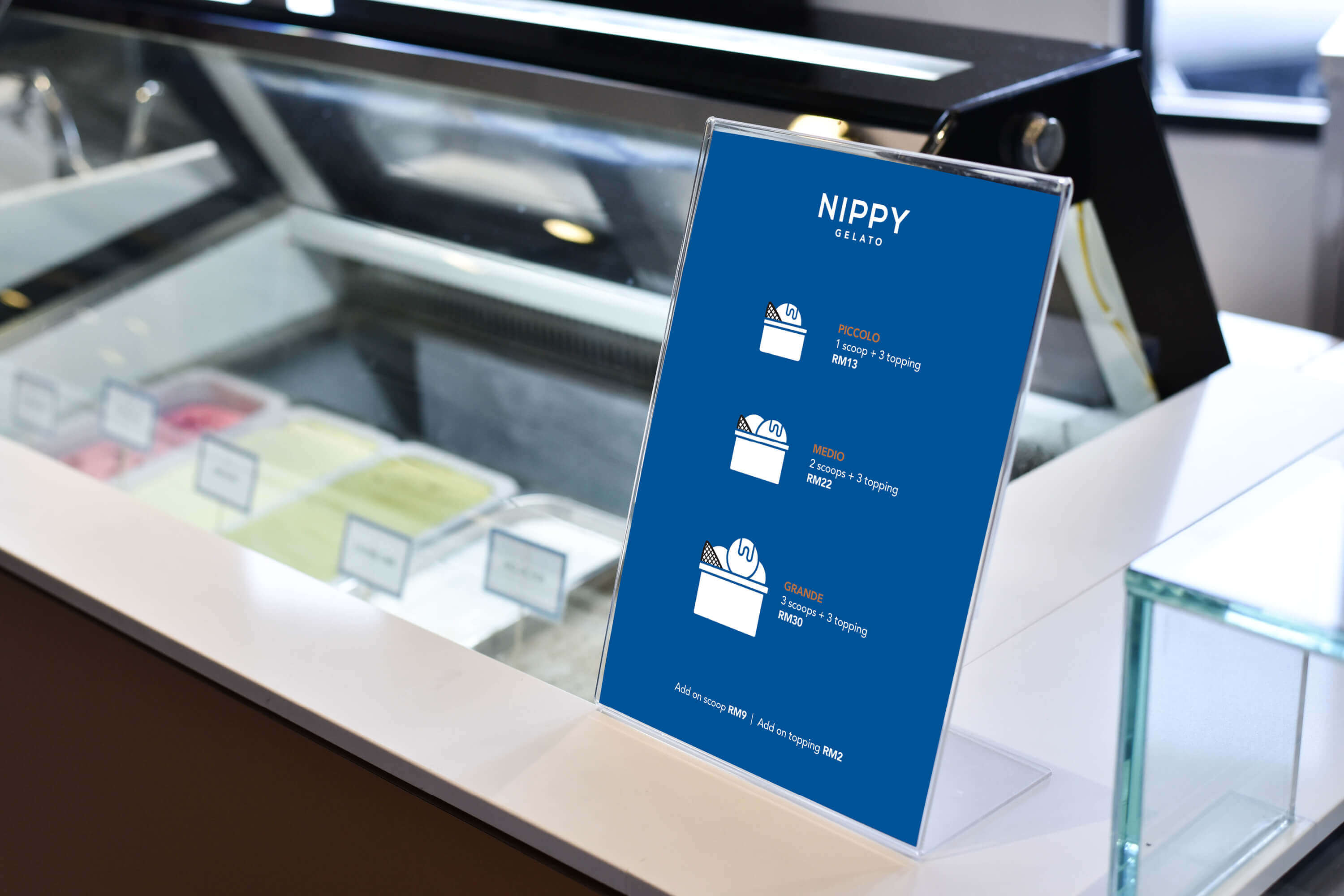
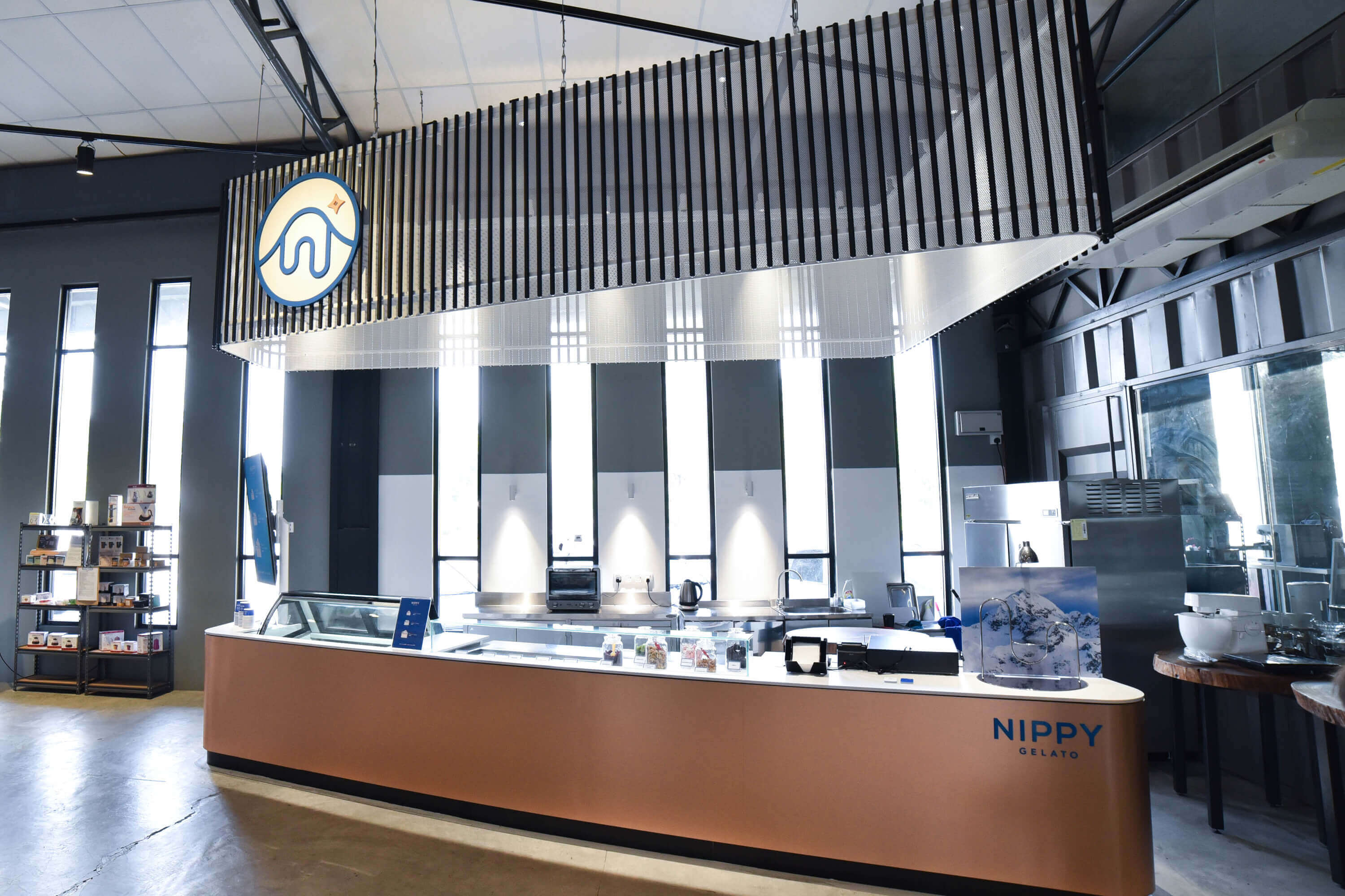
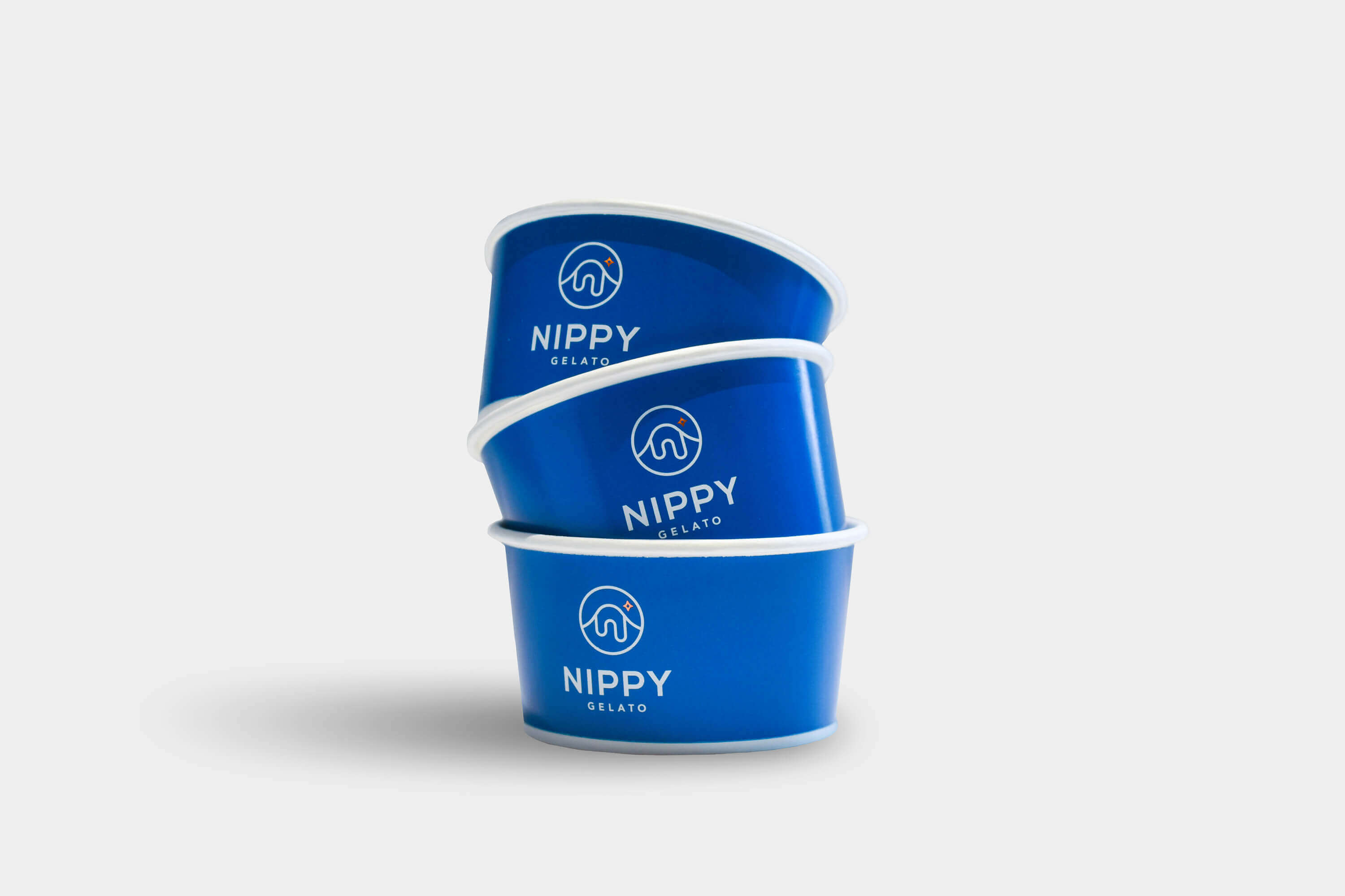
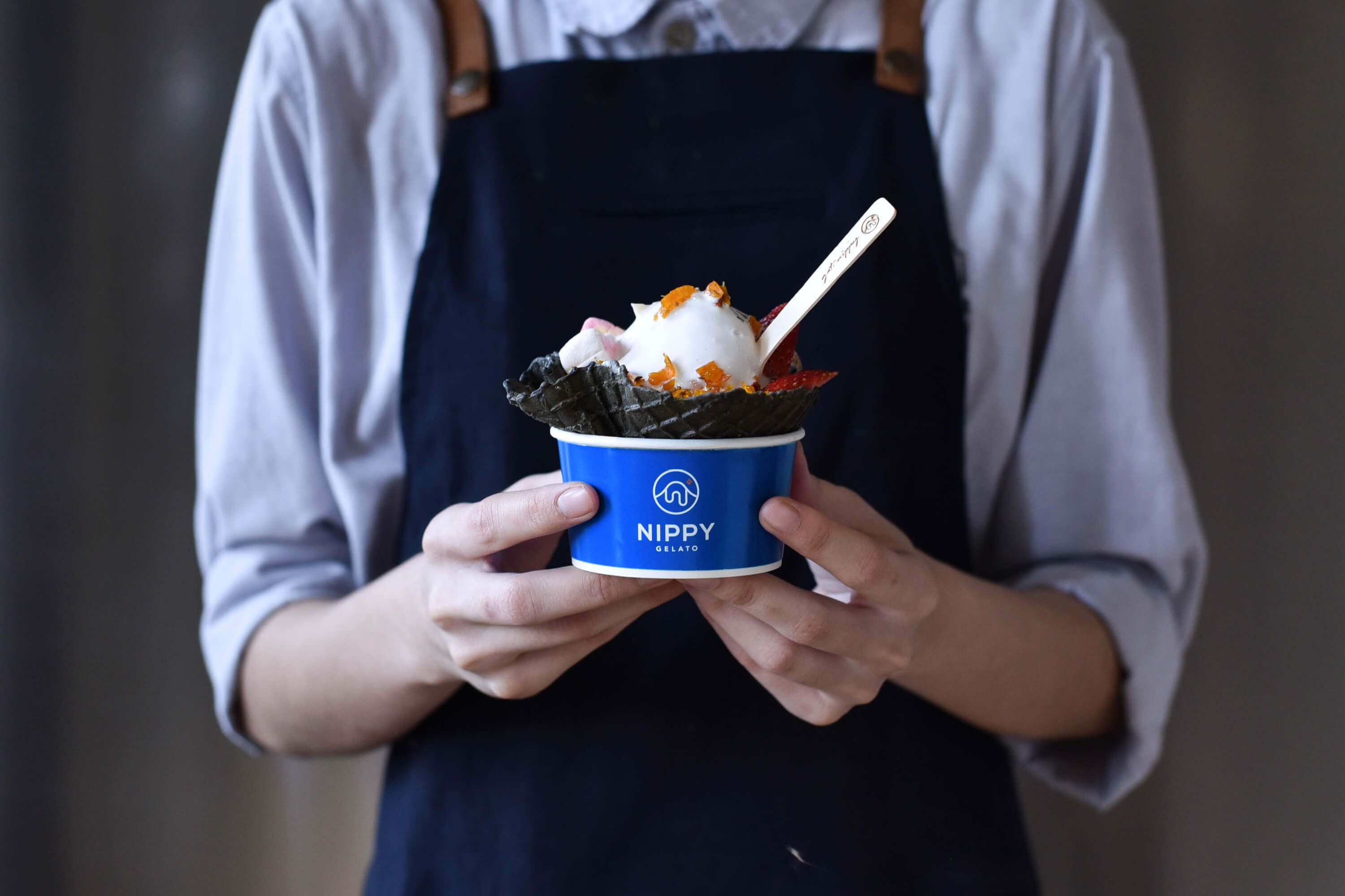
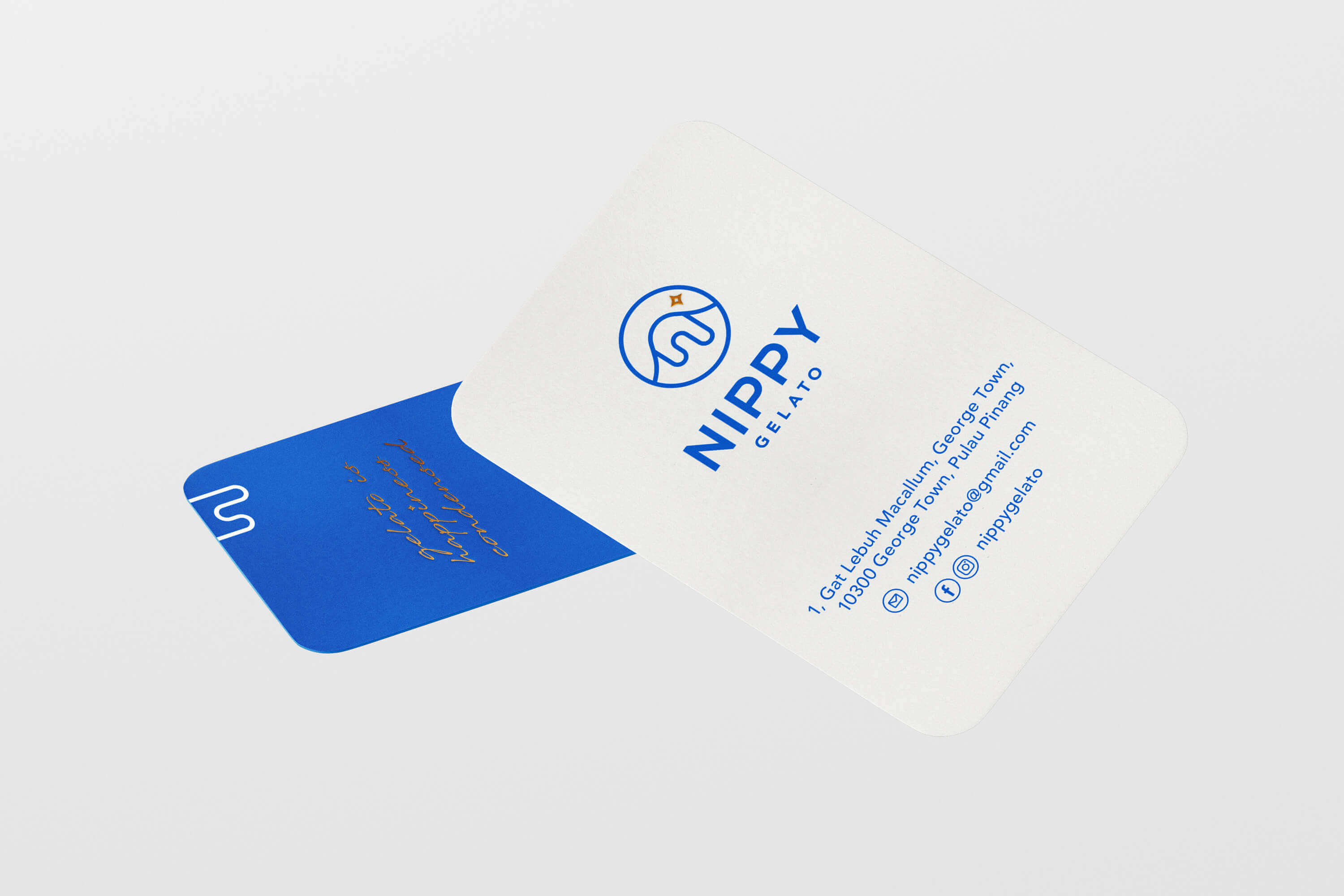
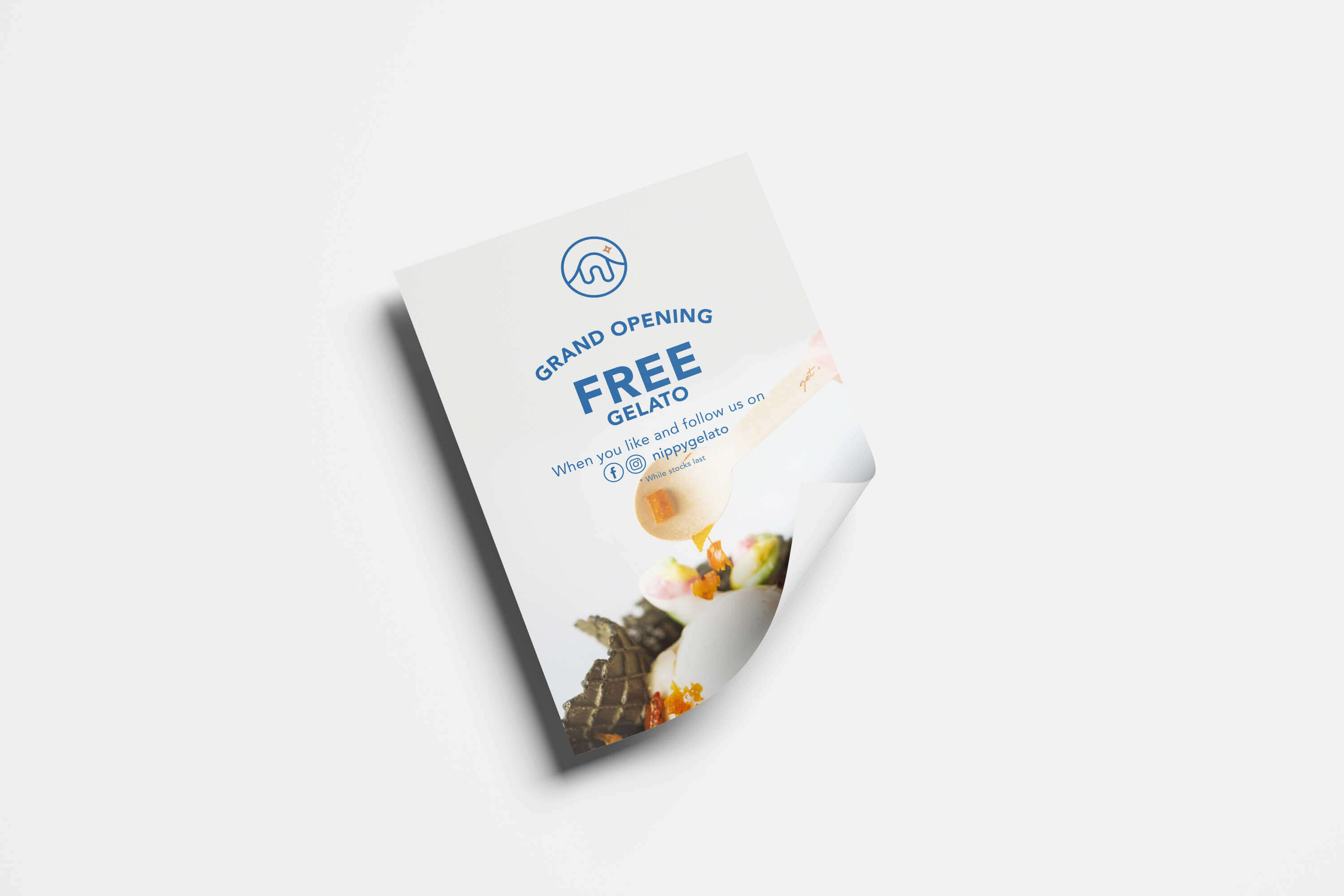
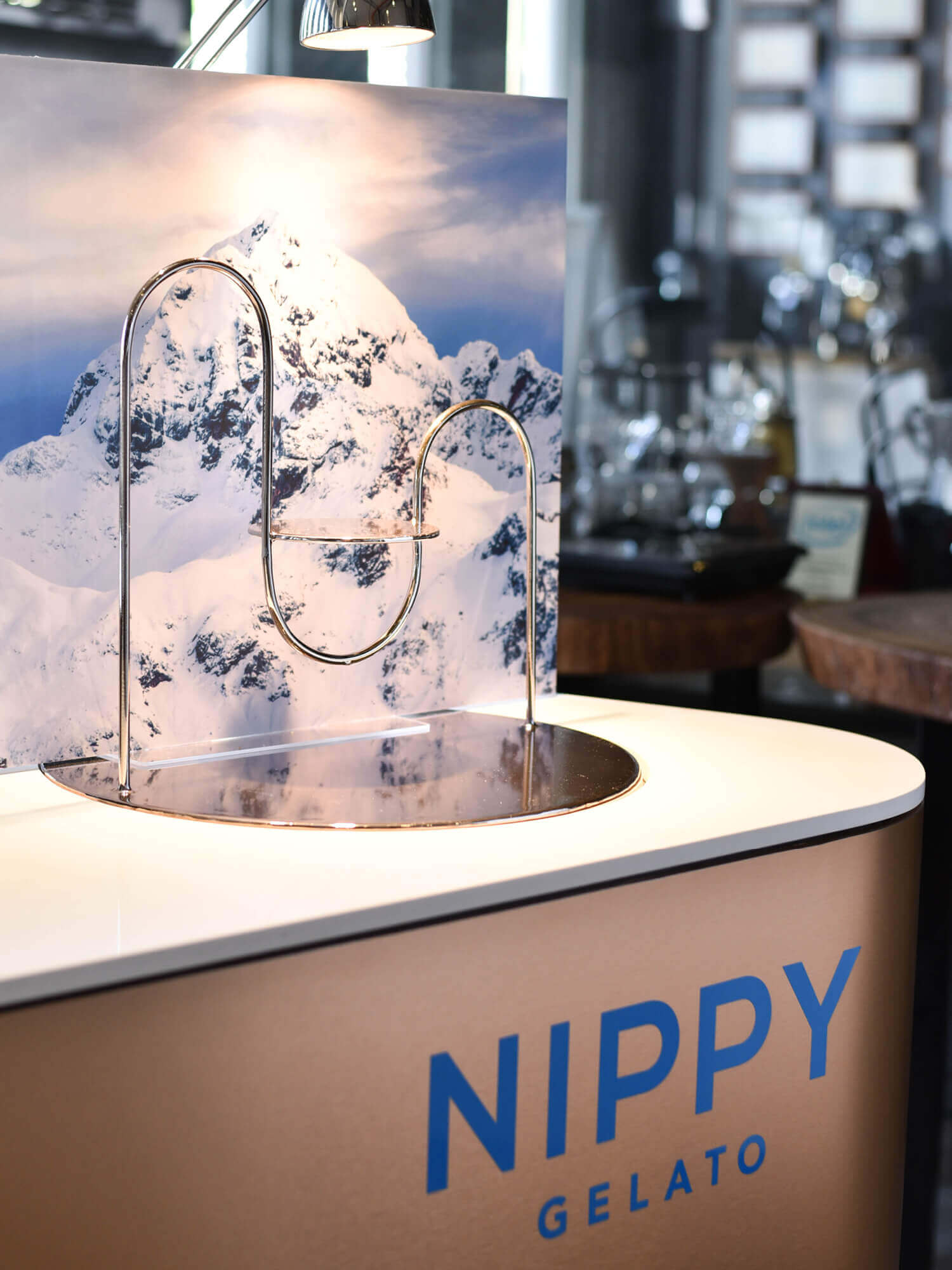
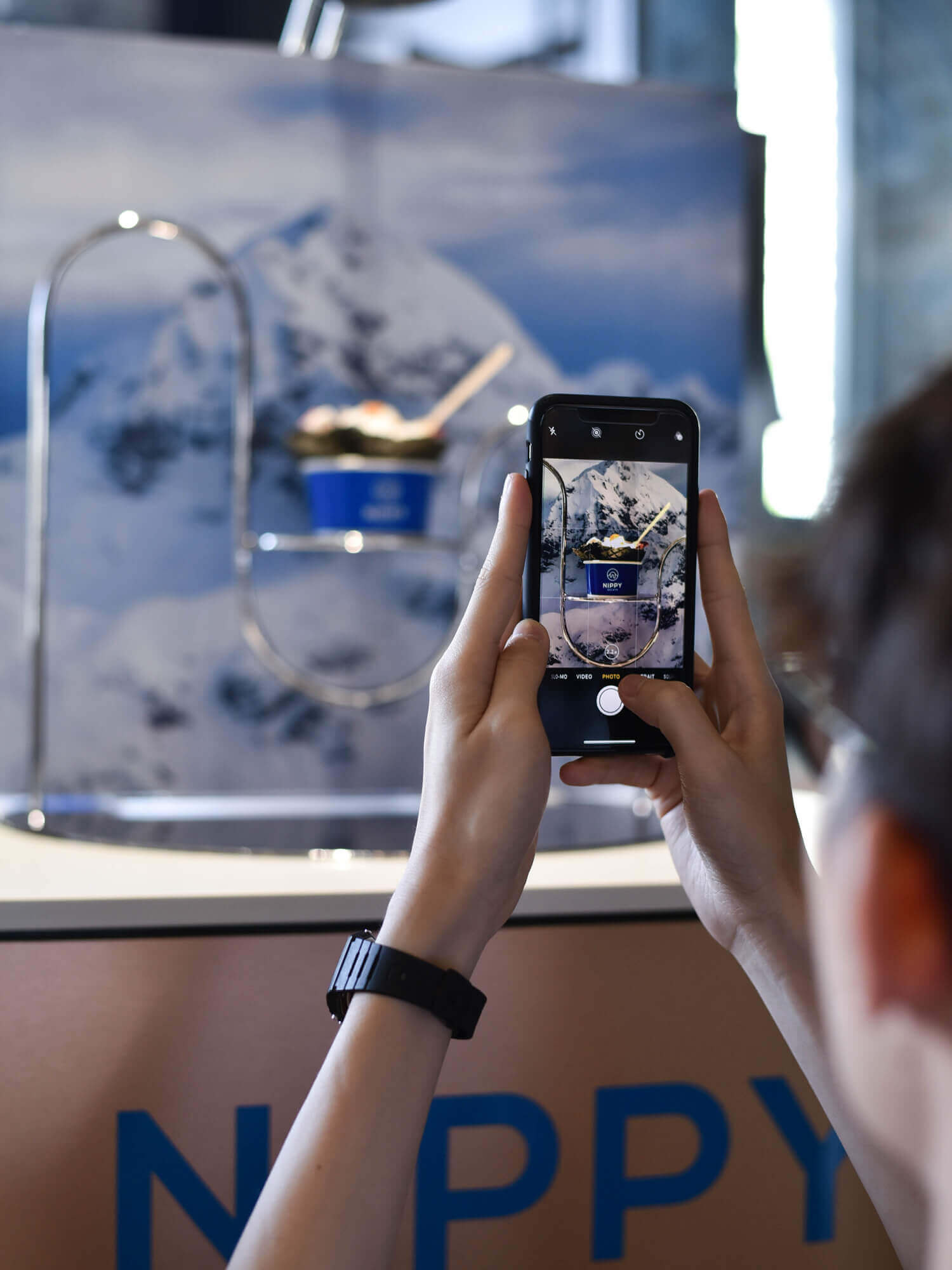
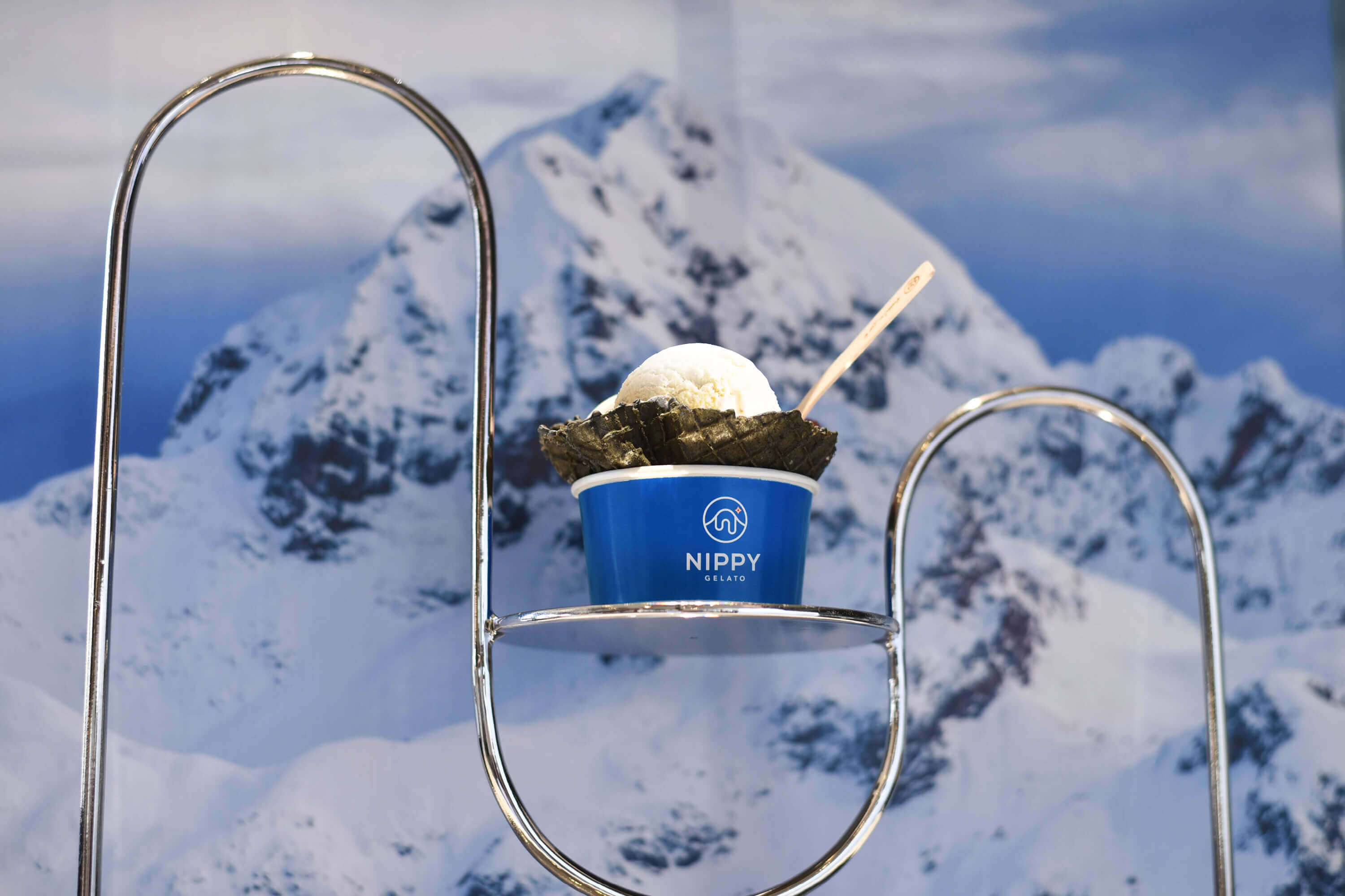
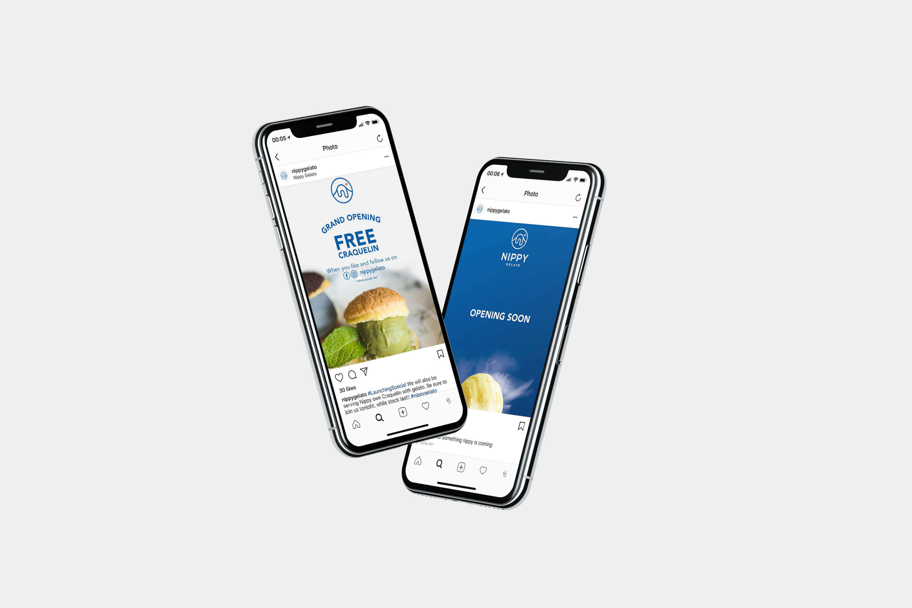
NIPPY GELATO
Nippy Gelato is located in Gat Lebuh Macallum, Penang, Malaysia. They feature authentic artisan gelato and unique black waffle that are made fresh daily.
Their gelato contains less fat than general ice cream, as the artisans use whole milk while ice cream is made with cream. This means you can have denser texture and more intense flavours, more importantly their gelato is made based on authentic recipe that taste like the Italian dessert staple.
Task: Brand Identity
Category: Food & Beverage
Art direction: TE PERSPECTIVE
Design: TE, Yimin Heng
Interior design: Chaos Design Studio
Photography: Vince Ong, TW Freeman
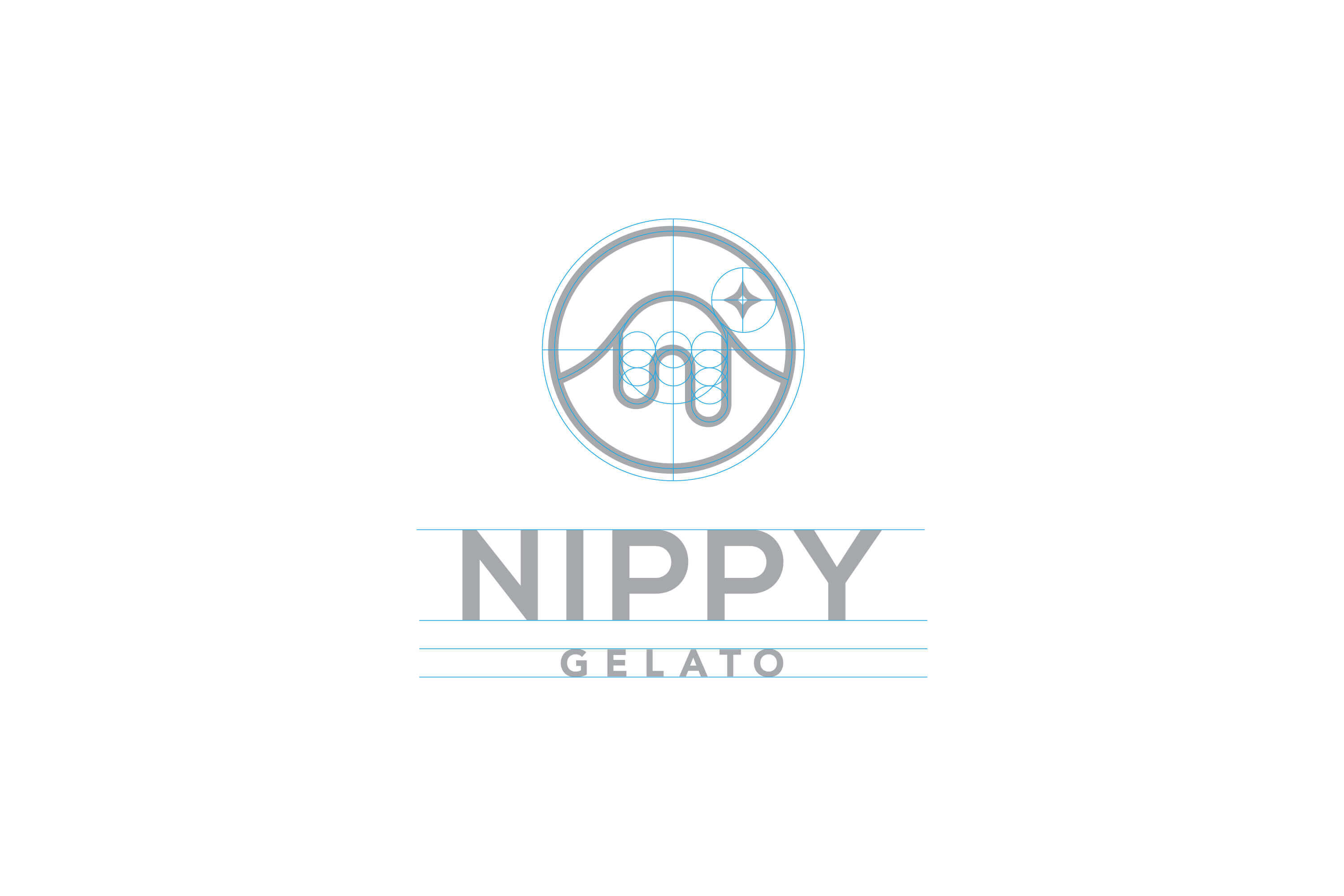
The logo make reference to having great gelato is just like taking a weekend trip to the mountains during cold and chilly weather, It numbs your tongue but it rewards you with an unforgettable experience.
The ‘Nippy Gelato’ brand name is presented in a minimalist sans-serif font to achieve a clean and contemporary look. This font type has clear readability that helps in easy familiarisation.
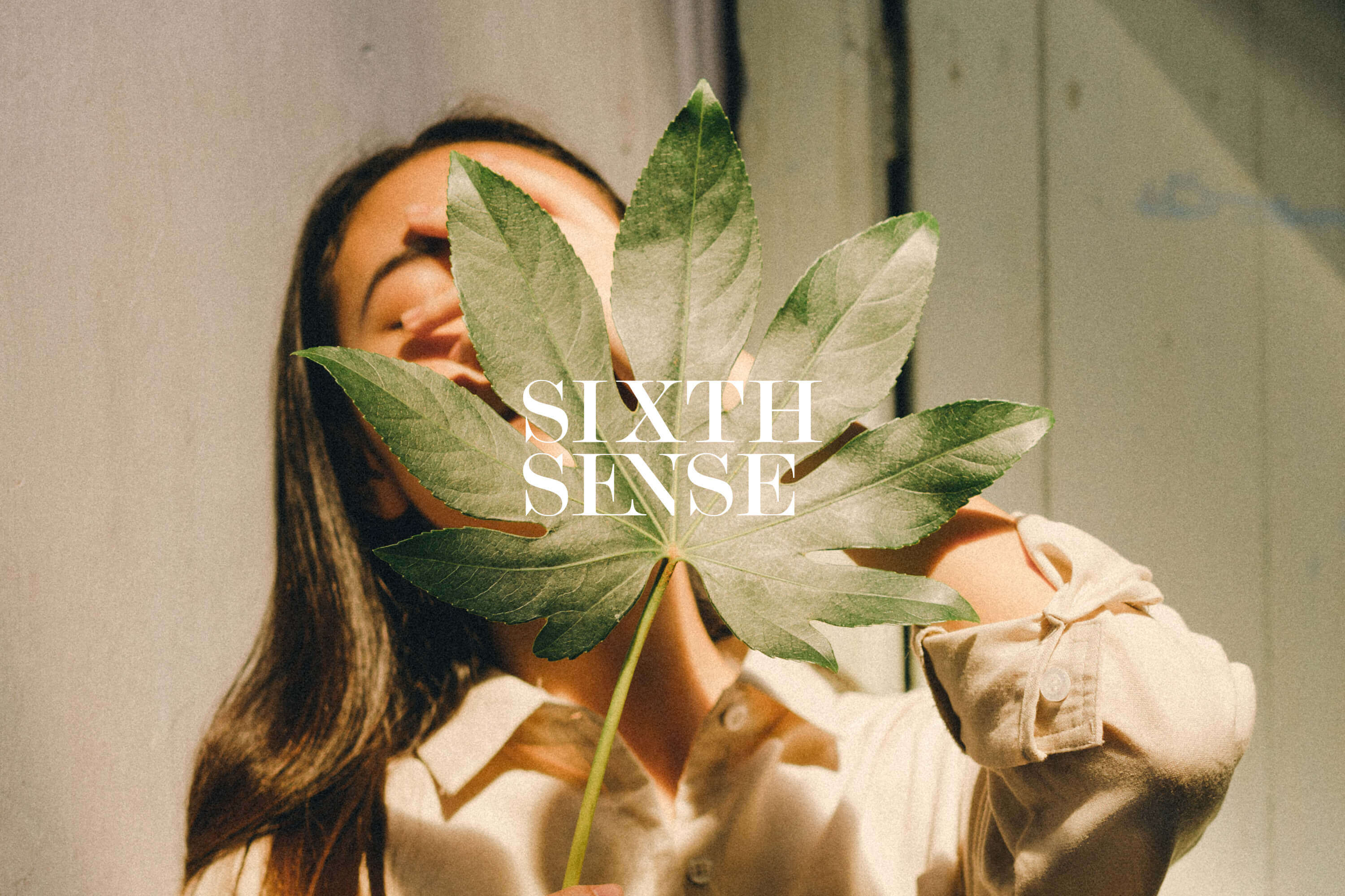
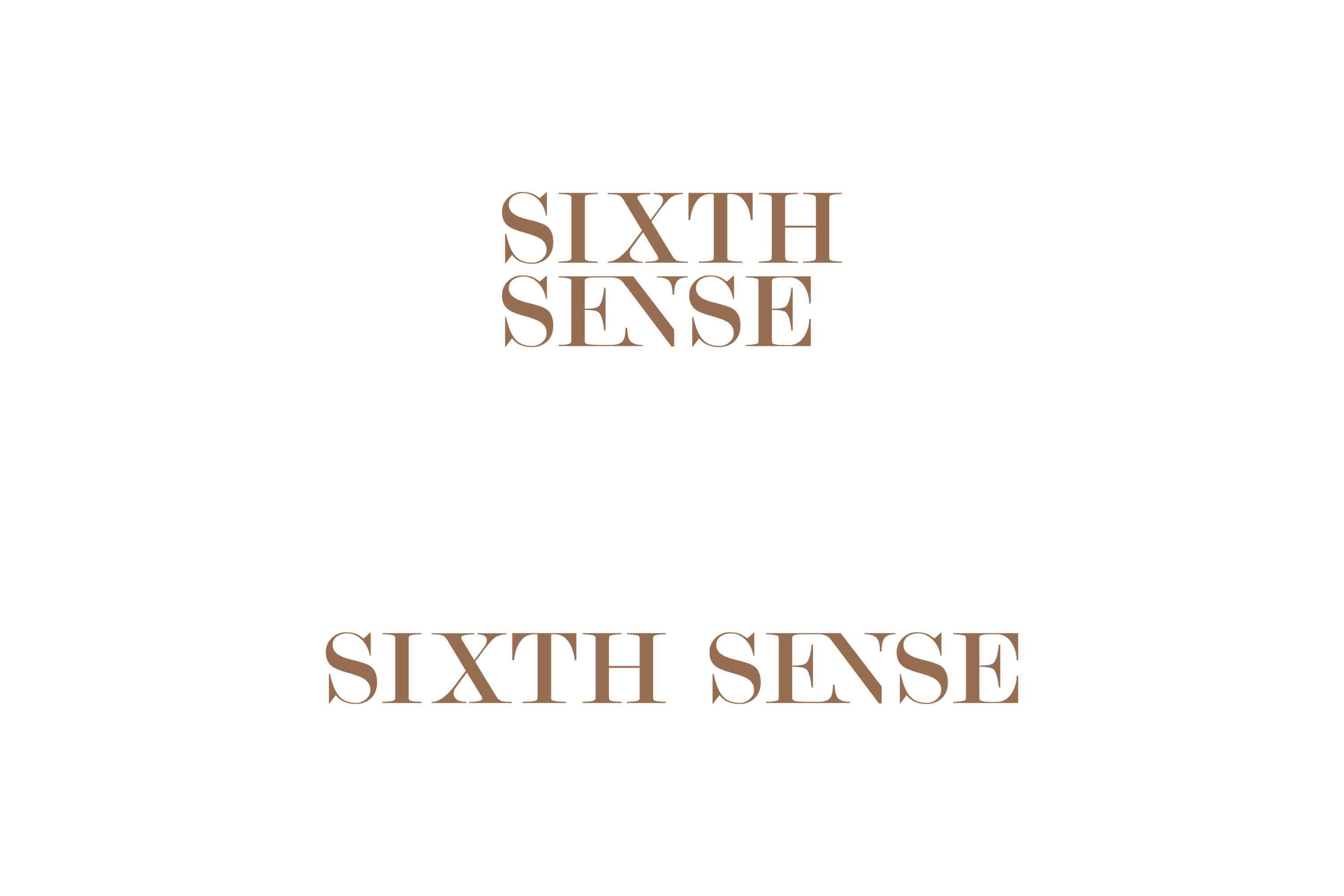
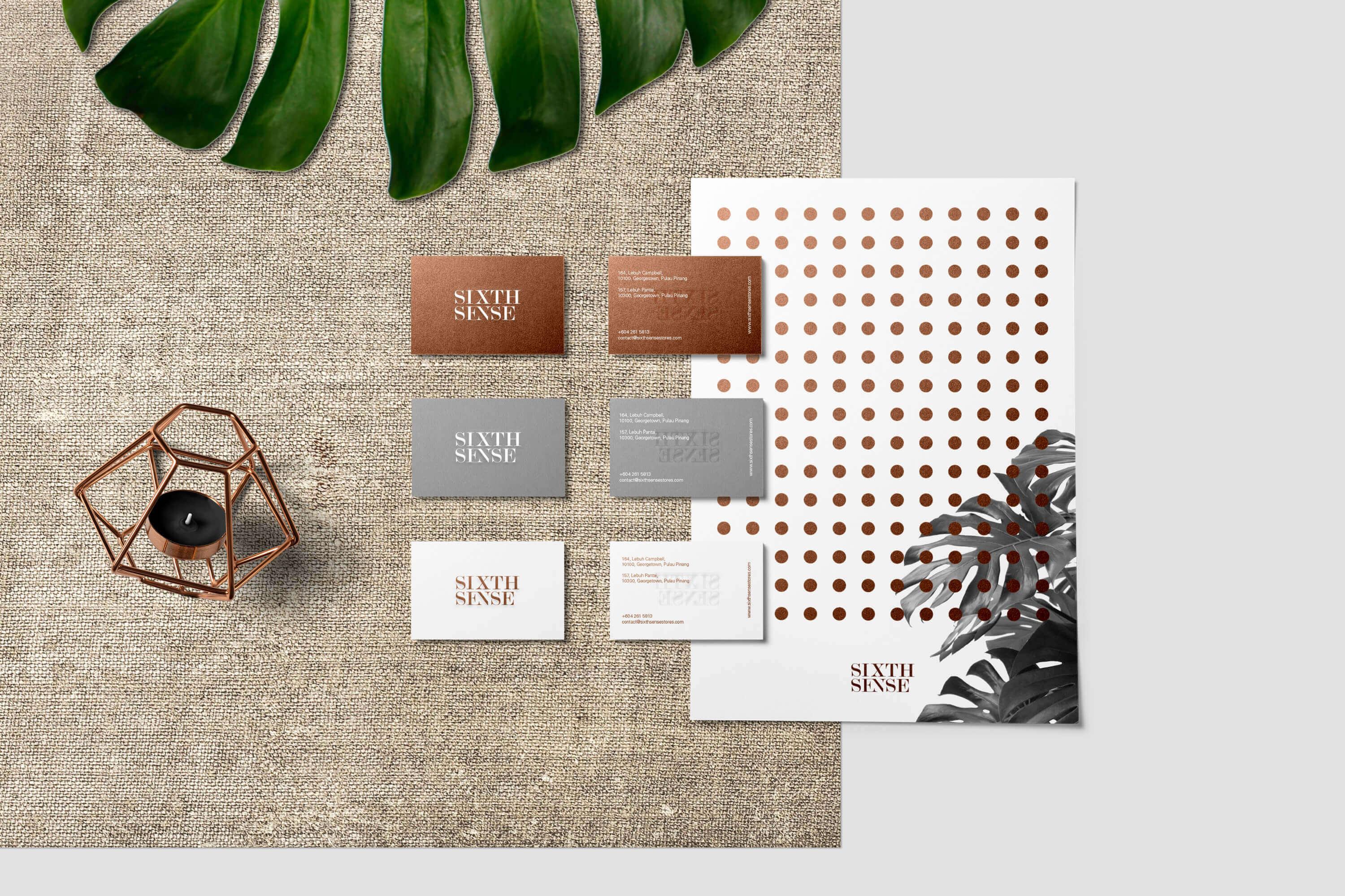
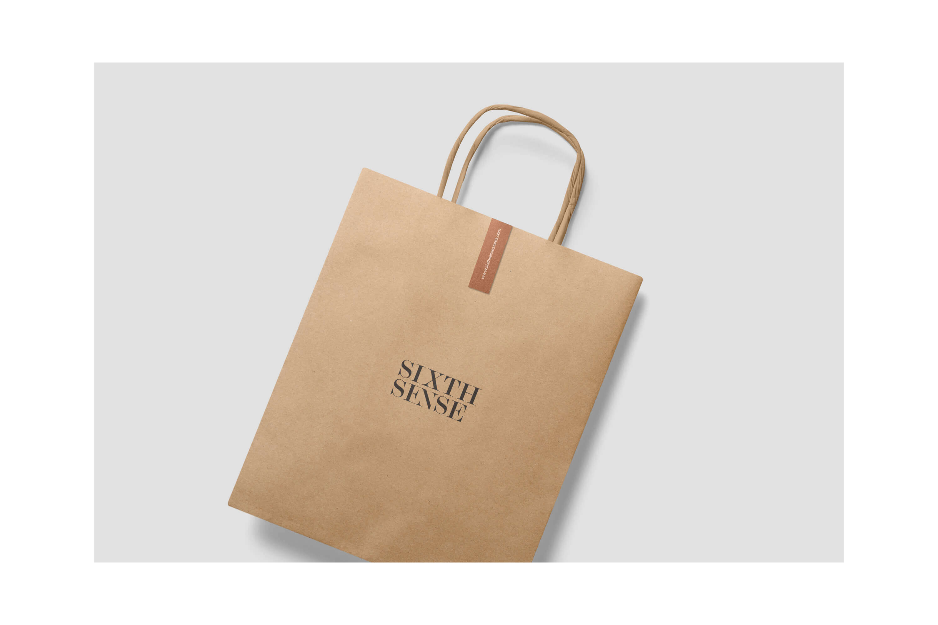
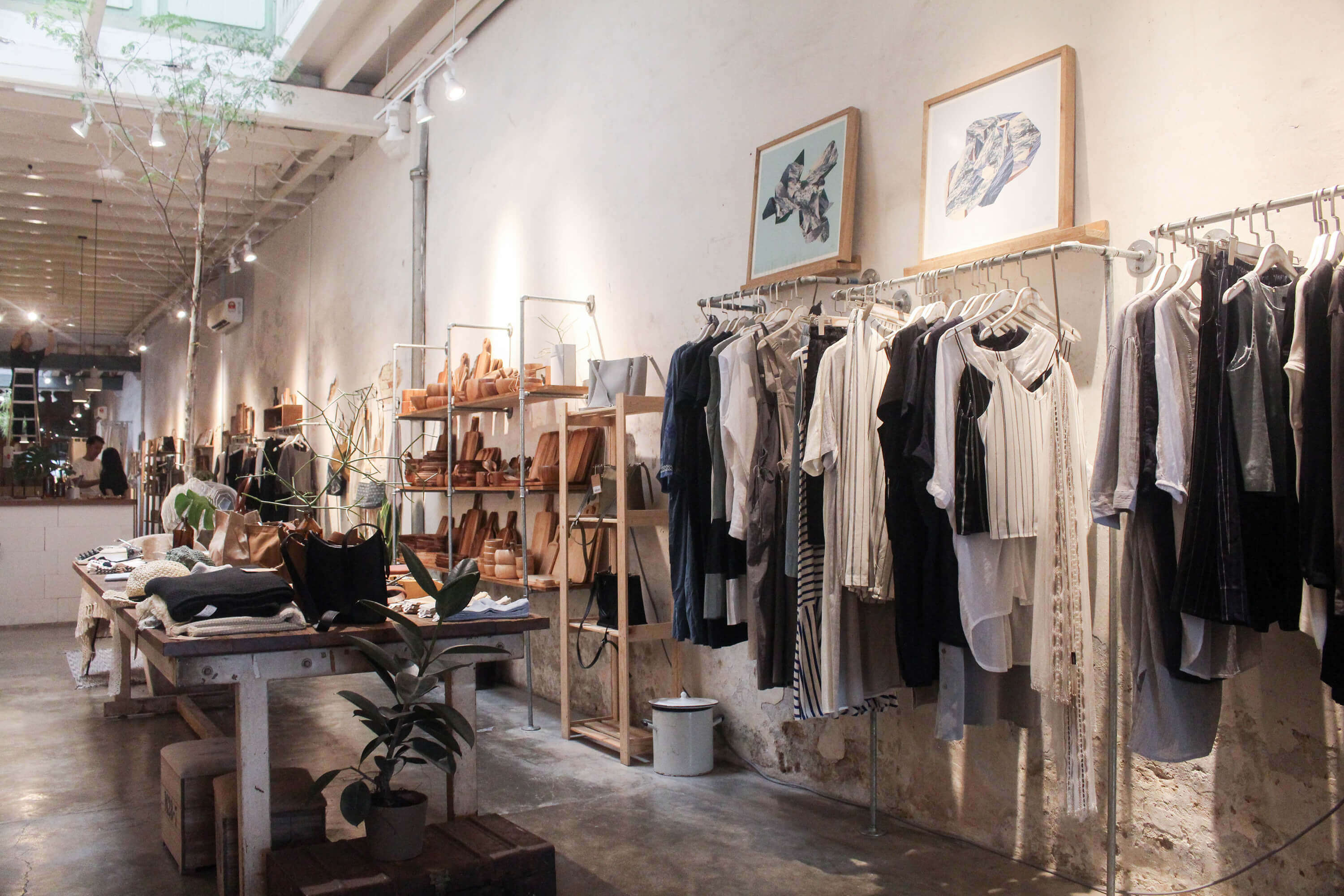
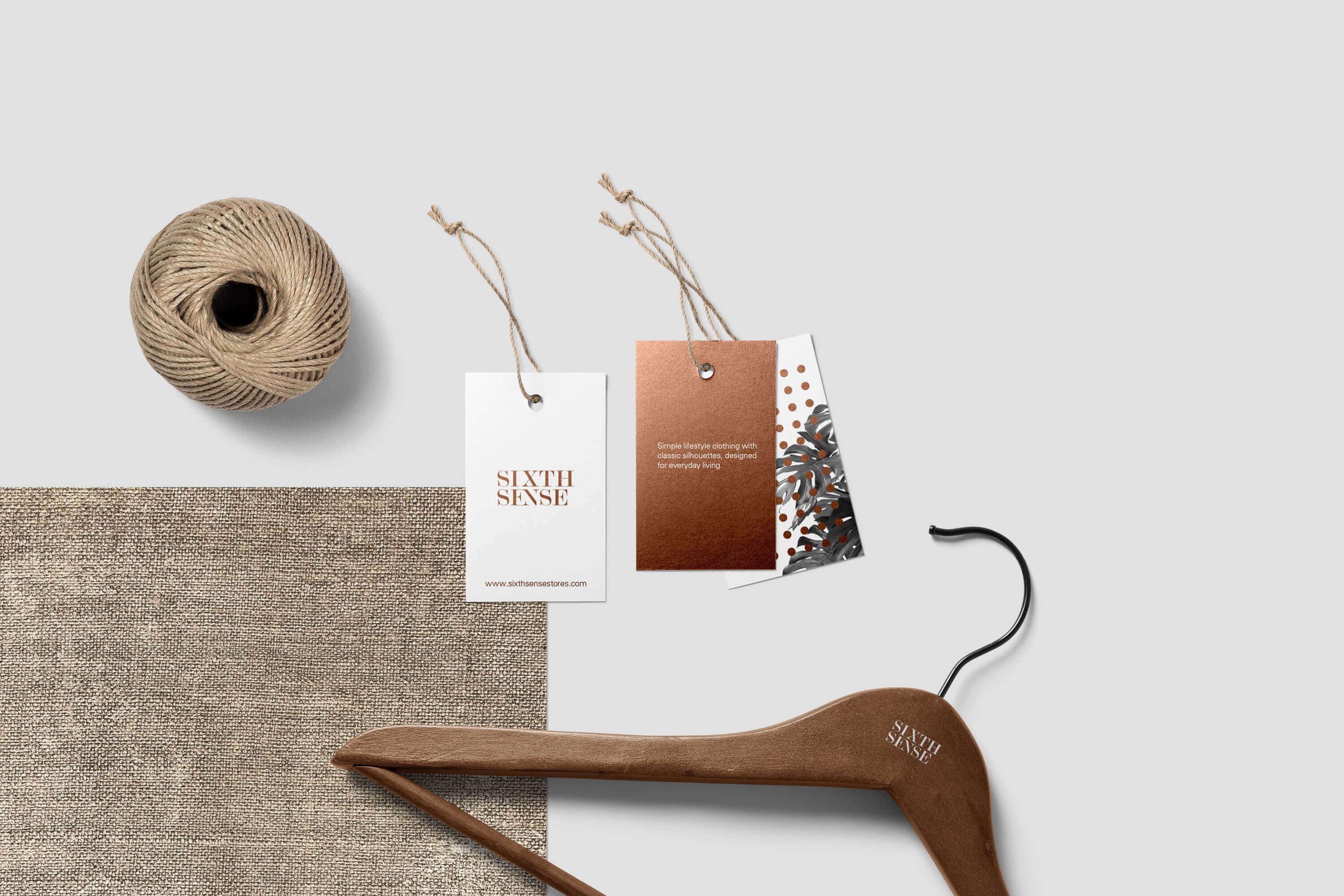
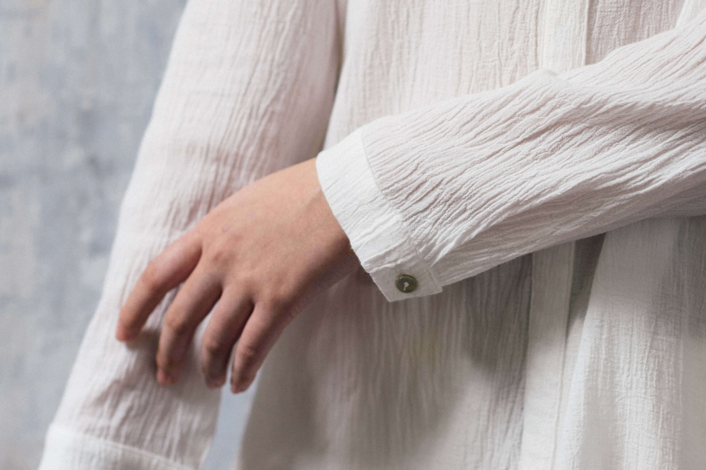
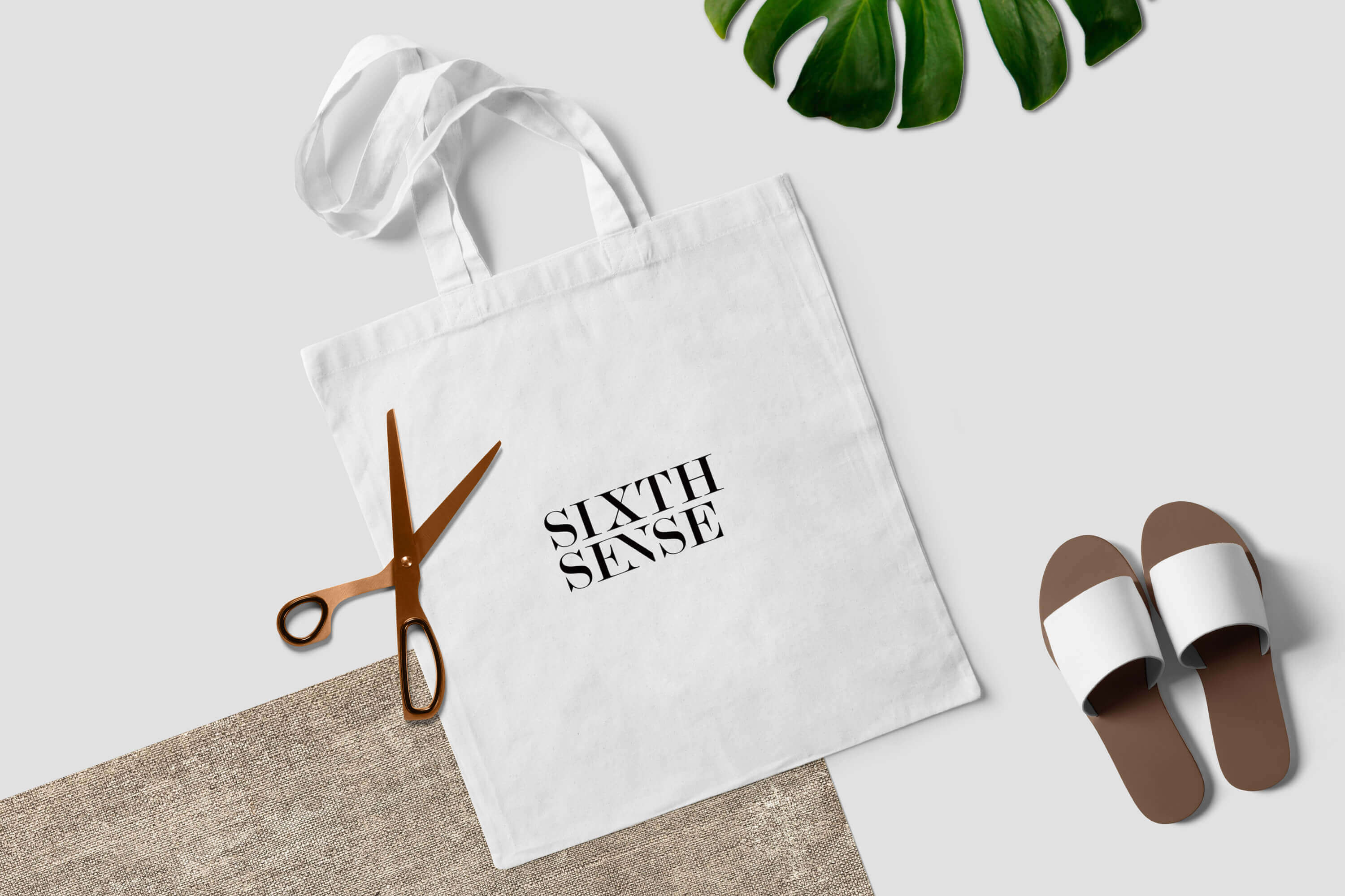
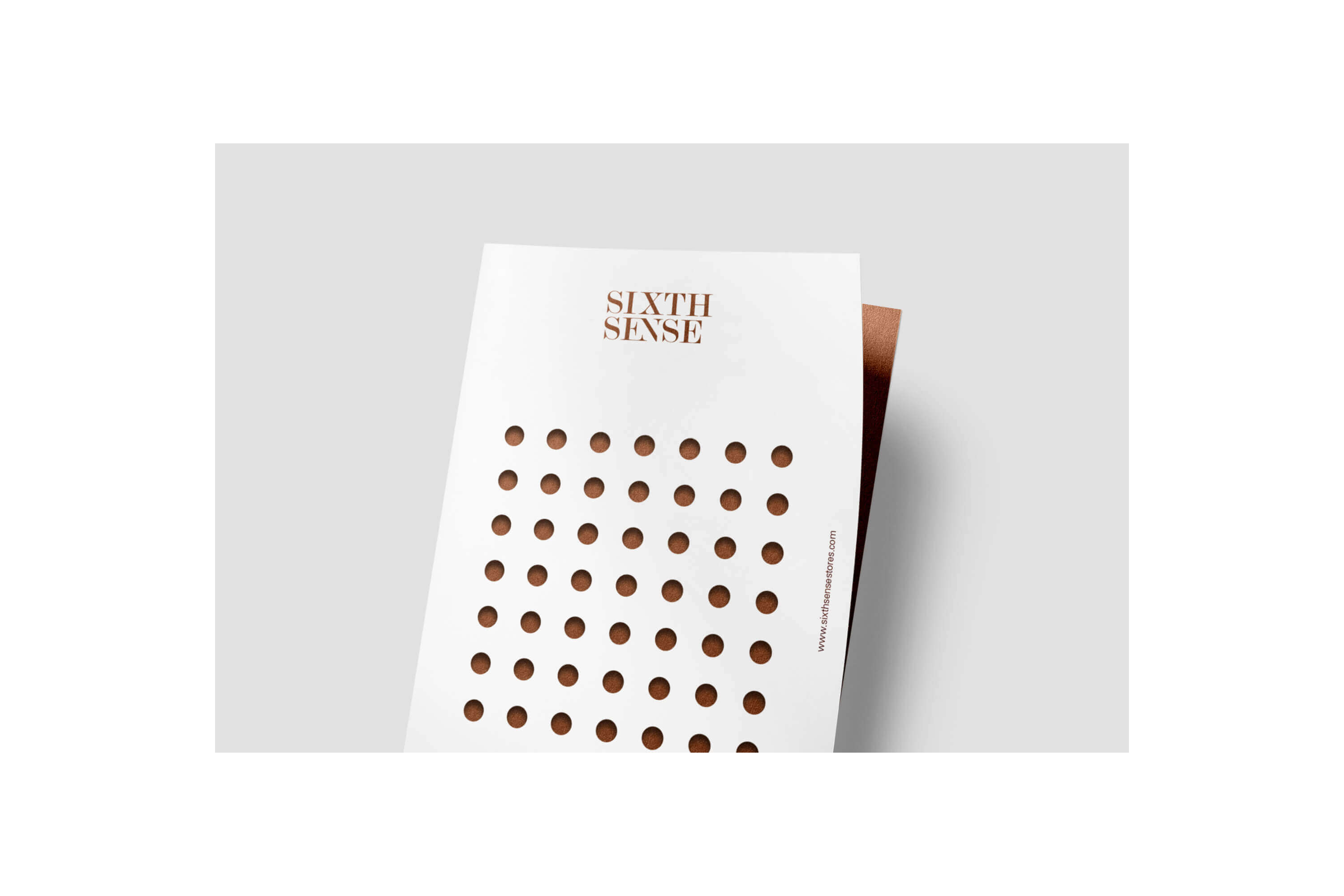
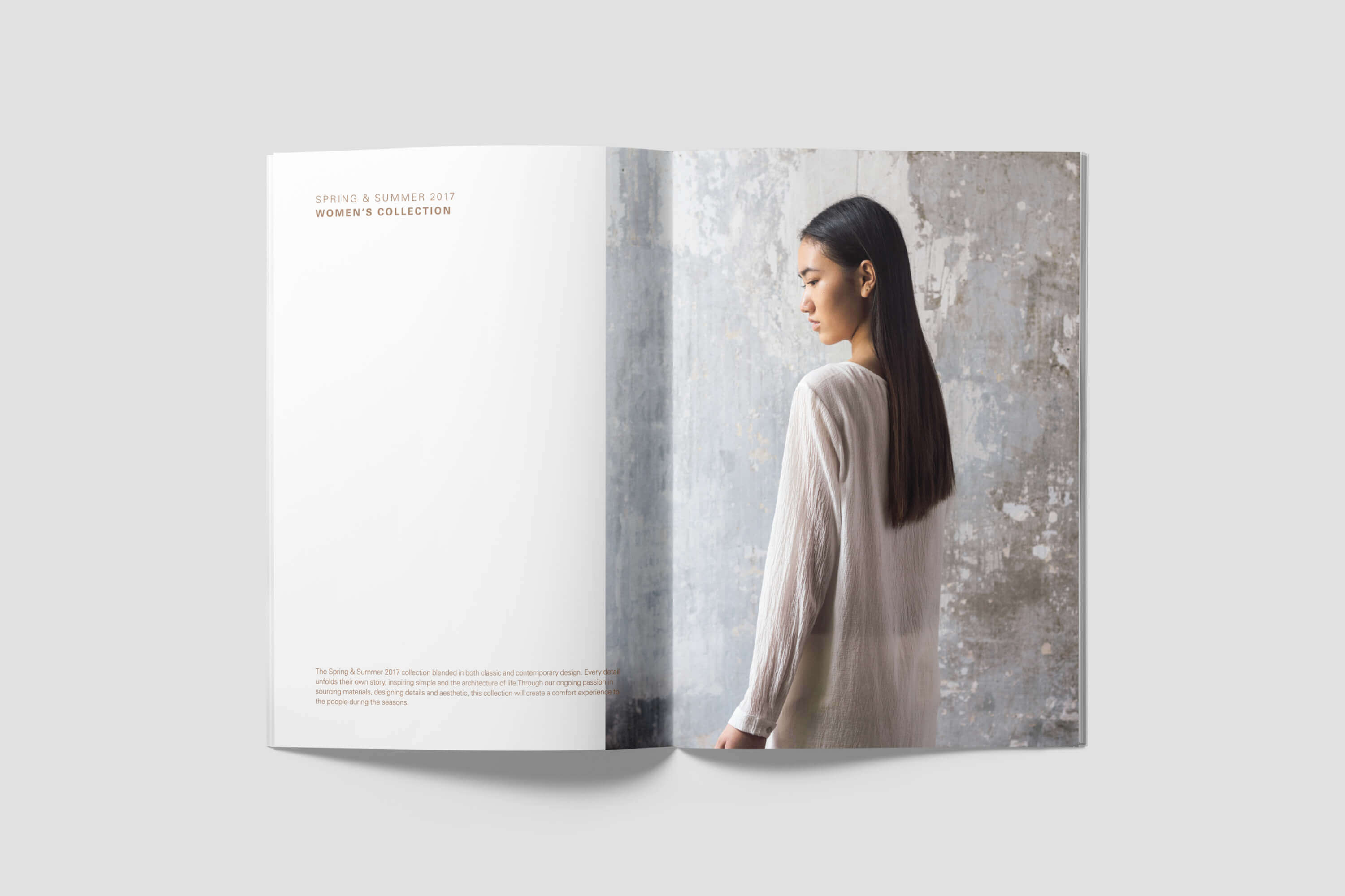
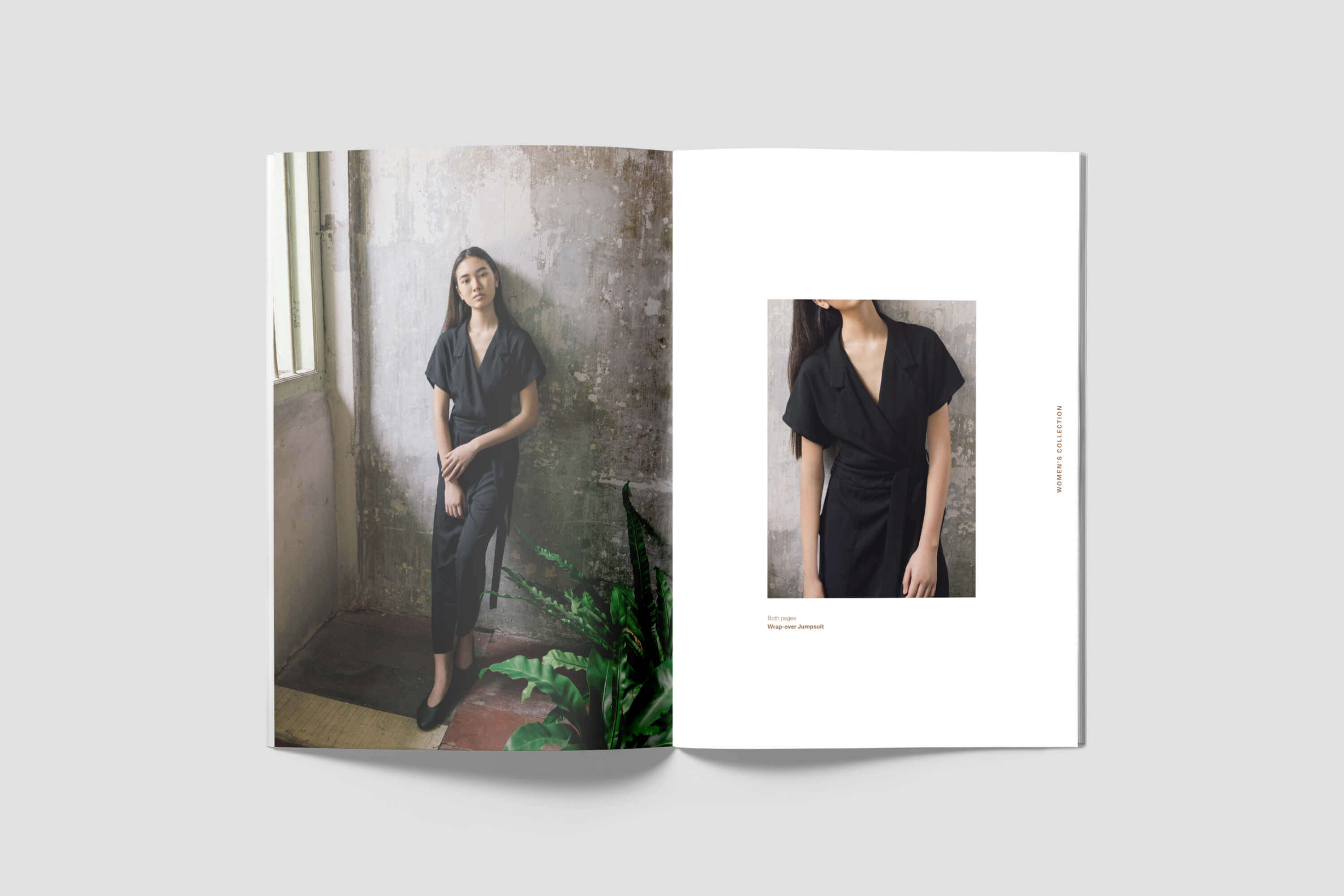
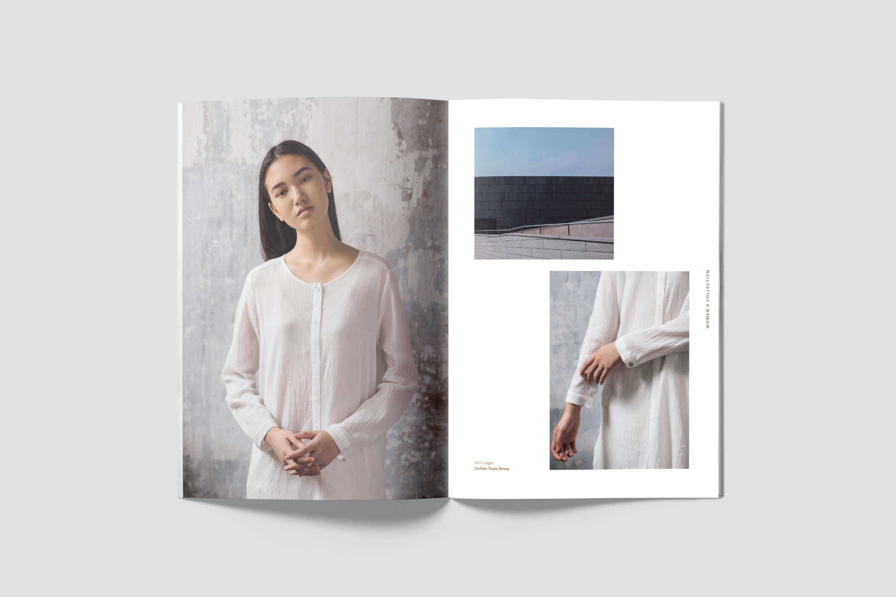
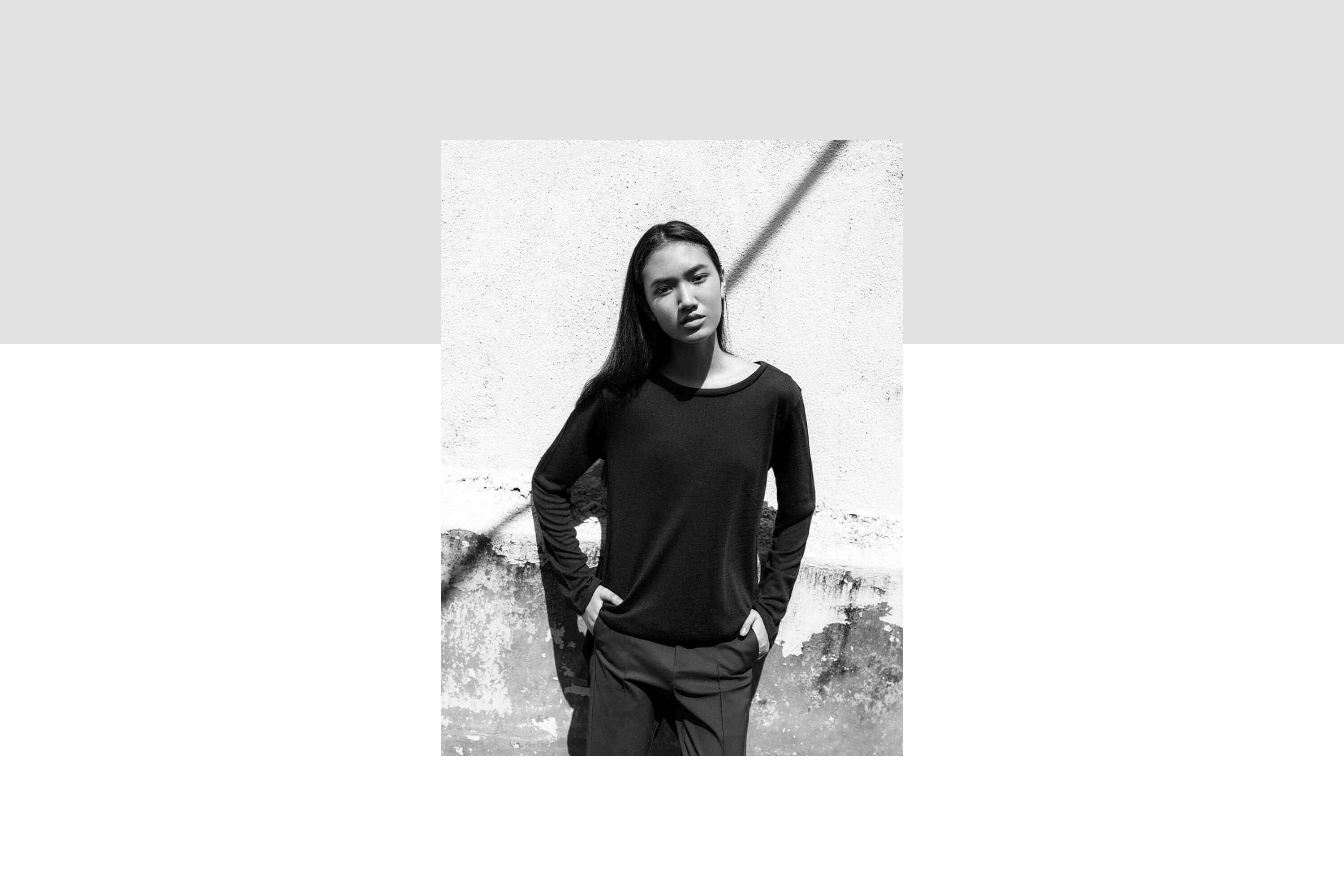
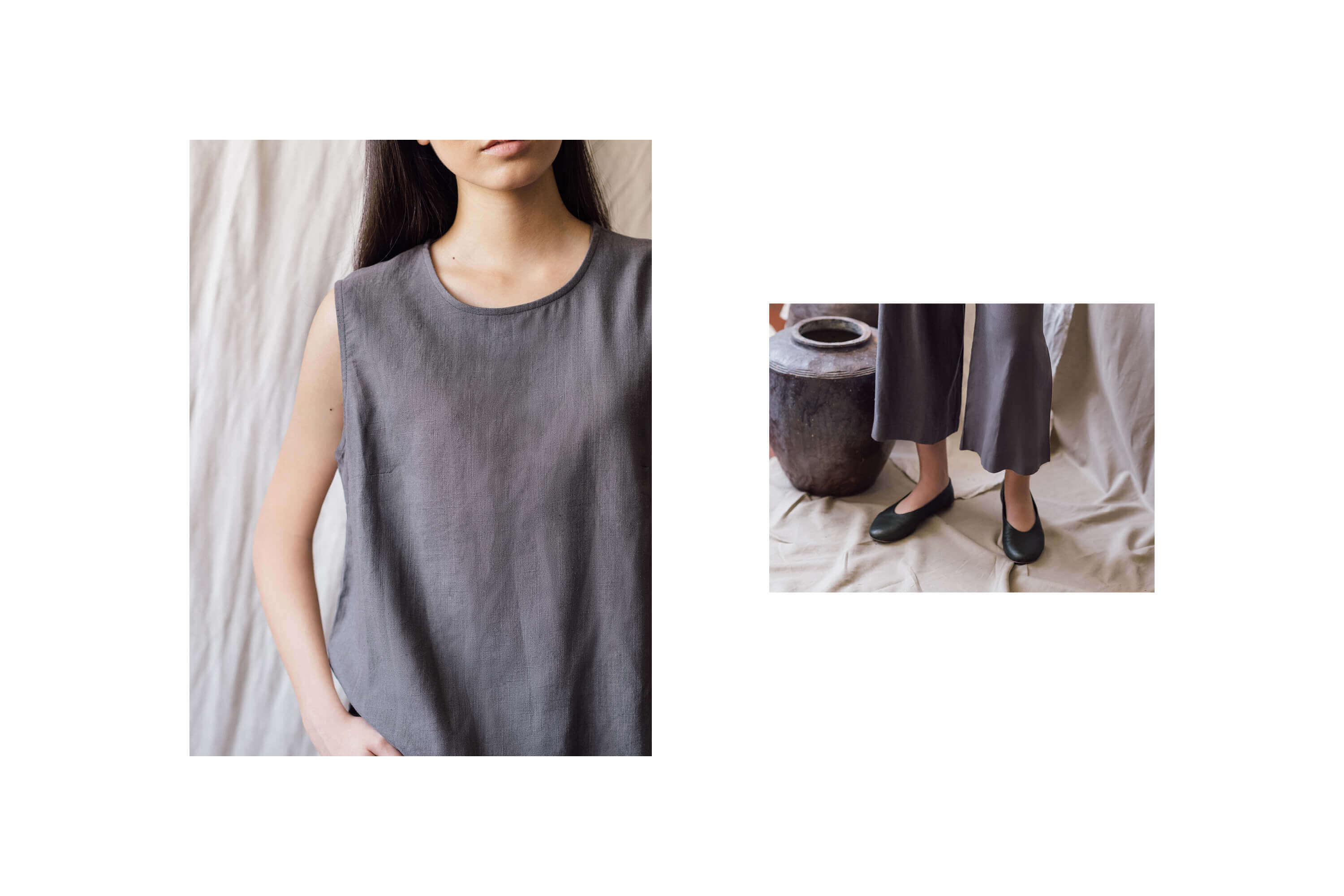
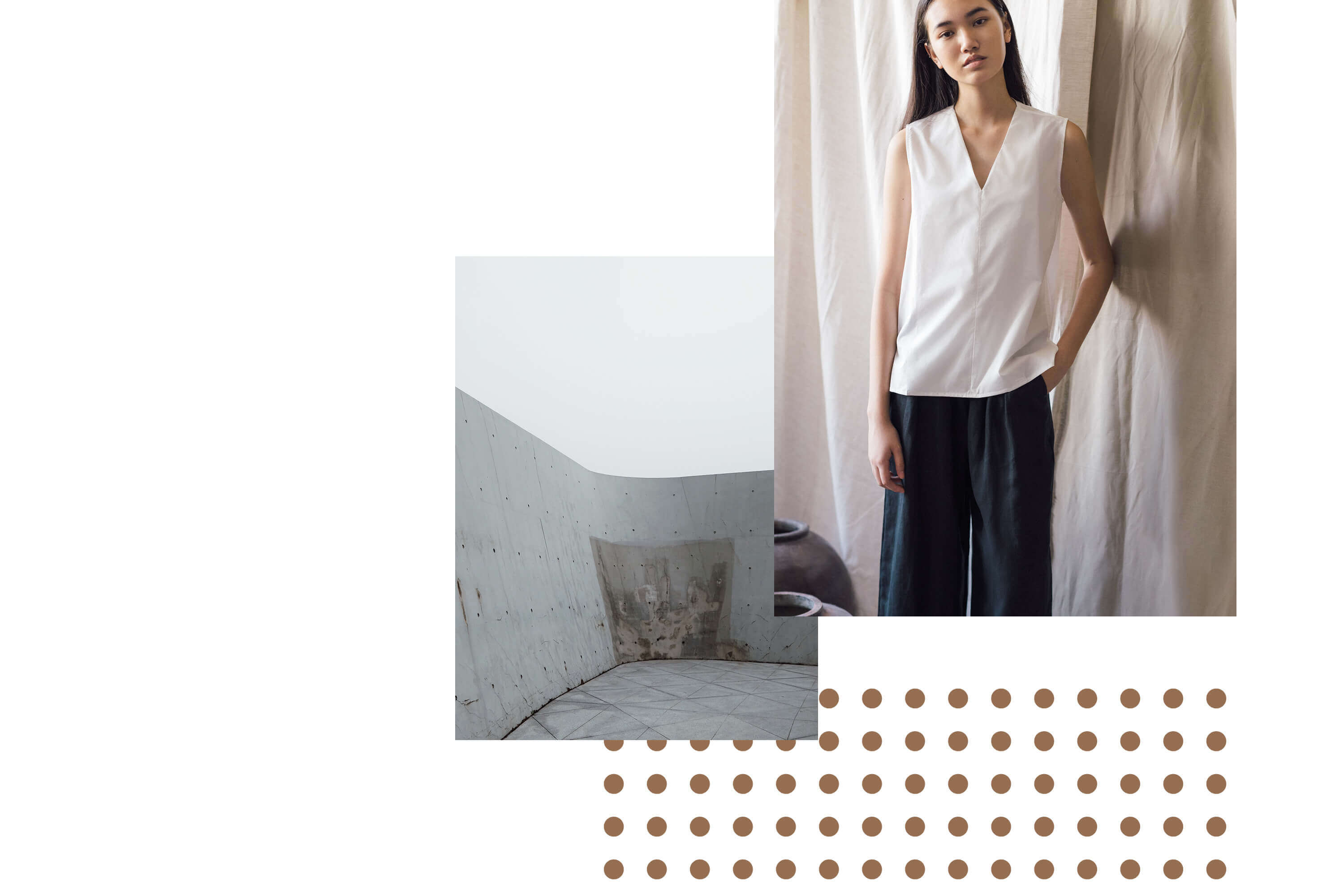
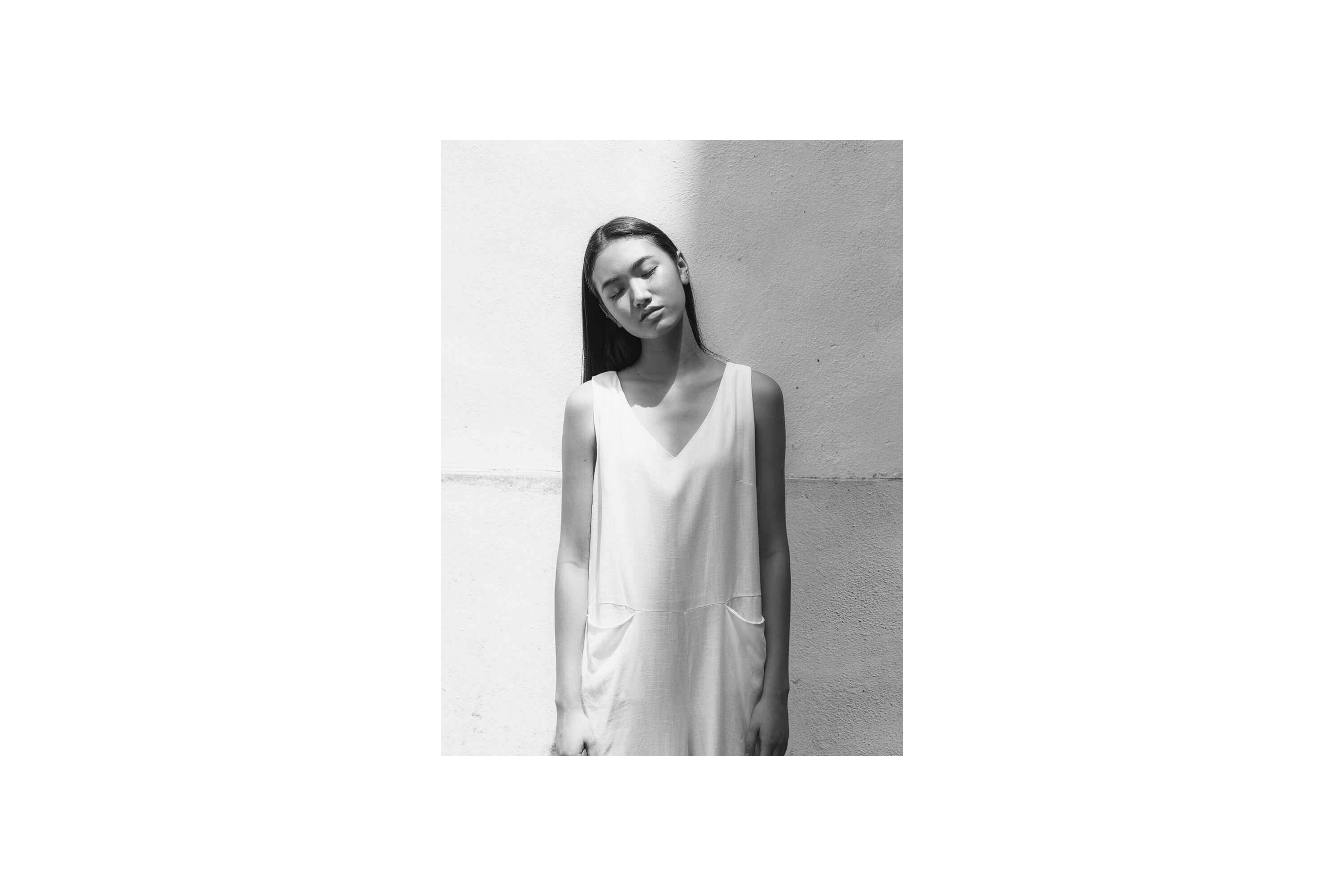
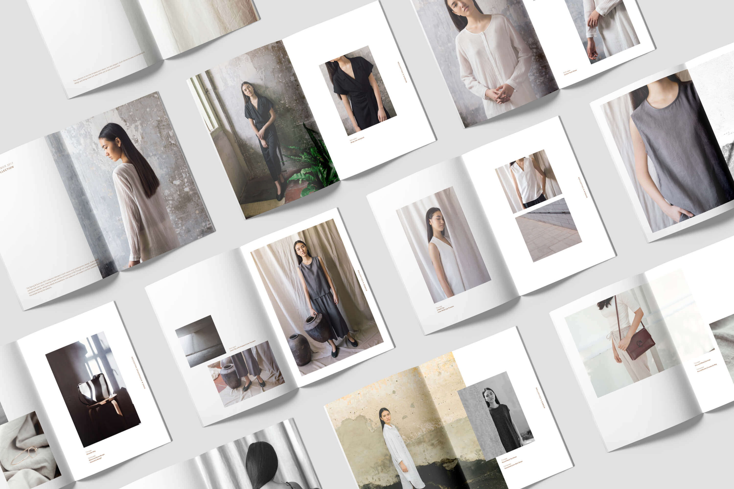
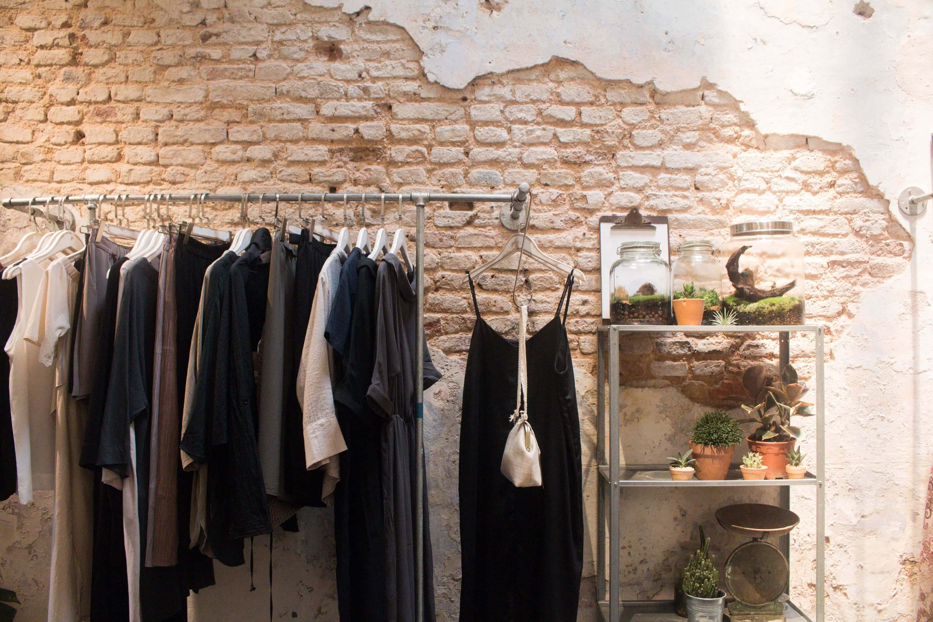
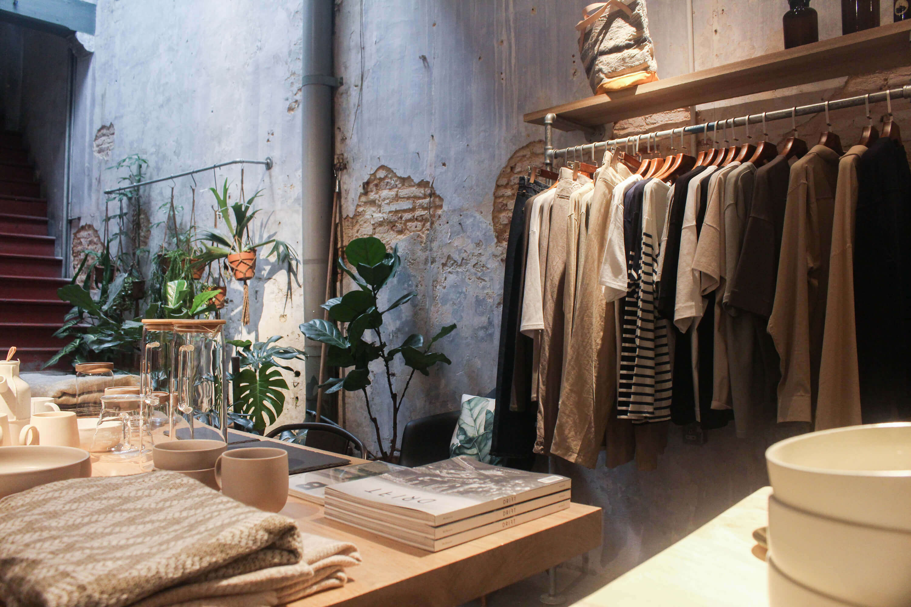
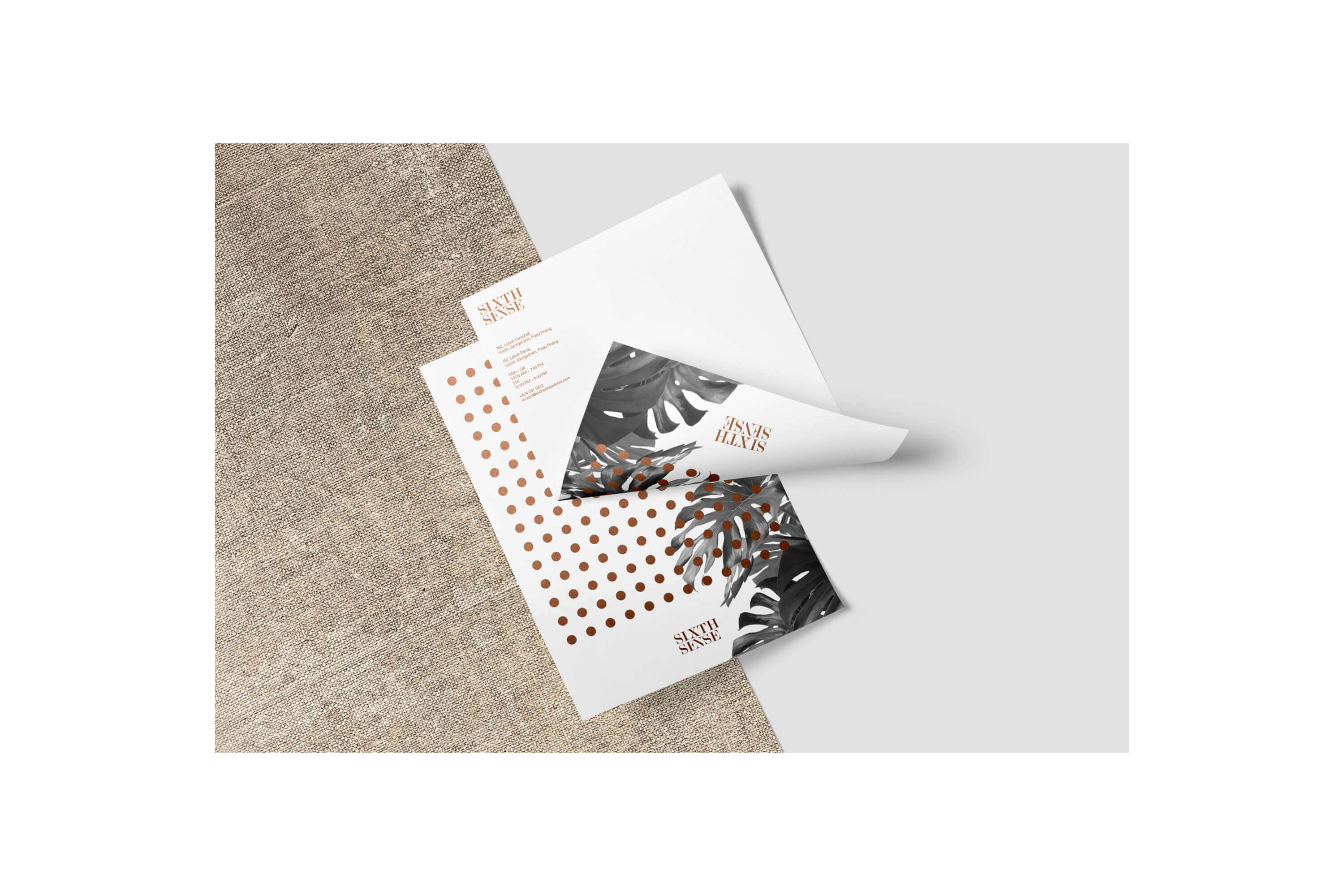
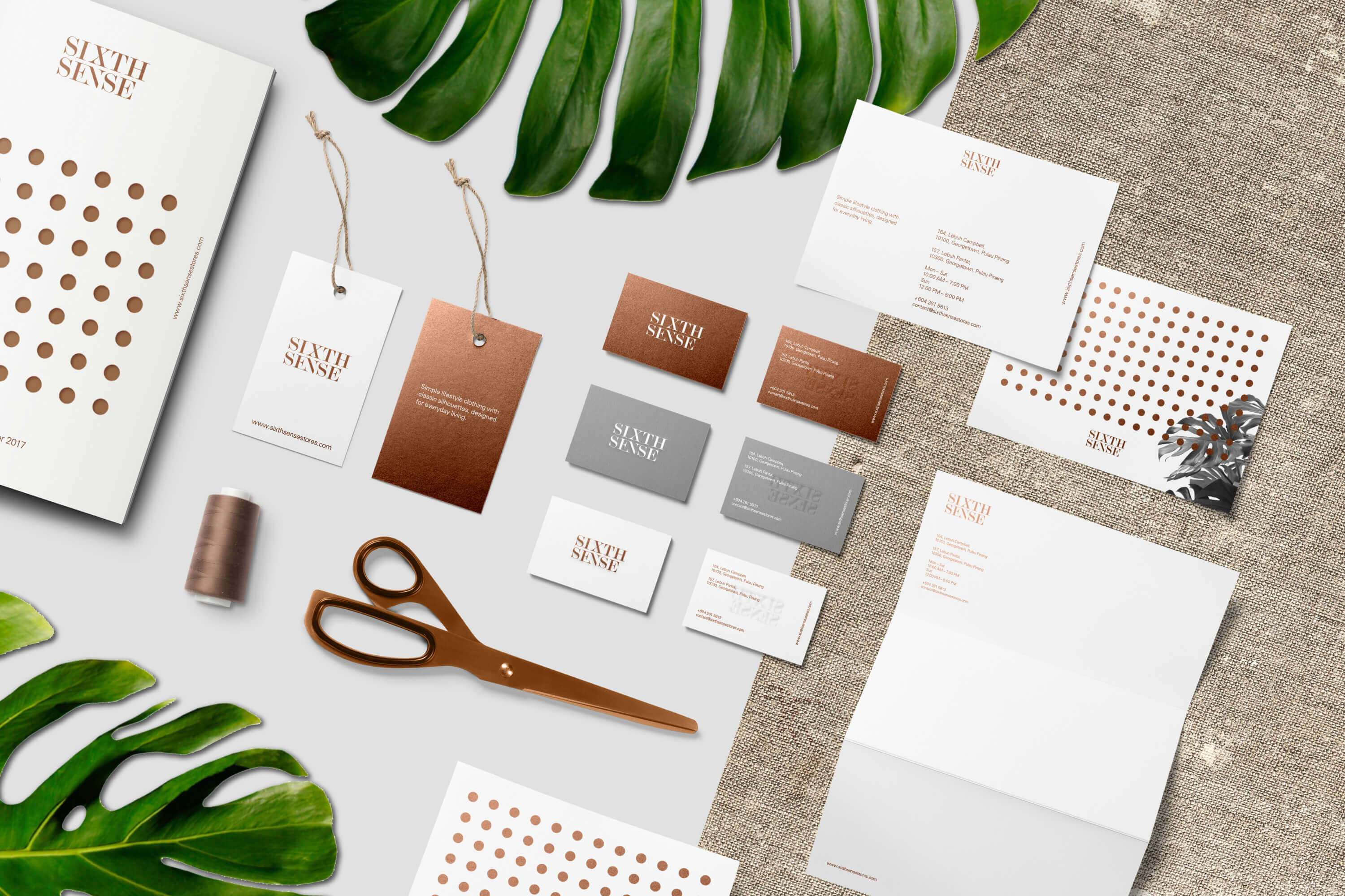
SIXTH SENSE
Sixth Sense is a multi-label concept store for women and men who value modern and comfort design. Timeless classics and considered design, their collection are made to last for seasons. They believe fashion is a form of art to express one self and inspire others.
Task: Brand Identity
Category: Fashion & Lifestyle
Art direction: TE PERSPECTIVE
Design: TE
Photography: Franz Navarrete, Joshua Tan
Styling: Hosanna Swee
Model: Jane Gay
Installation: Charles Loh
When we designed Sixth Sense’s brand identity, we wanted to emphasize their aesthetic and appreciation of modern apparel. The logo should be minimal yet distinctive, thus easily recognizable. By applying copper color (Pantone 876C) as their brand color, we were able to create a truly sophisticated and rich visuals.
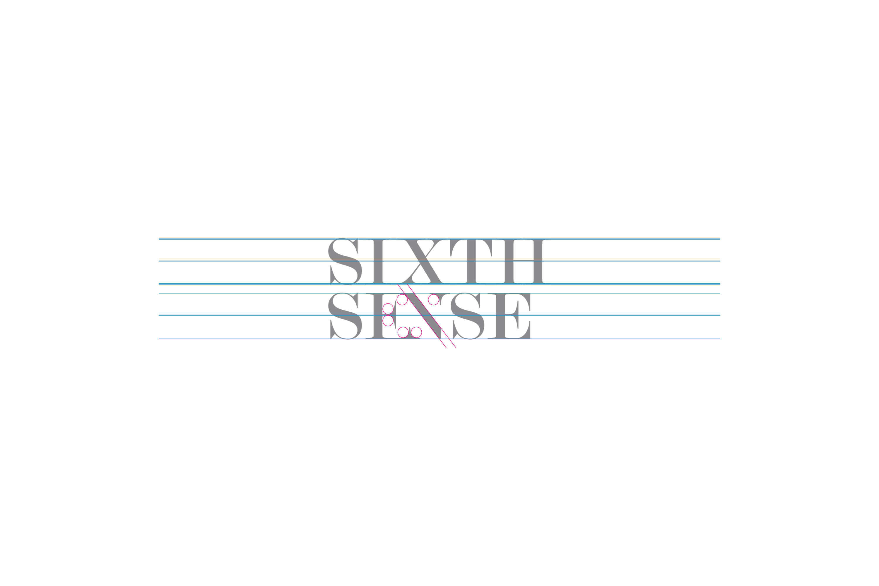
The definition of sixth sense is a power of perception like but not one of the five senses. In order to create graphic element that represent someting that is unable to be touched or grasped, the circle pattern is formed. The pattern take reference to atoms and molecules which composed of matter. Just like the brand designer himself, who has sixth sense (intangible) for creating sophisticated apparel (tangible).
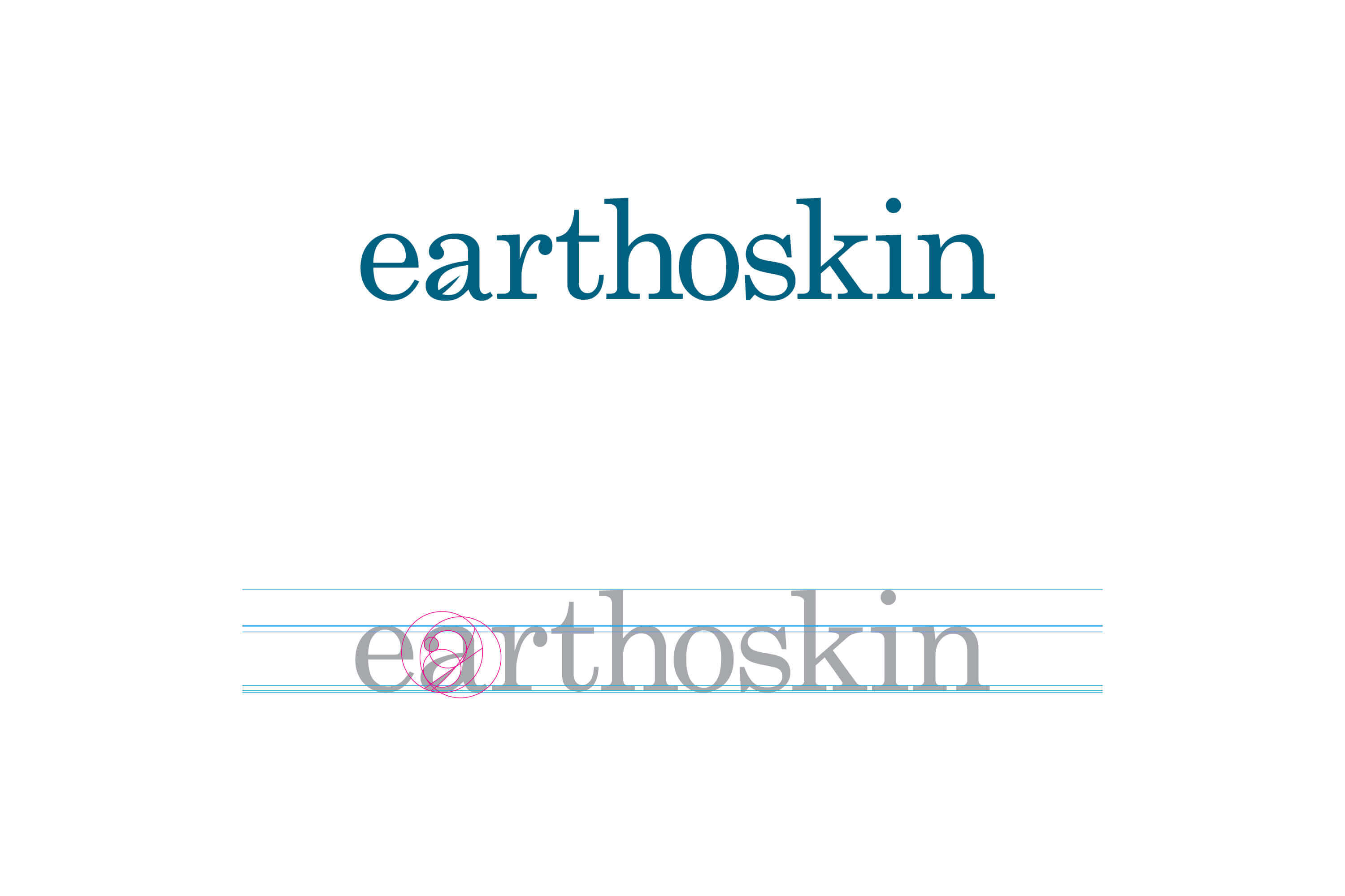
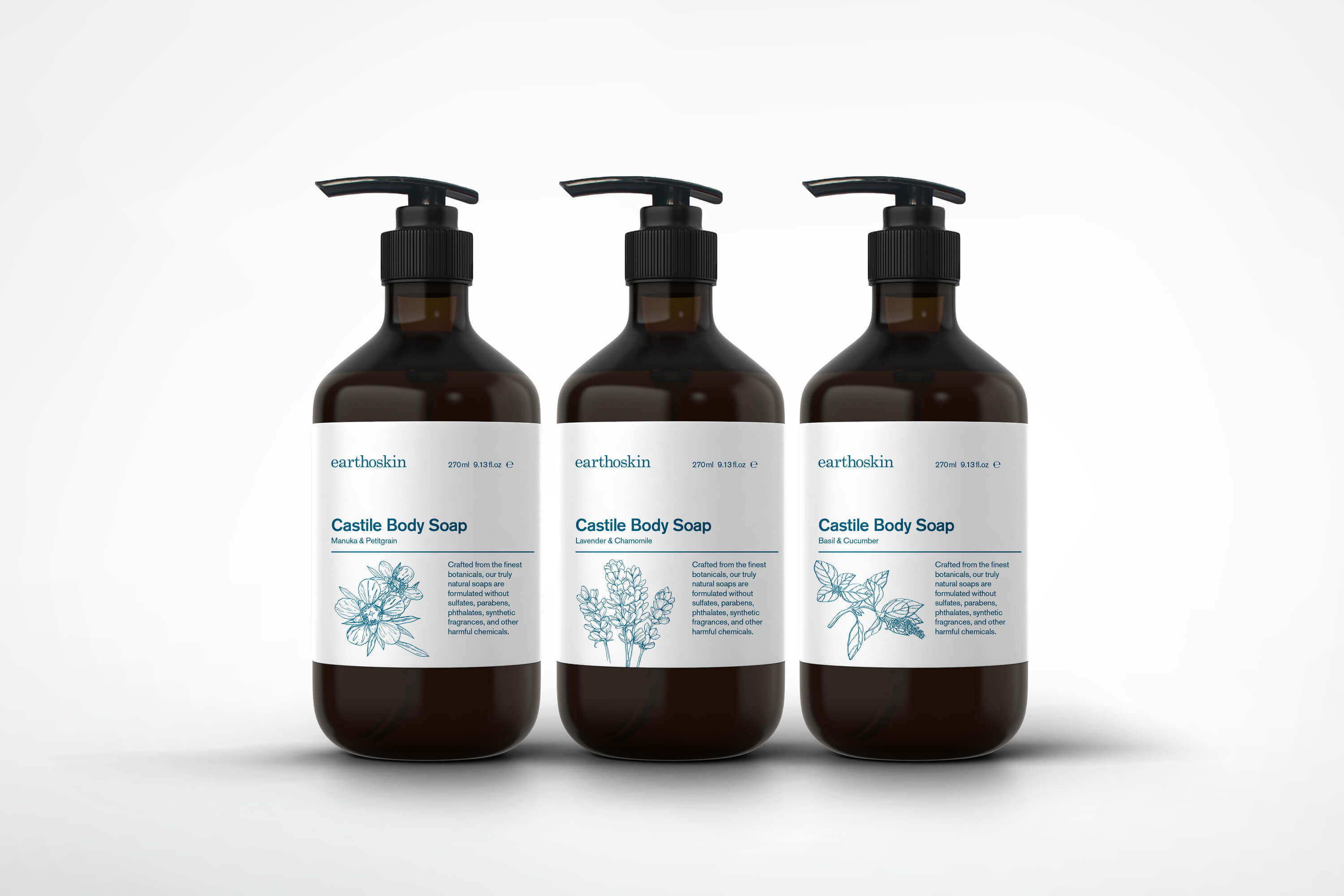
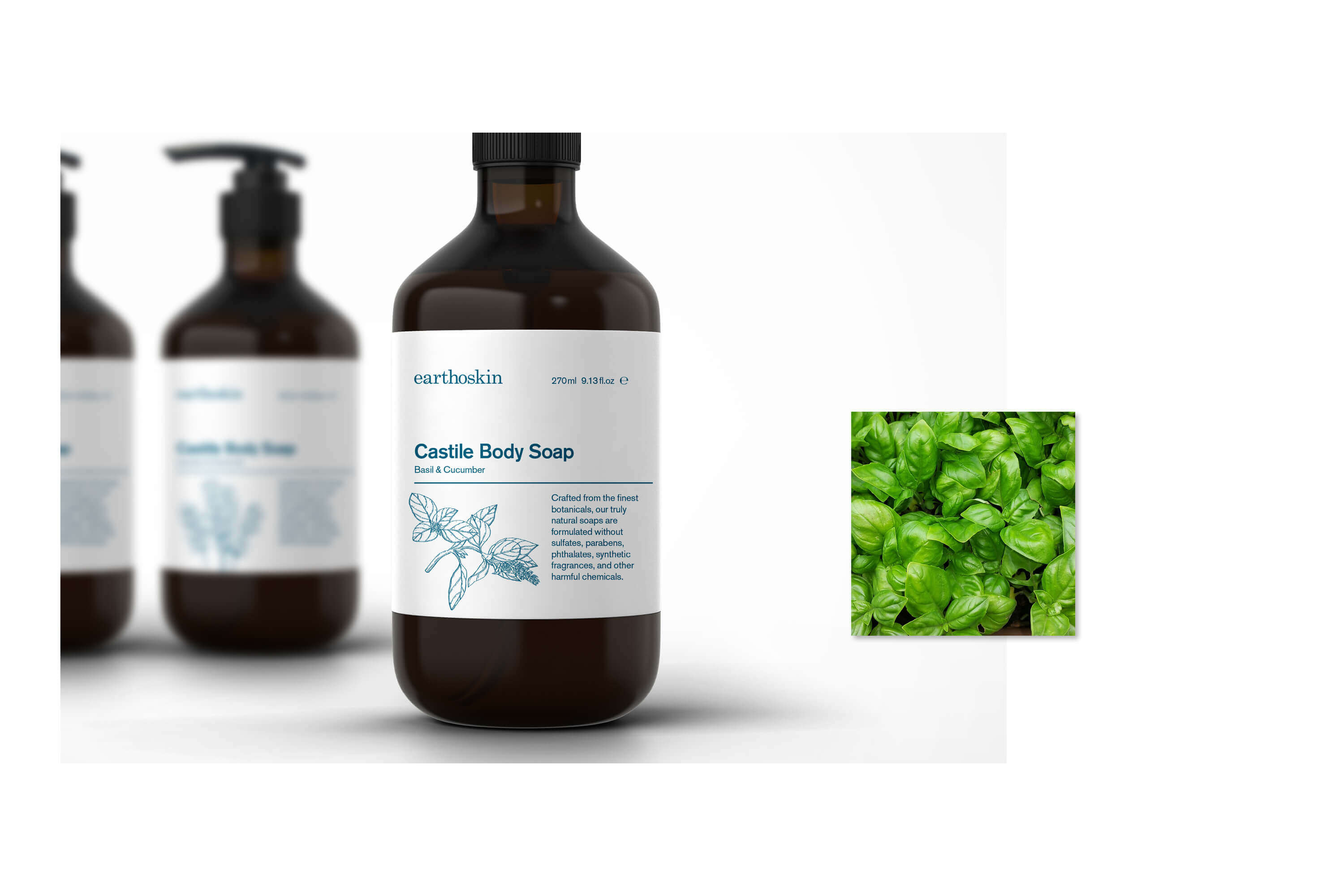
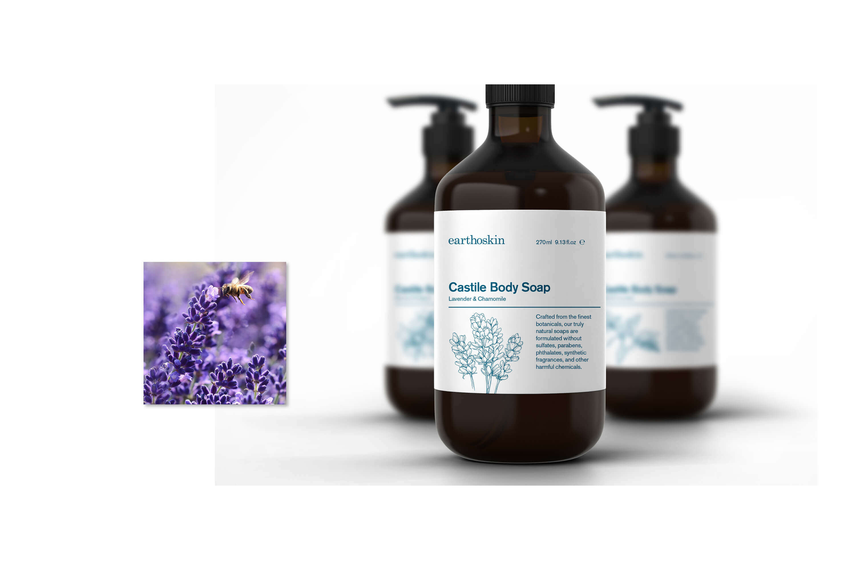
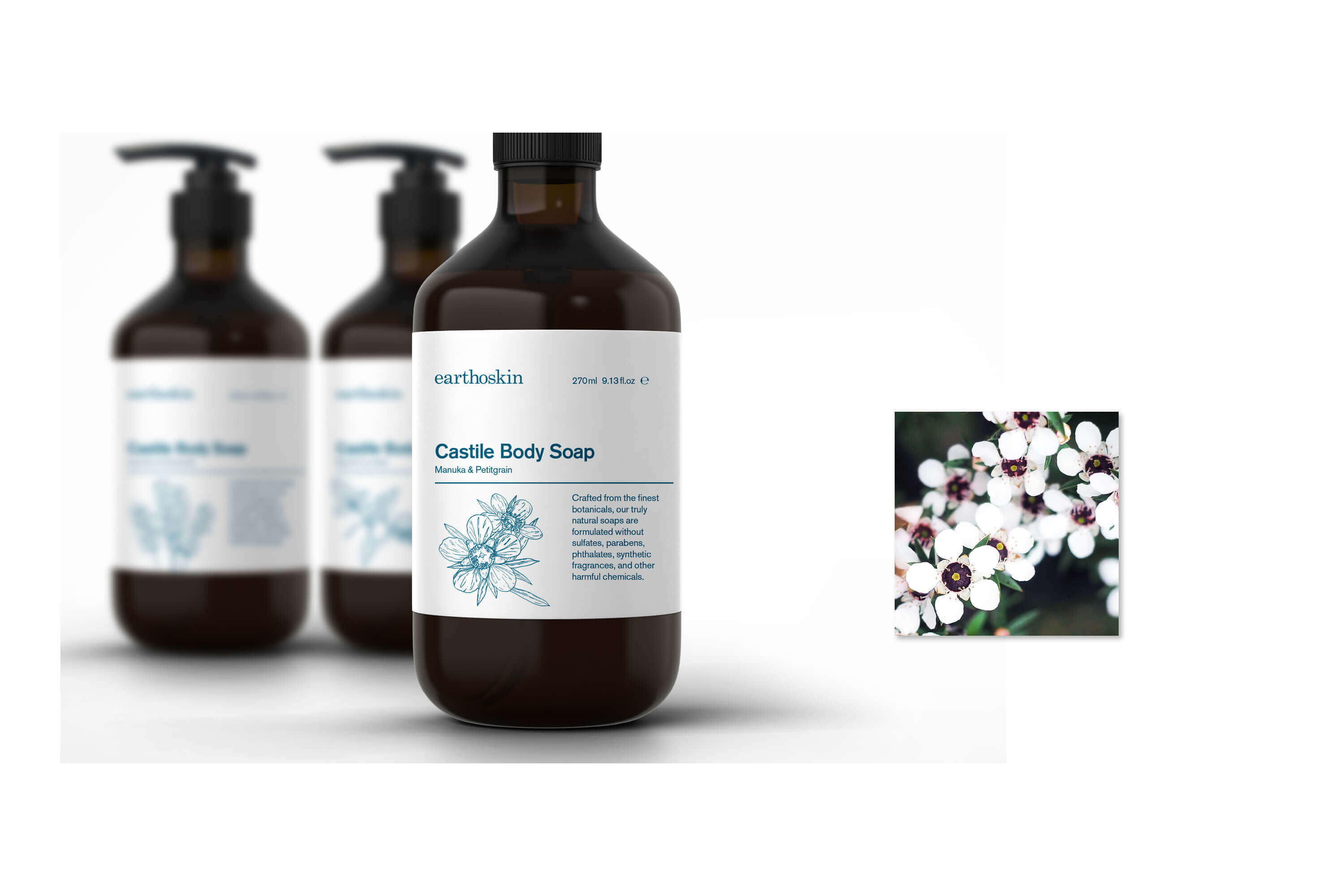
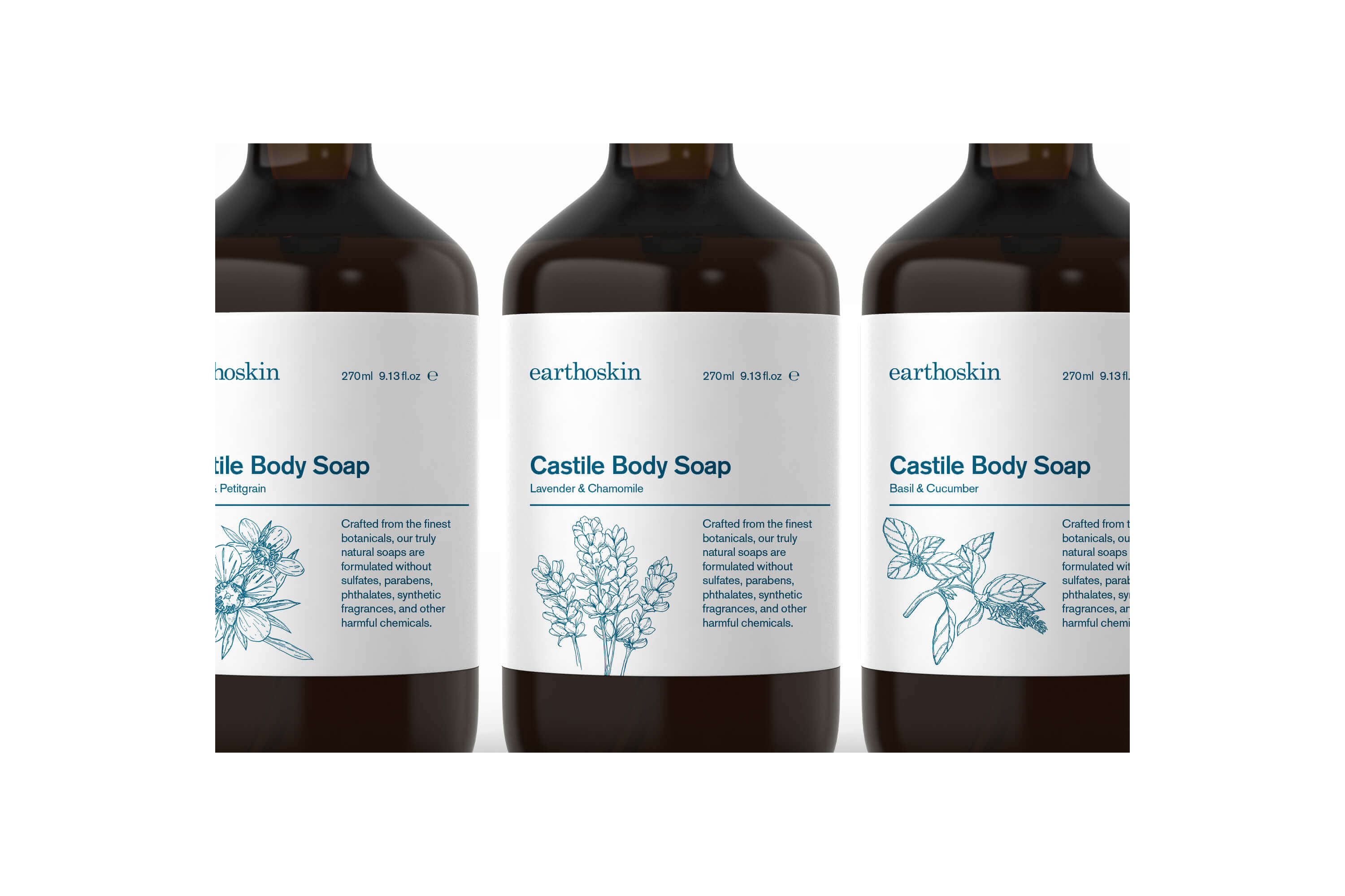
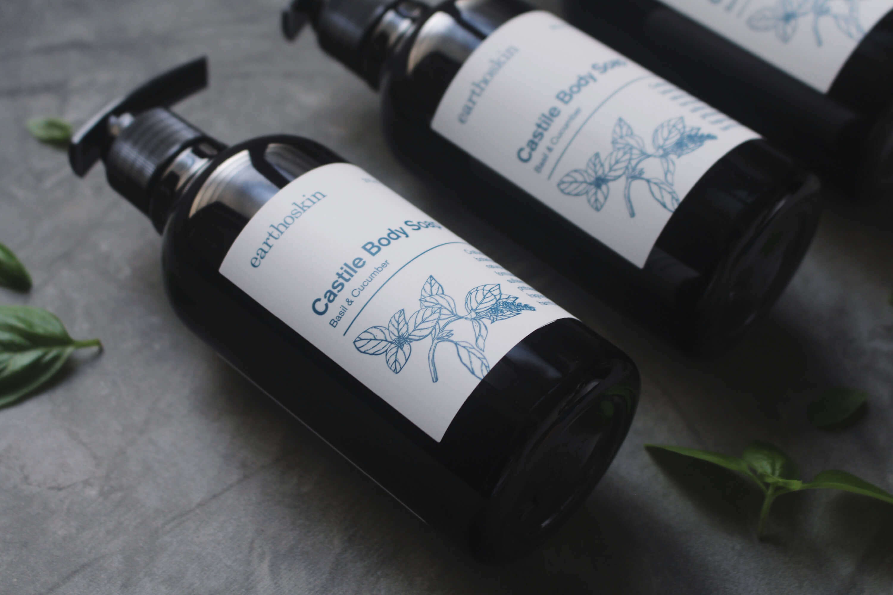
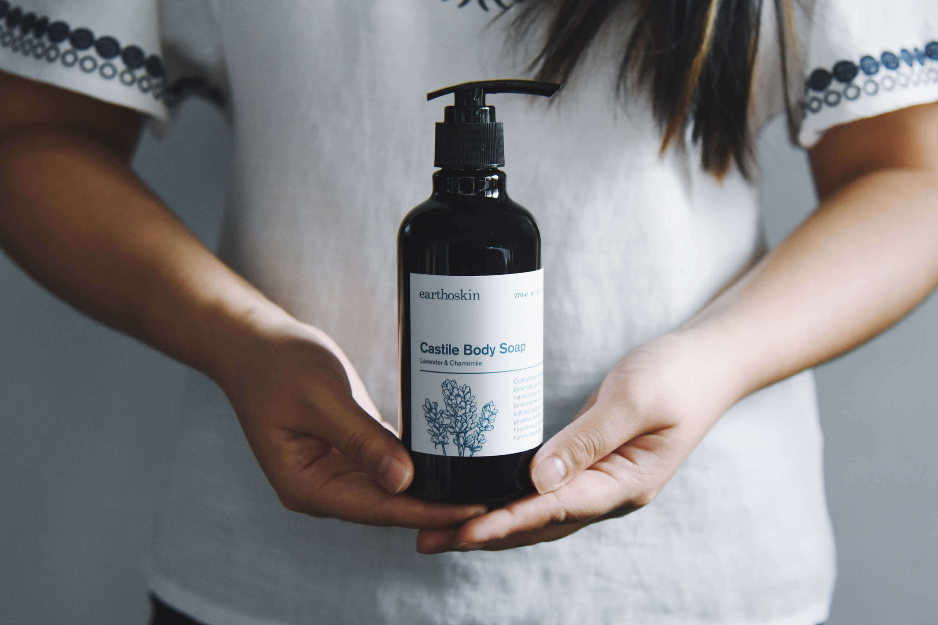
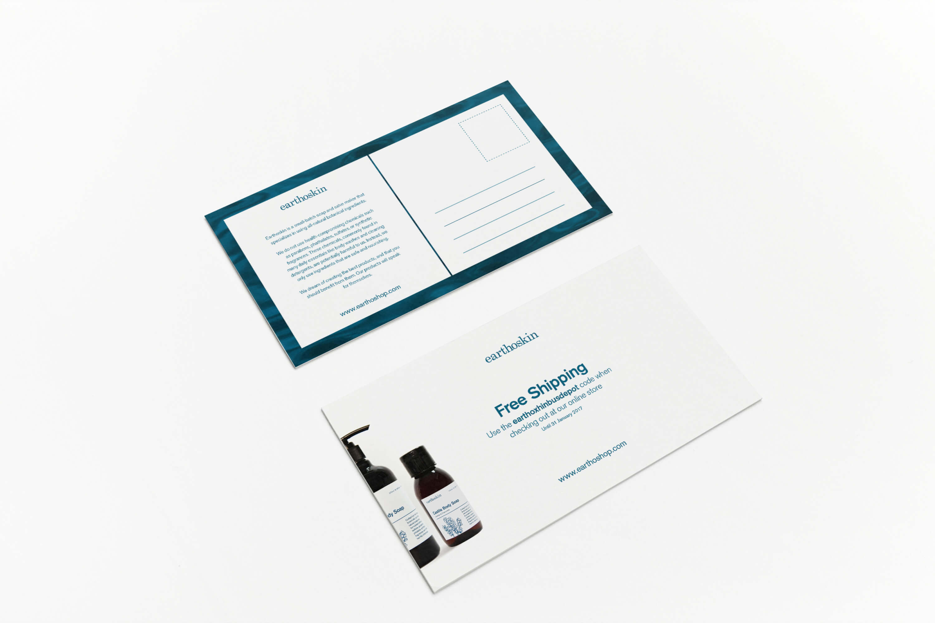
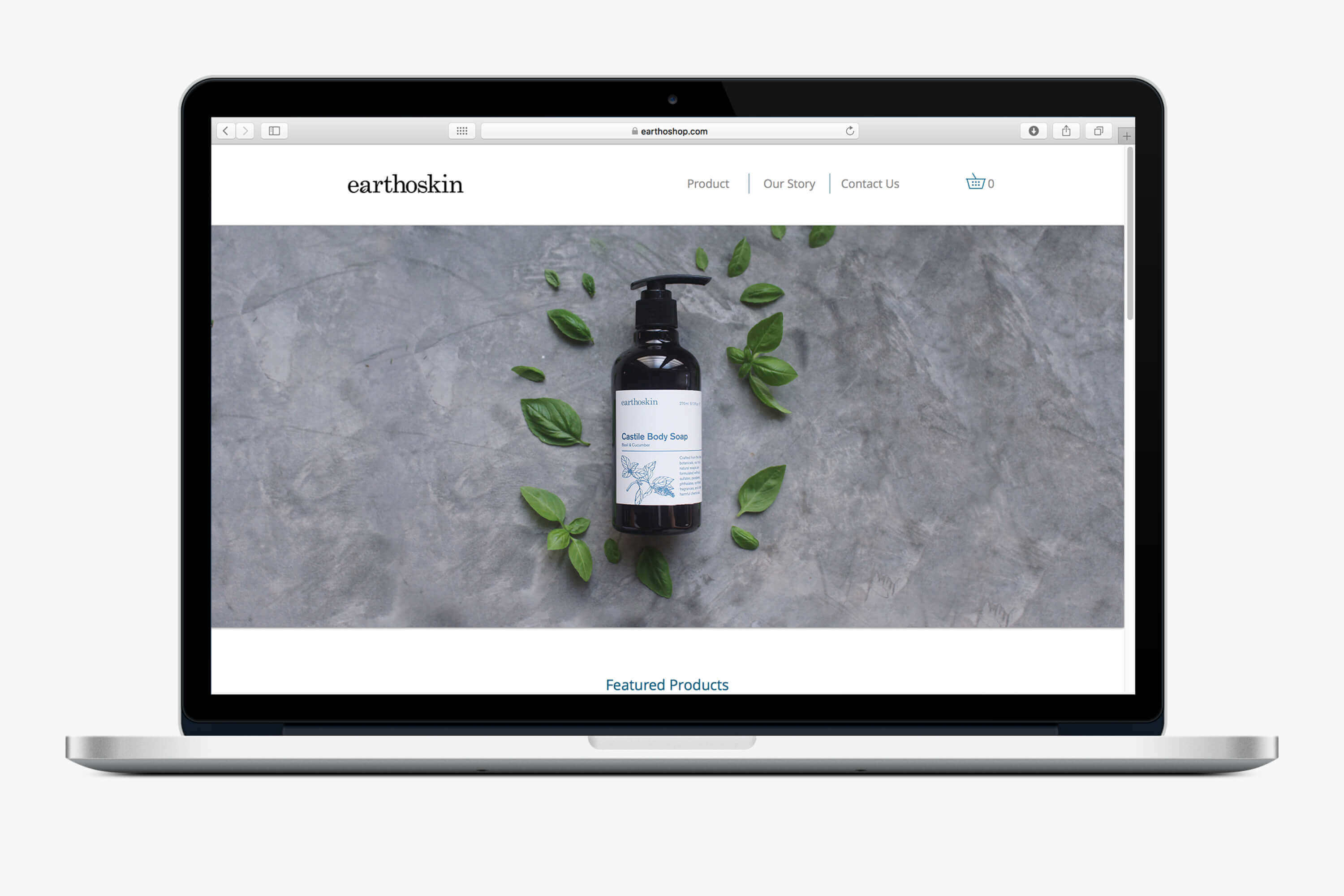
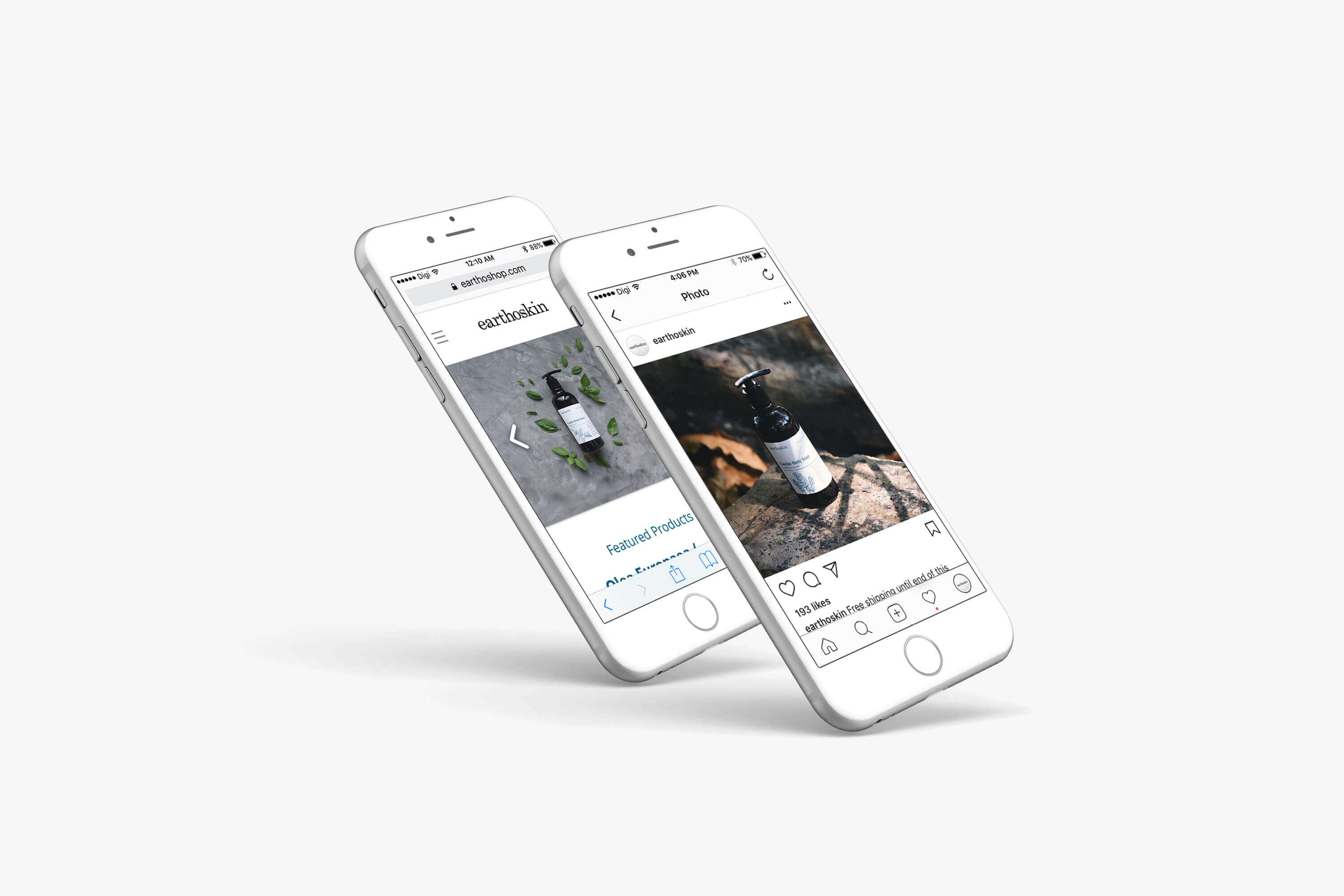
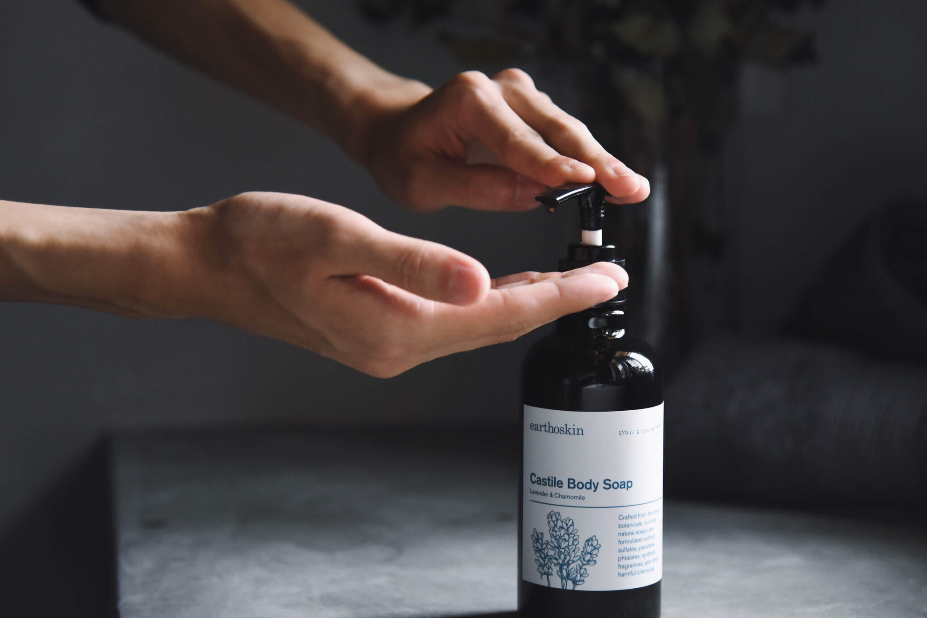
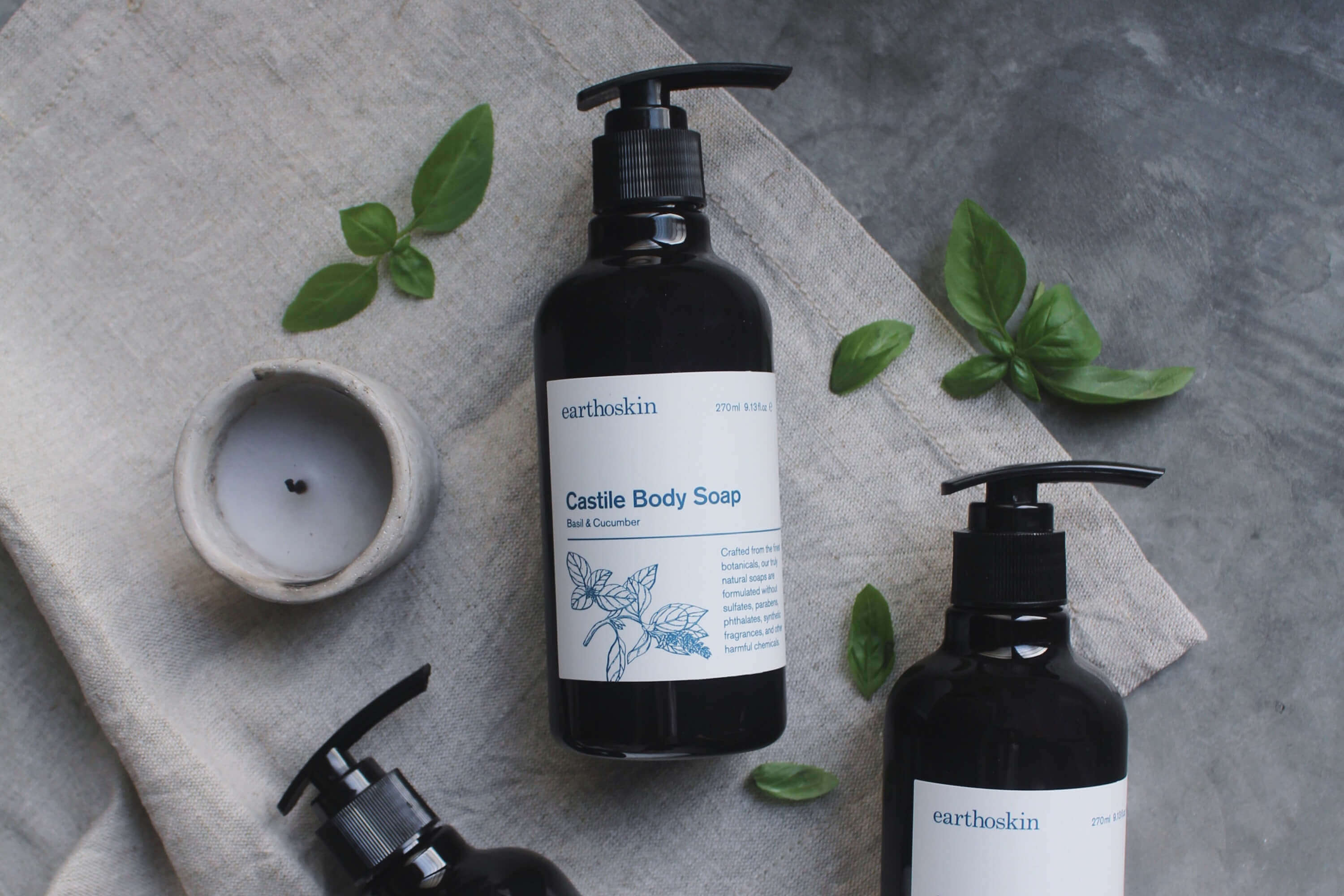
EARTHOSKIN
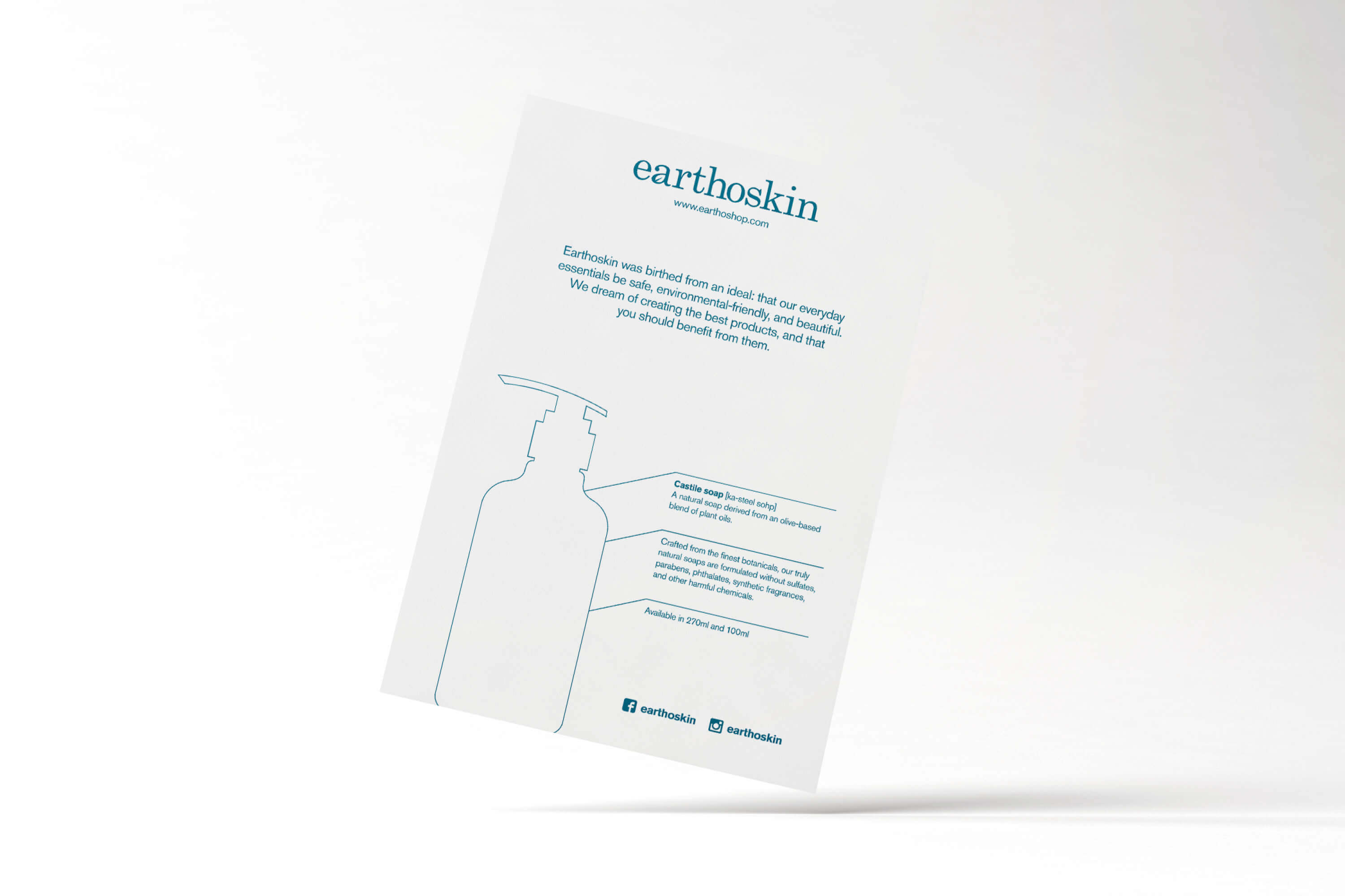
Earthoskin is a small-batch soap and salve maker that specializes in using all-natural botanical ingredients.
Their soaps are derived from an olive-based blend of plant oils, and lightly scented with pure essential oils. Formulated to be eective but gentle, their soaps will leave your skin feeling clean, soft, and moisturized. Their salves are crafted from a blend of coconut oil, raw beeswax, and pure essential oils. Each ingredient is thoughtfully selected for its health-giving properties to hydrate, sooth, and nourish your skin.
Task: Brand Identity
Category: Skin Care
Art direction: TE PERSPECTIVE
Design: TE
Illustration: Yimin Heng
Photography: Syms Ooi
A customised letter ‘a’ which composes the leaf symbol make reference to nature which are the most important factors for the ingredients of Earthoskin products. Considering the positioning and direction of the brand, the logo was made with an elegant and simple structure that can stand the test of time.
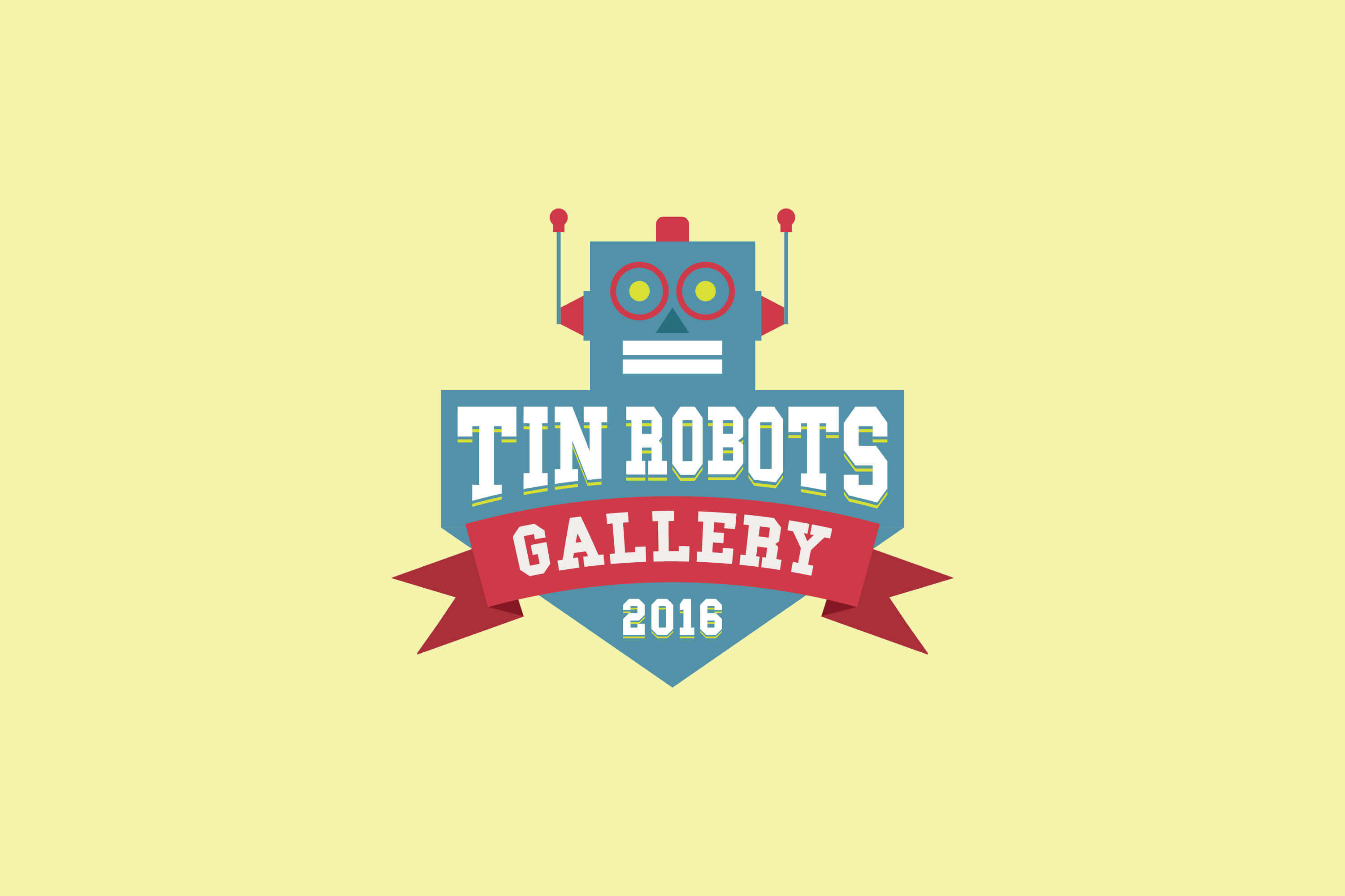
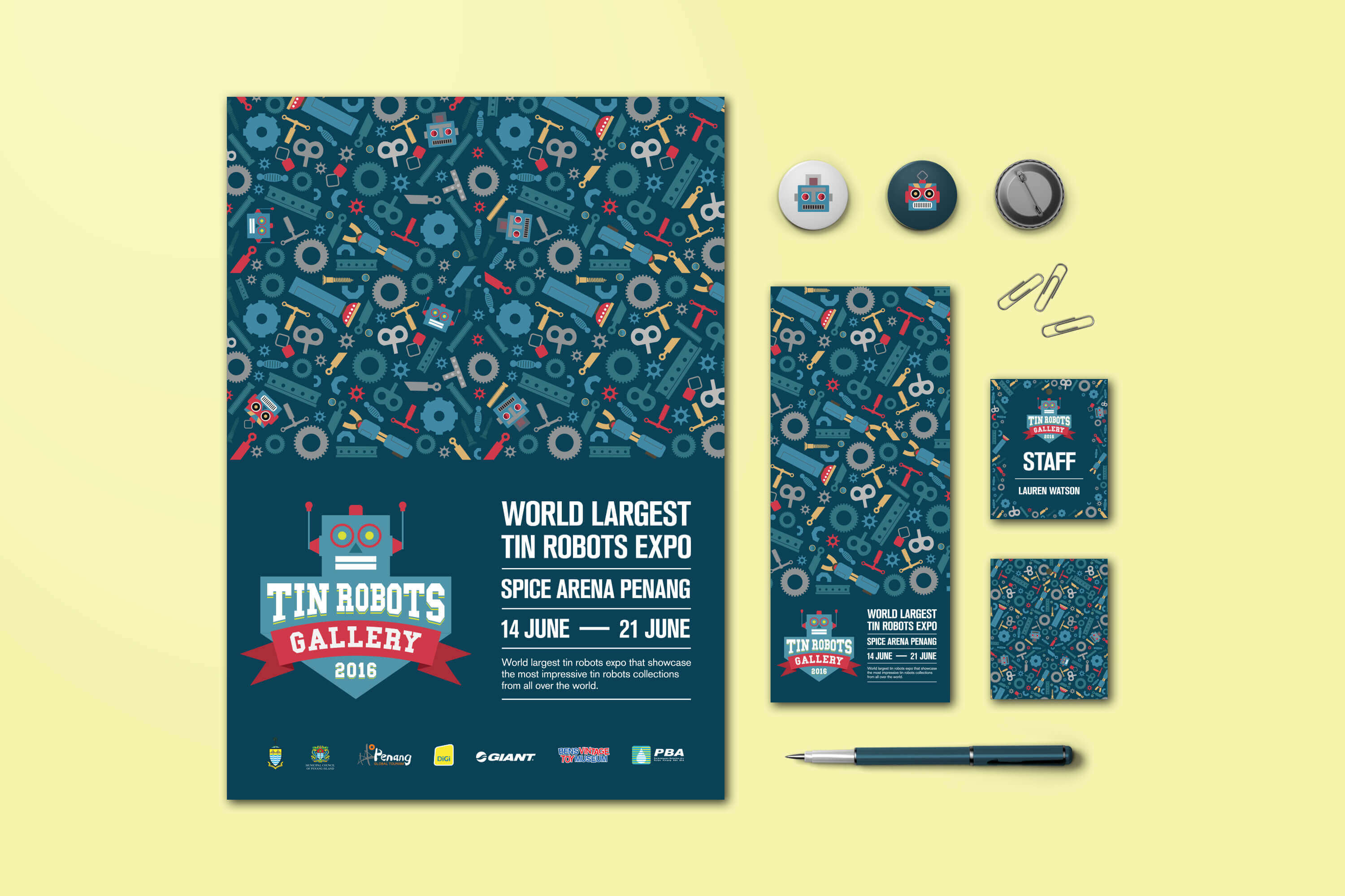
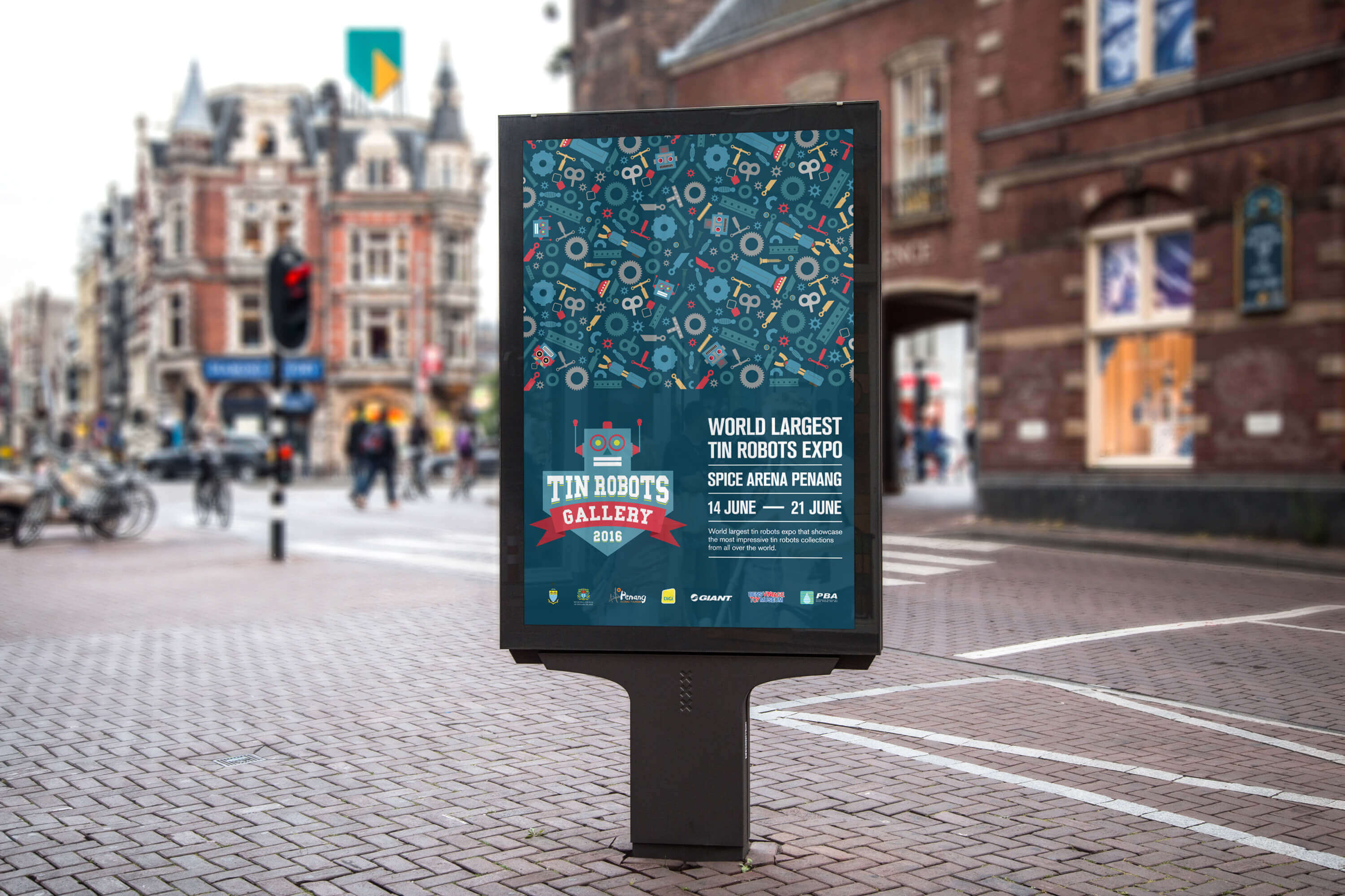
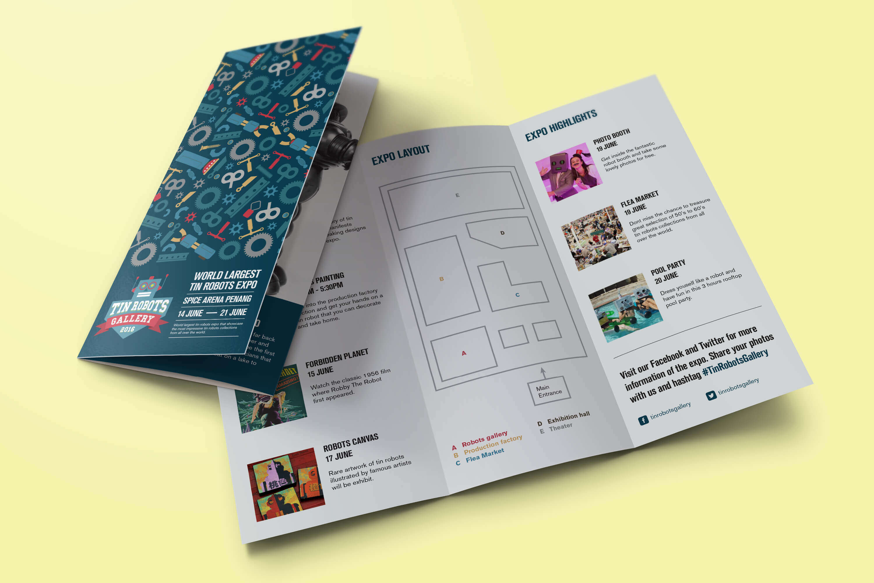
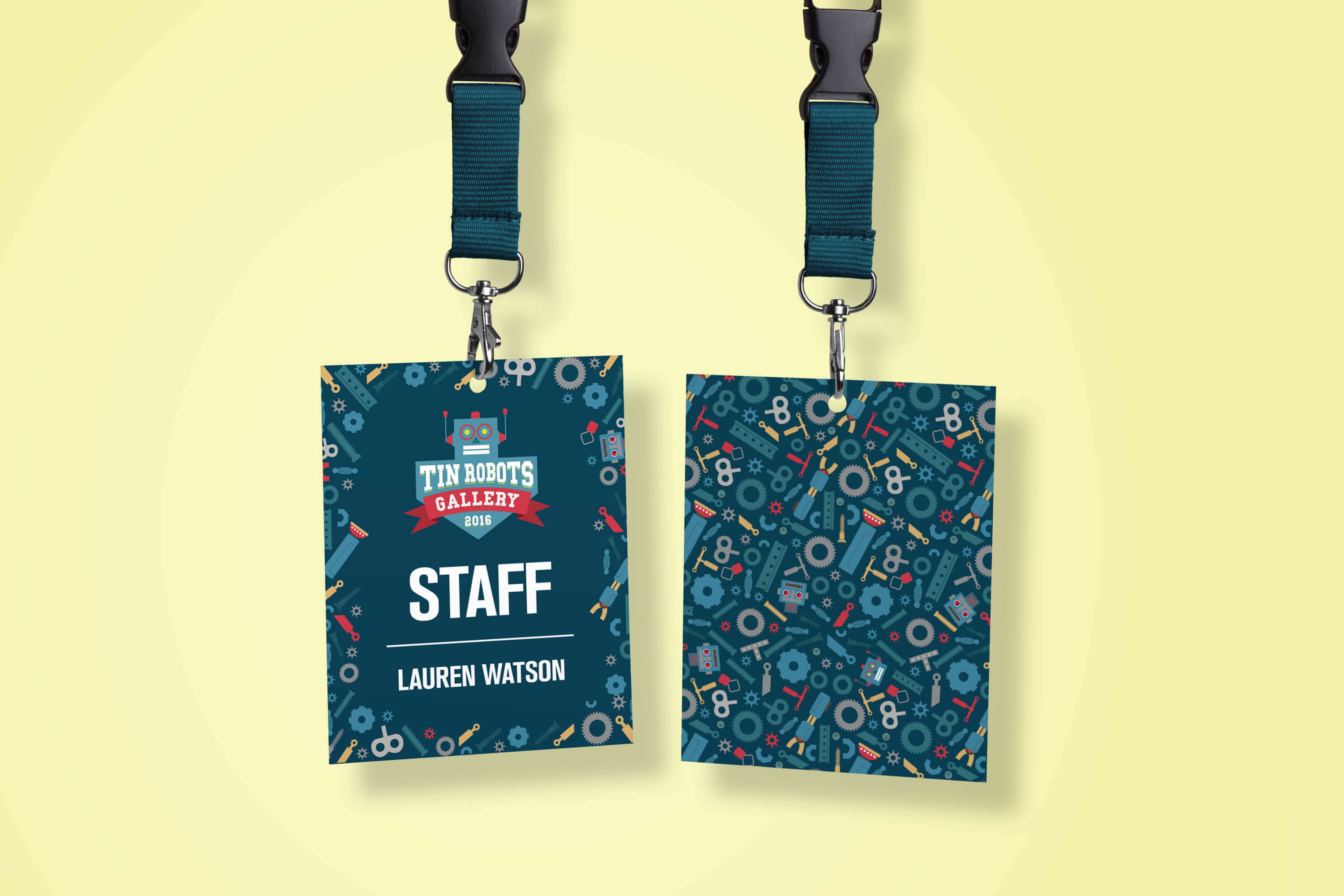
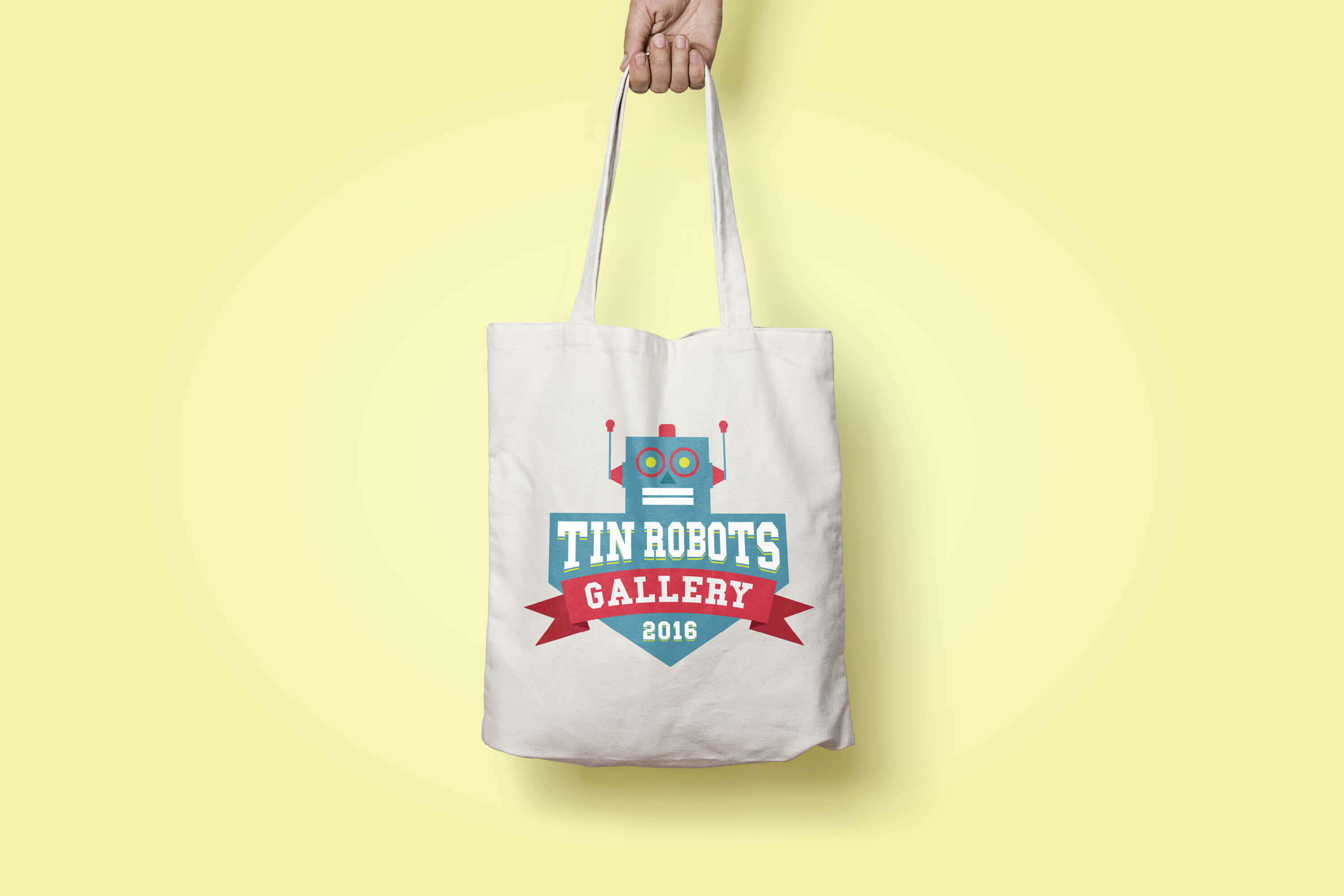
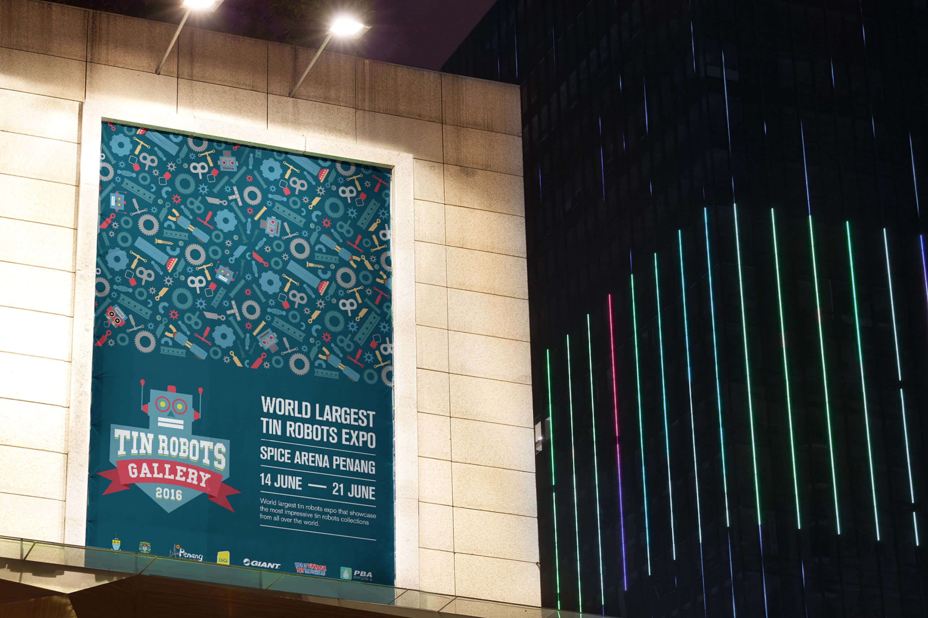
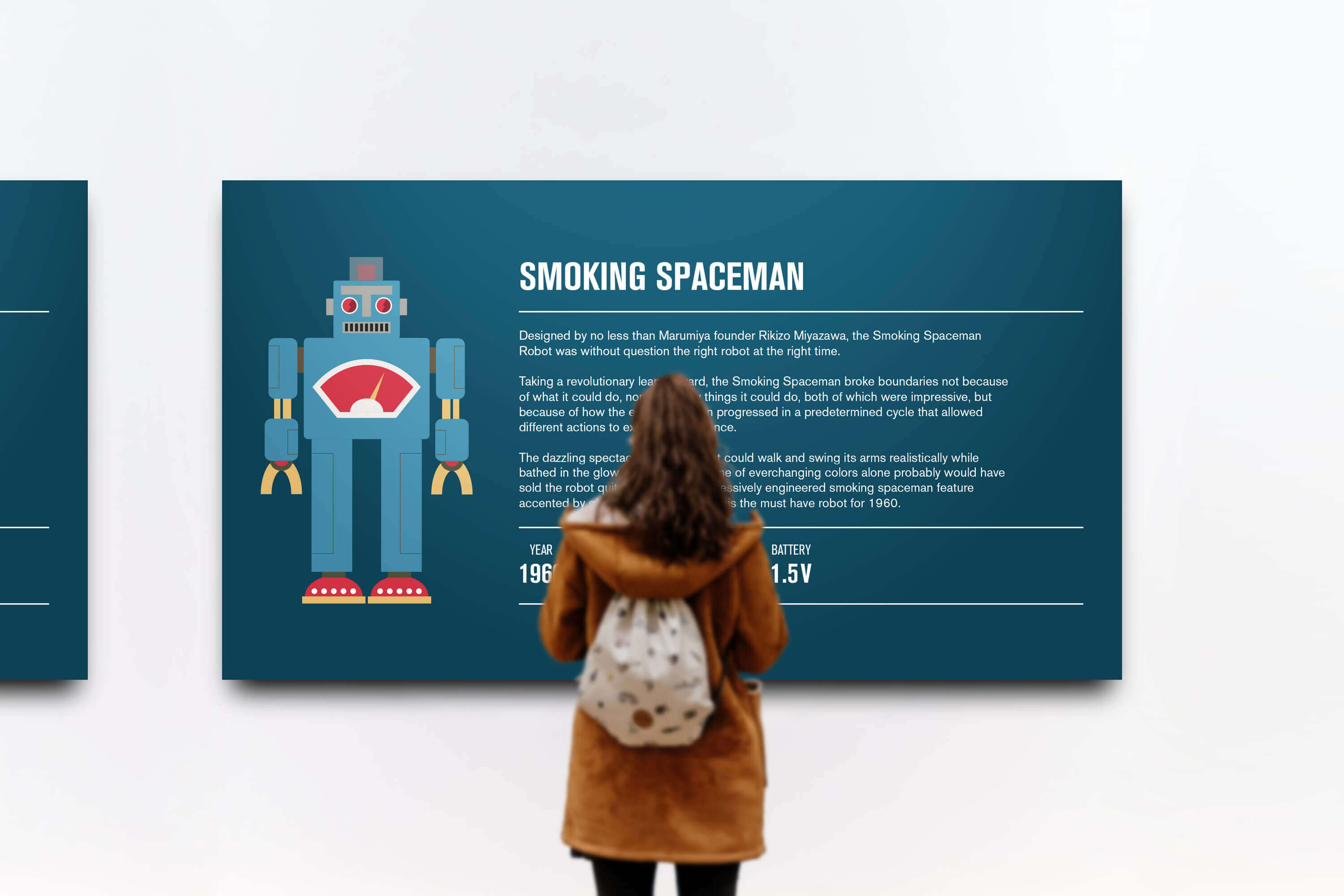
TIN ROBOTS GALLERY
As its name suggest, Tin Robots Gallery is an expo that showcase vintage tin robots from the 1940’s right through to the 1970’s. Some are one of a kind and very are rare. This expo is sought after by toy collectors from all over the world, but for some, a visit to the expo will be like a walk down memory lane evoking memories of their childhood.
The expo logo is designed based on the popular tin robot – Horikawa Star Strider. The primary color for the identity is blue. It emphasize the loyalty of collectors towards vintage toys. Motif is made out of parts that are used to assemble a tin robot.