EARTHOSKIN
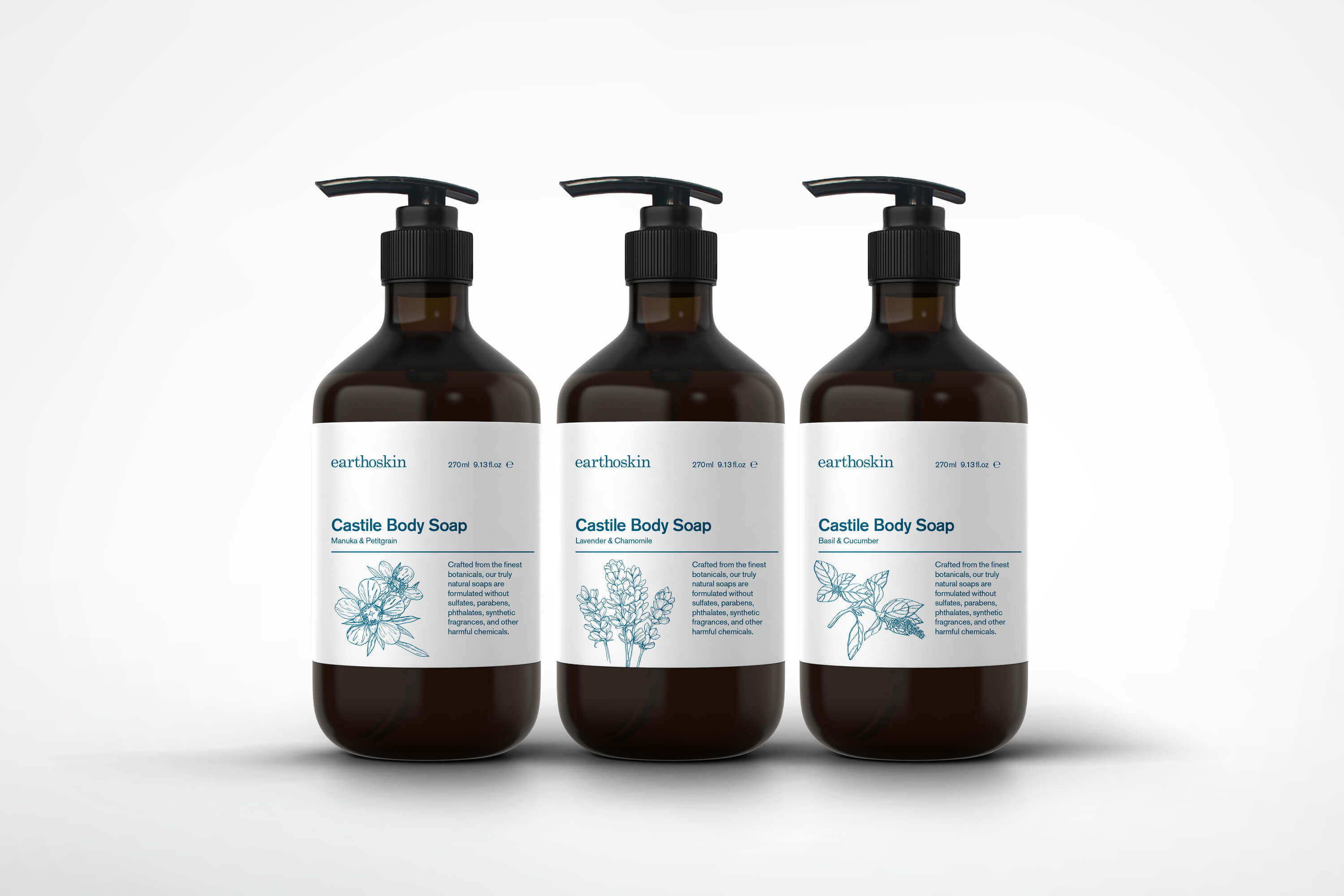
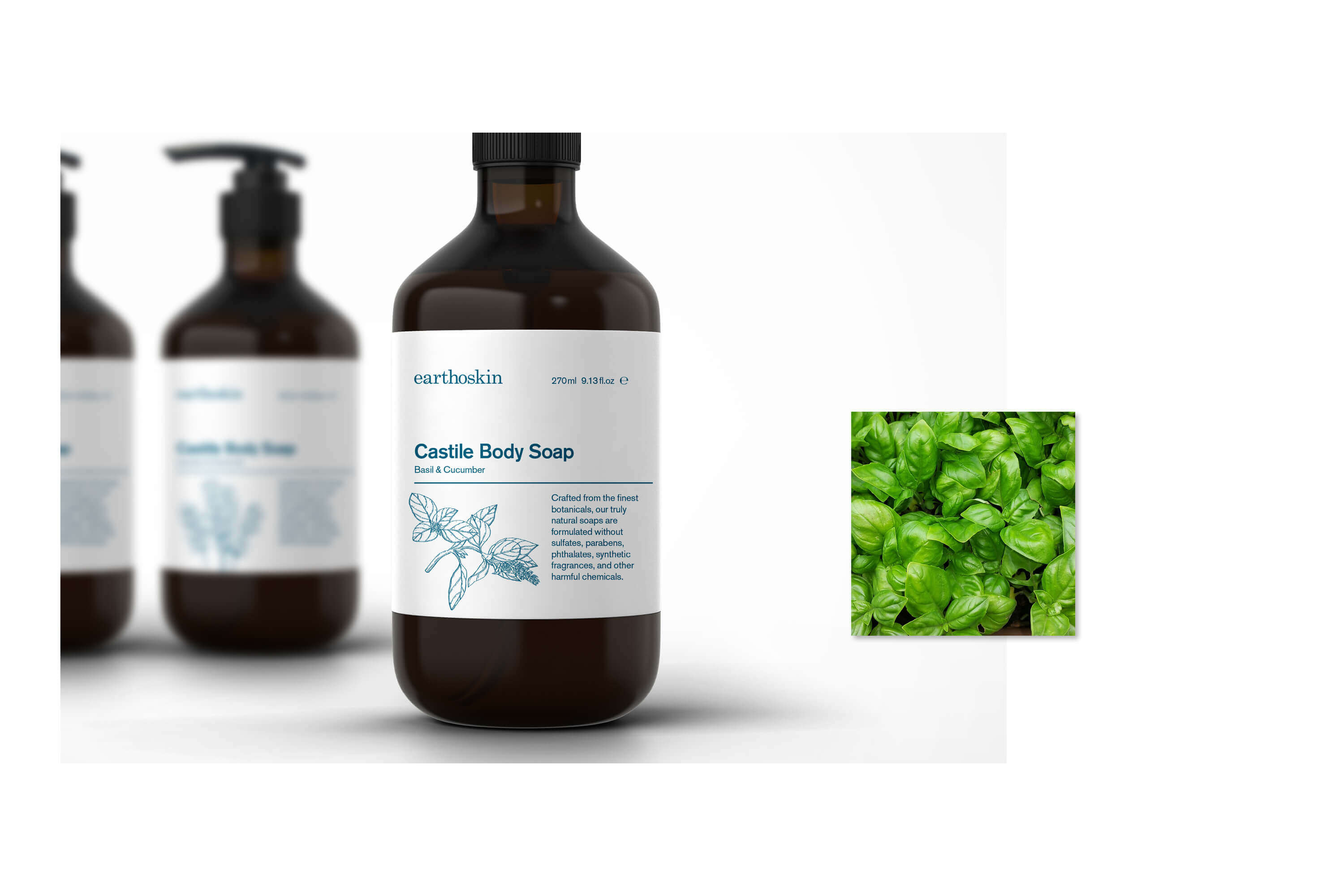
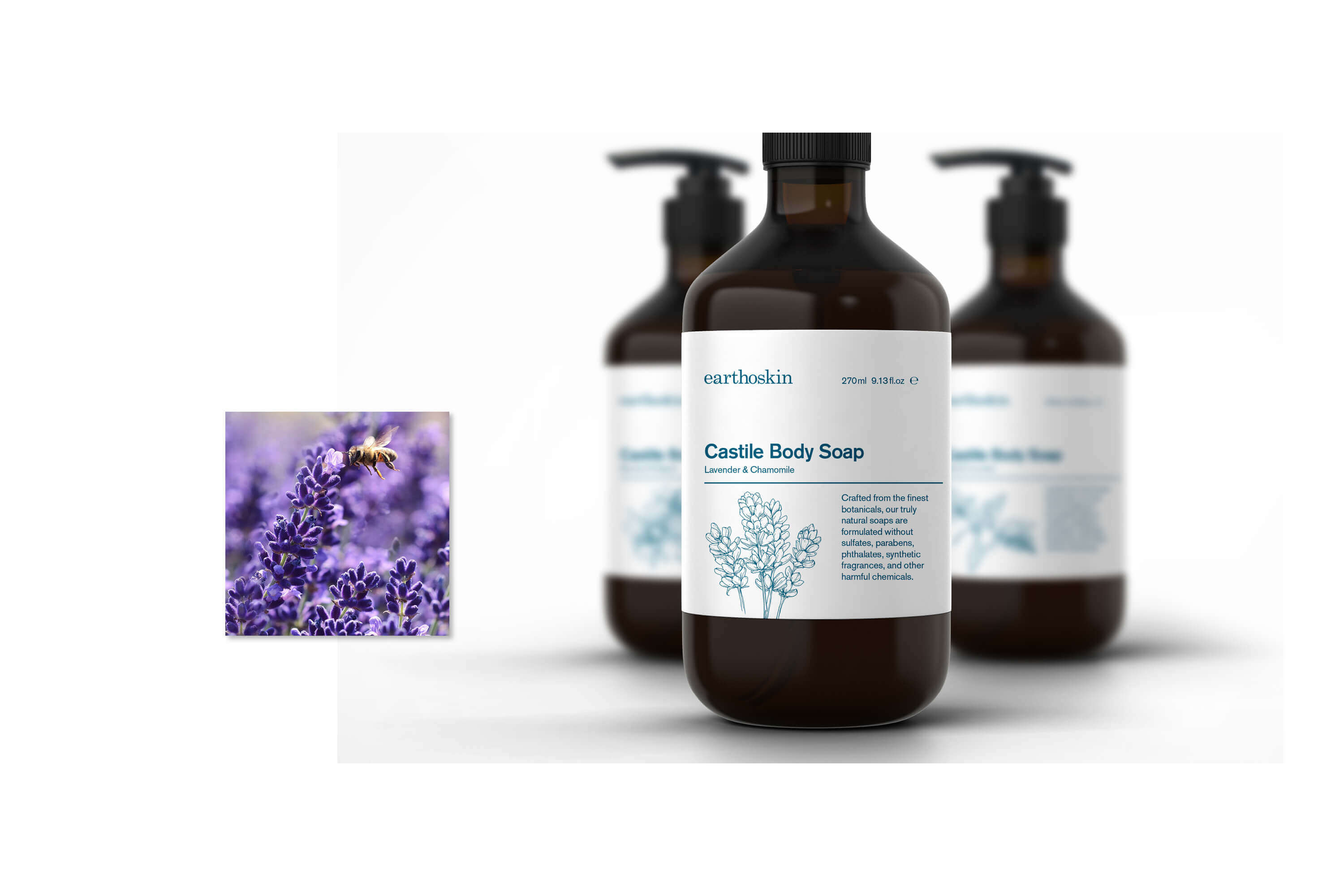
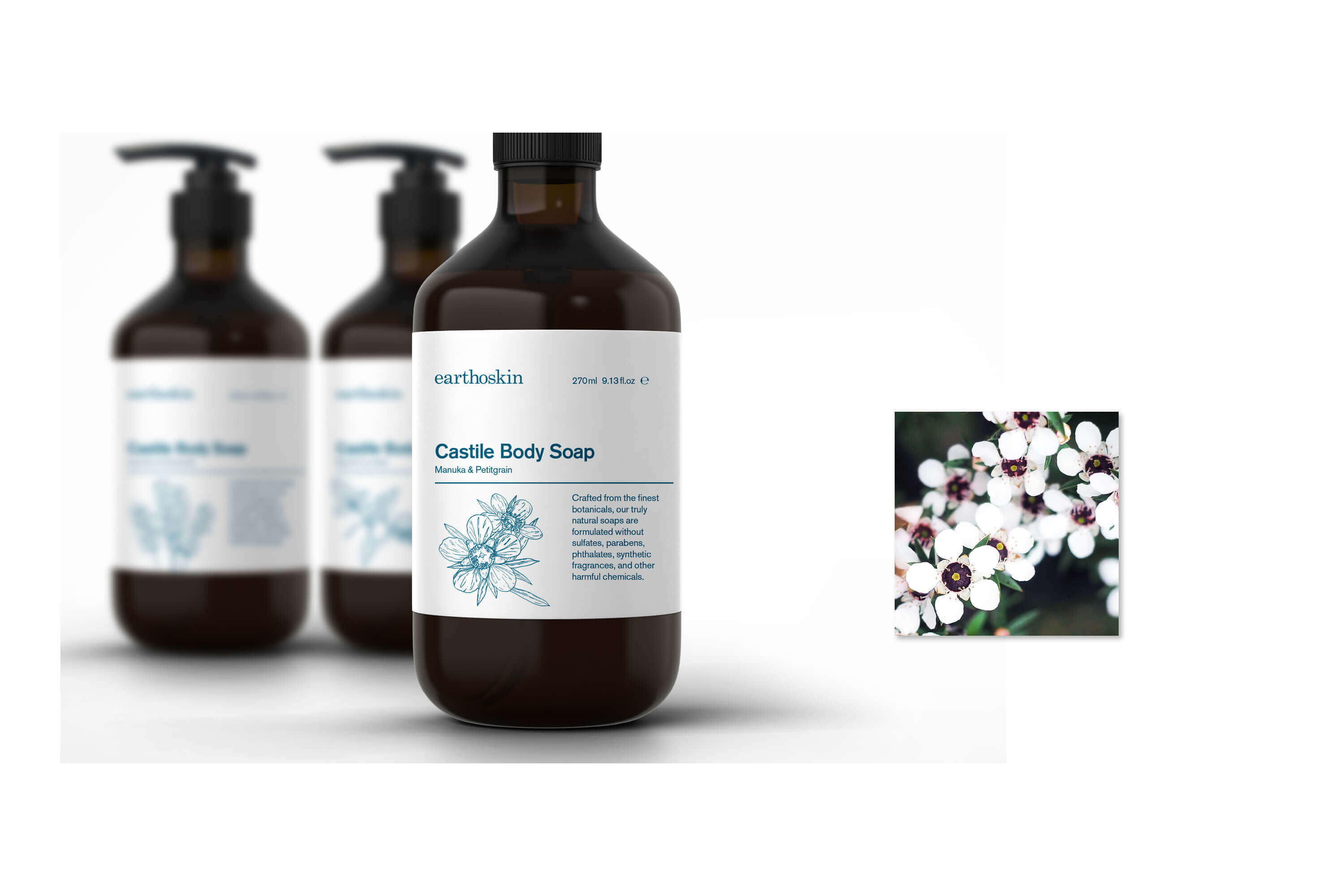
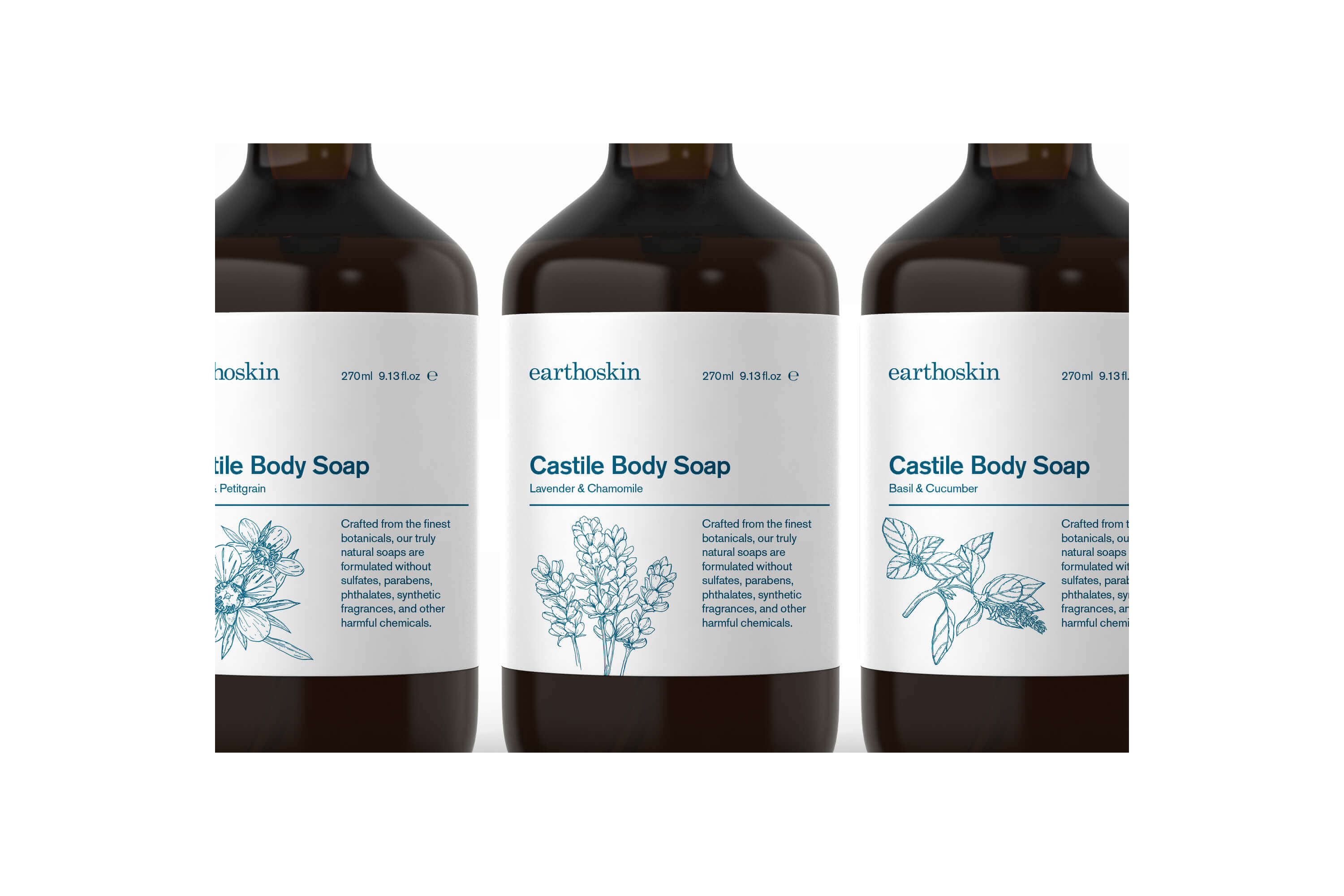
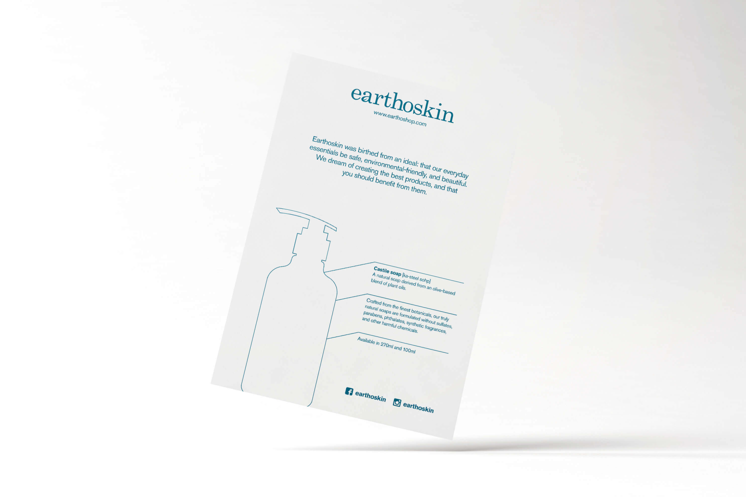
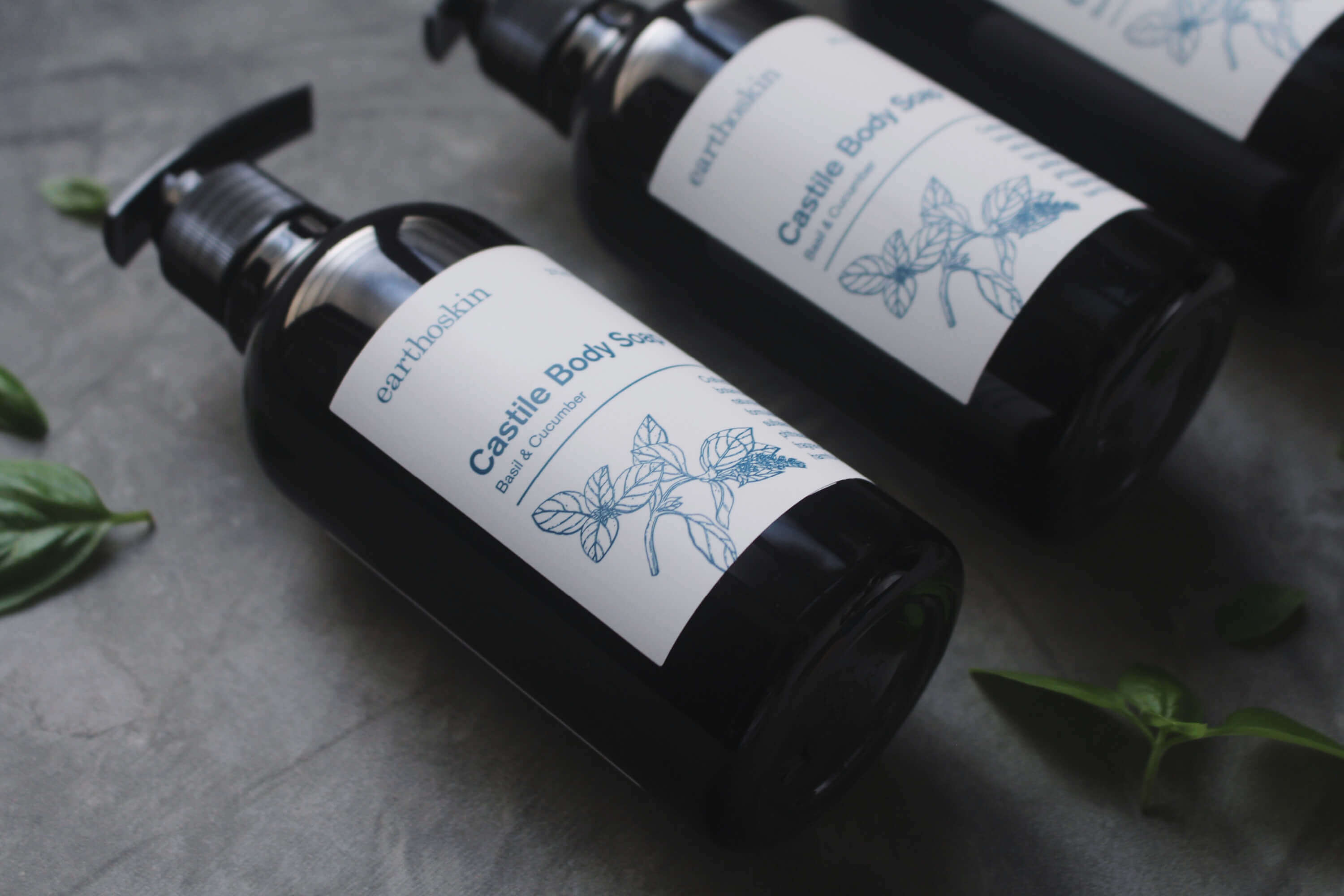
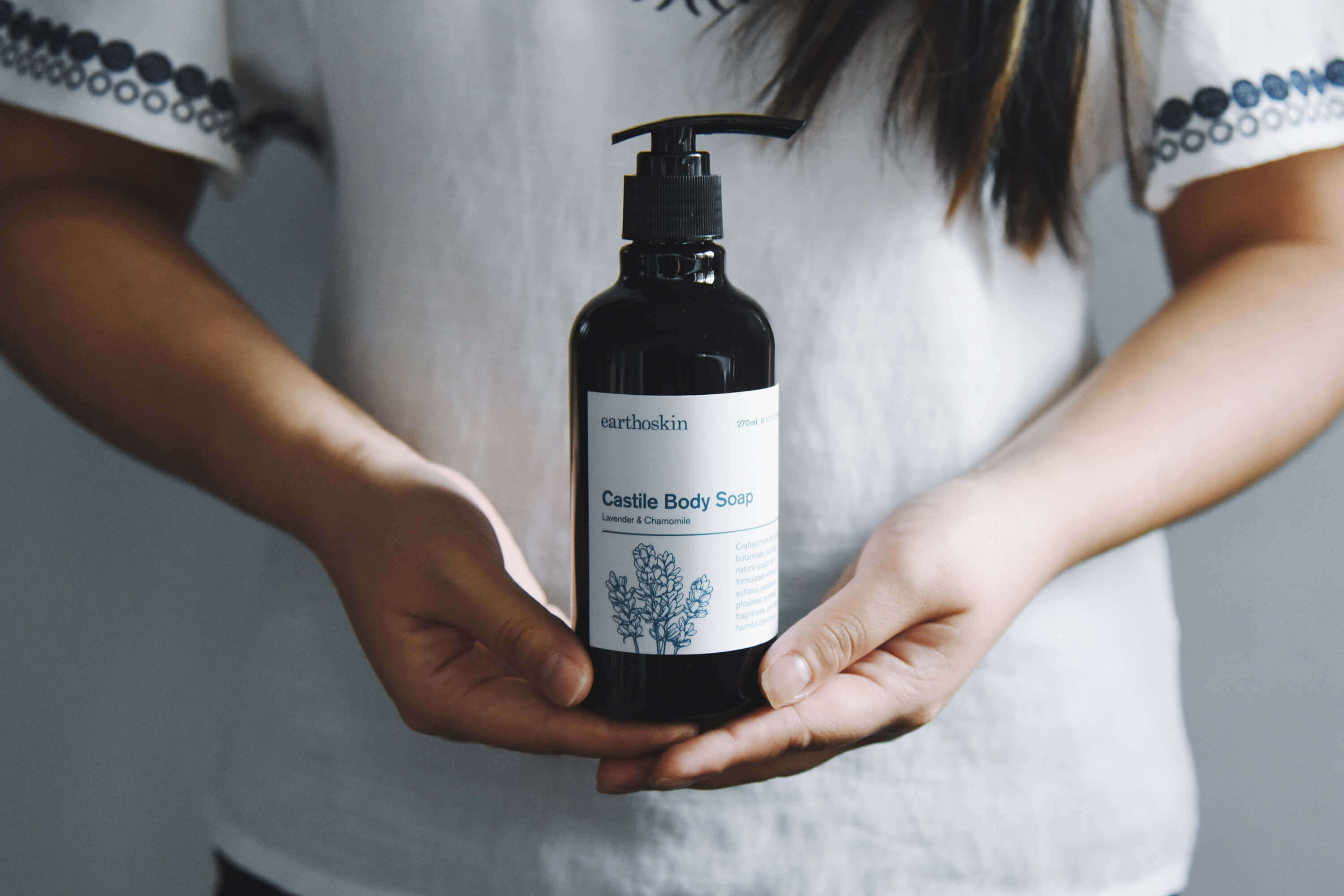
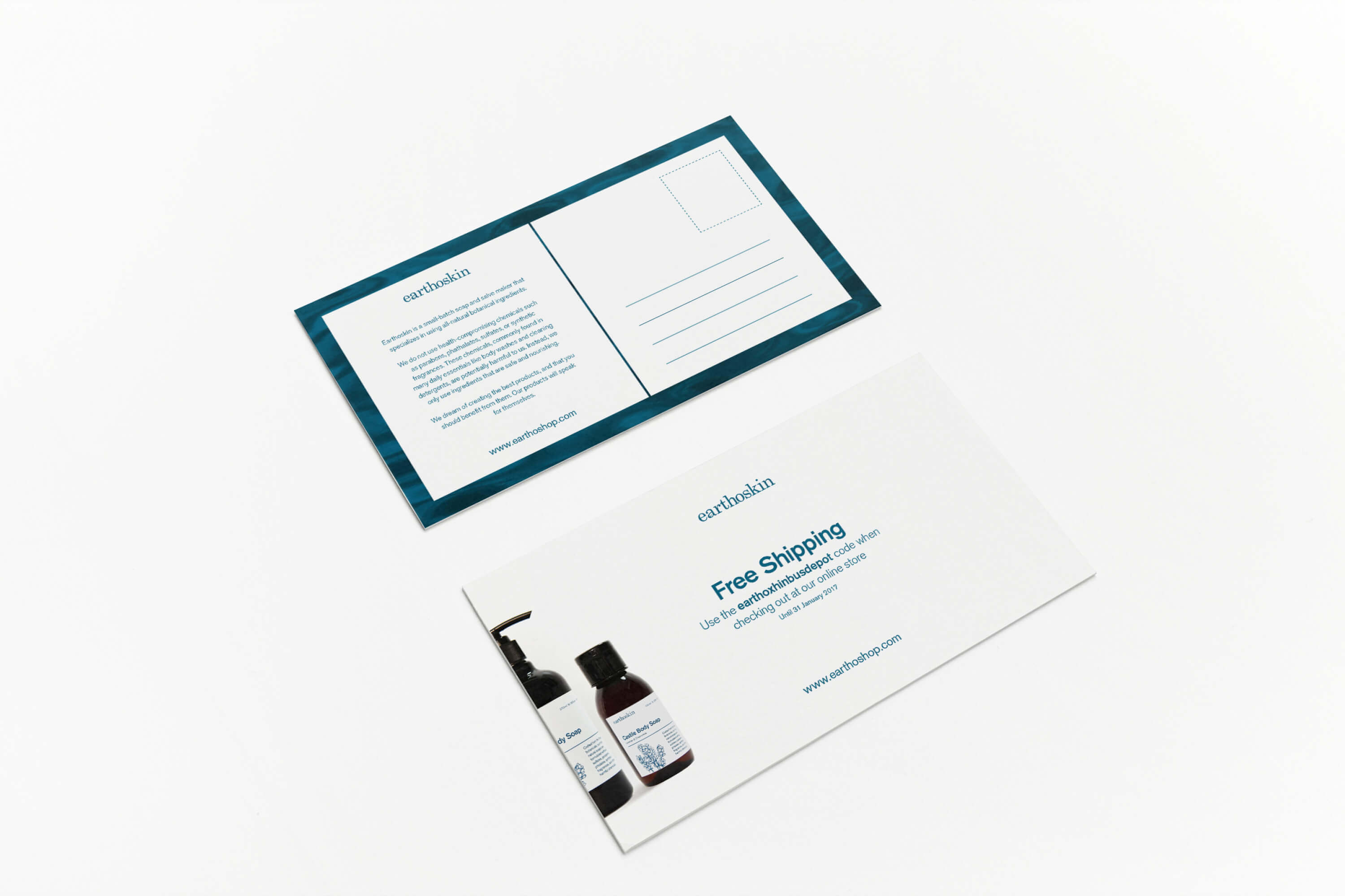
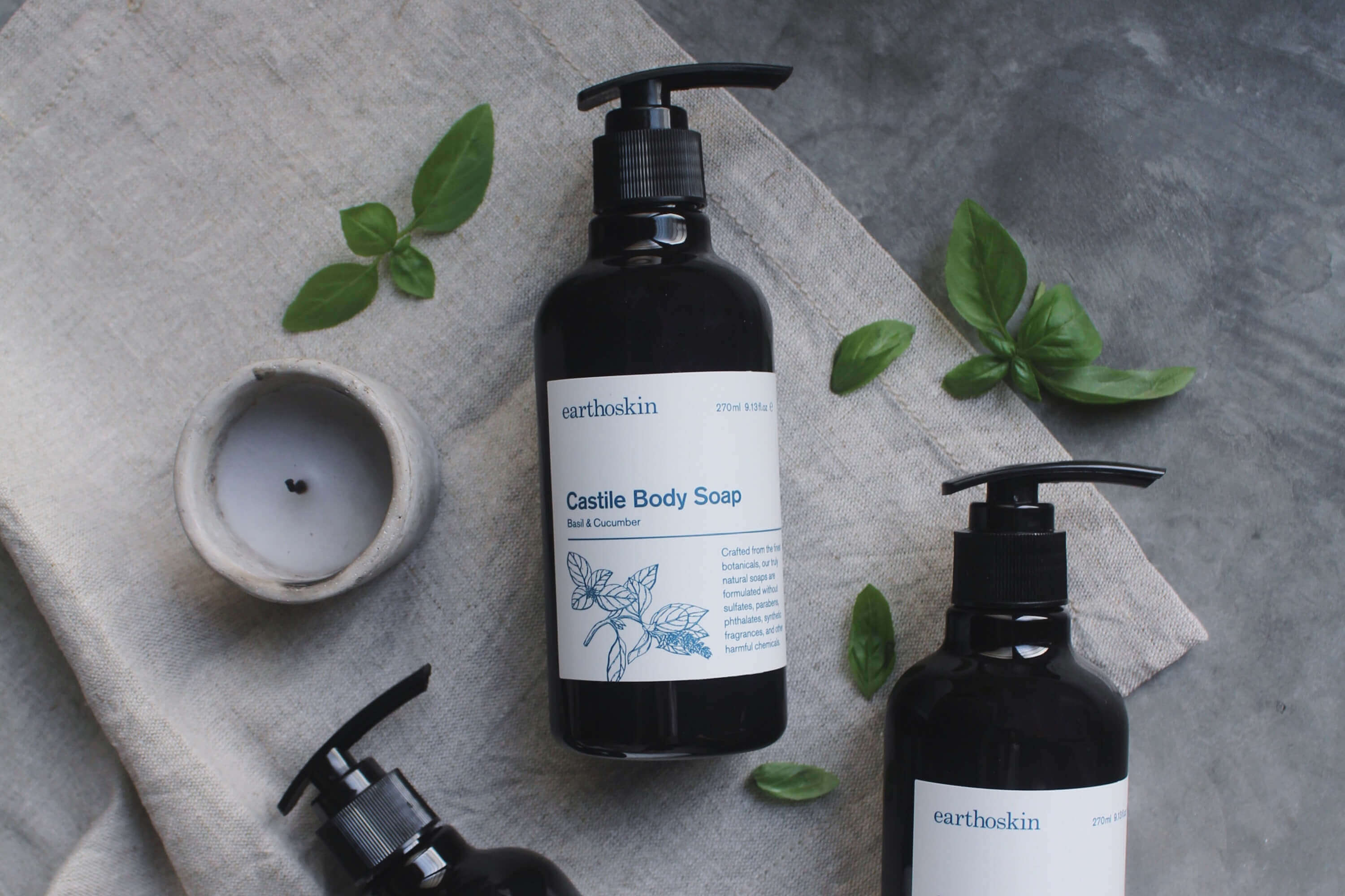
Earthoskin is a small-batch soap and salve maker that specializes in using all-natural botanical ingredients.
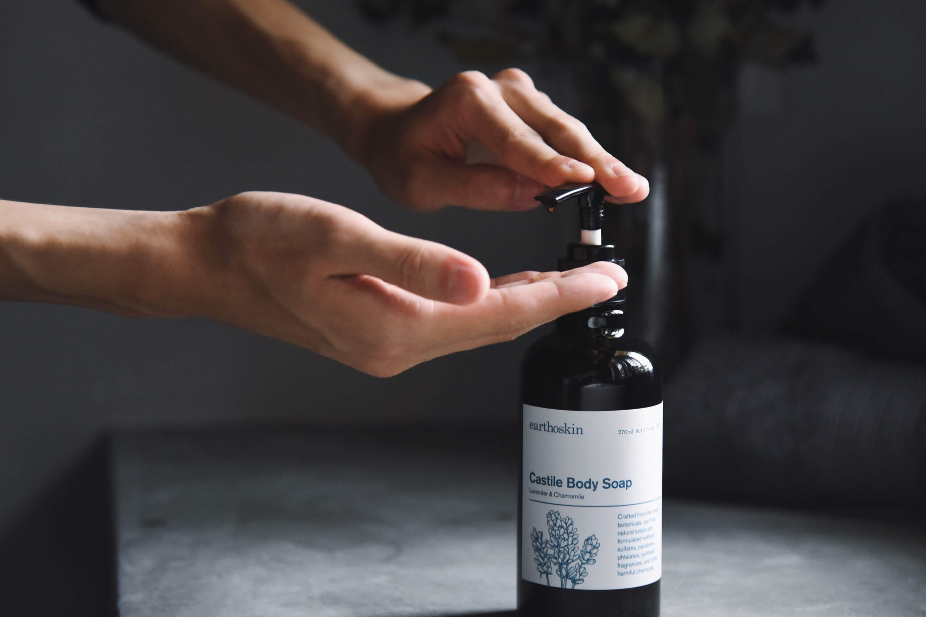
Their soaps are derived from an olive-based blend of plant oils, and lightly scented with pure essential oils. Formulated to be eective but gentle, their soaps will leave your skin feeling clean, soft, and moisturized. Their salves are crafted from a blend of coconut oil, raw beeswax, and pure essential oils. Each ingredient is thoughtfully selected for its health-giving properties to hydrate, sooth, and nourish your skin.
Task: Brand Identity
Category: Skin Care
Art direction: TE PERSPECTIVE
Design: TE
Illustration: Yimin Heng
Photography: Syms Ooi
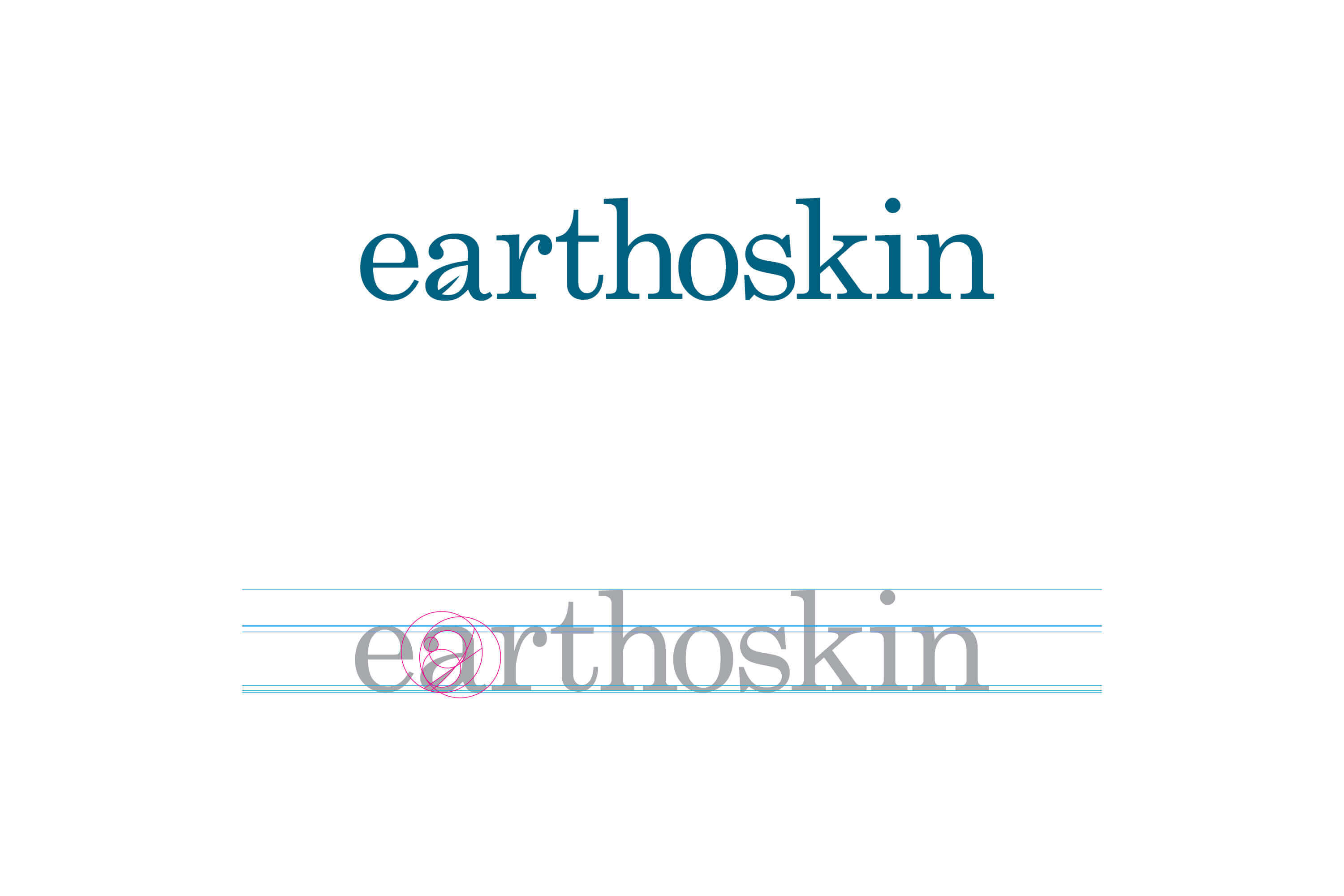
A customised letter ‘a’ which composes the leaf symbol make reference to nature which are the most important factors for the ingredients of Earthoskin products. Considering the positioning and direction of the brand, the logo was made with an elegant and simple structure that can stand the test of time.
