TE PERSPECTIVE is the design practice and creative consultancy of Malaysia designer Ted Lim. He work with brands from all over the world to develop solutions that focus on usability, clarity and creativity.
At TEP, we believe design can open up all sorts of possibilities that can be used to define a preferable future for companies, cities, and societies. With a dedicated approach to each project at hand, we offer new perspectives and create purpose-built solutions that function for your goals and connect with the right audiences.
CORE SERVICES
Brand strategy
Brand identity
Social media content
Art direction
Website design
Graphic design
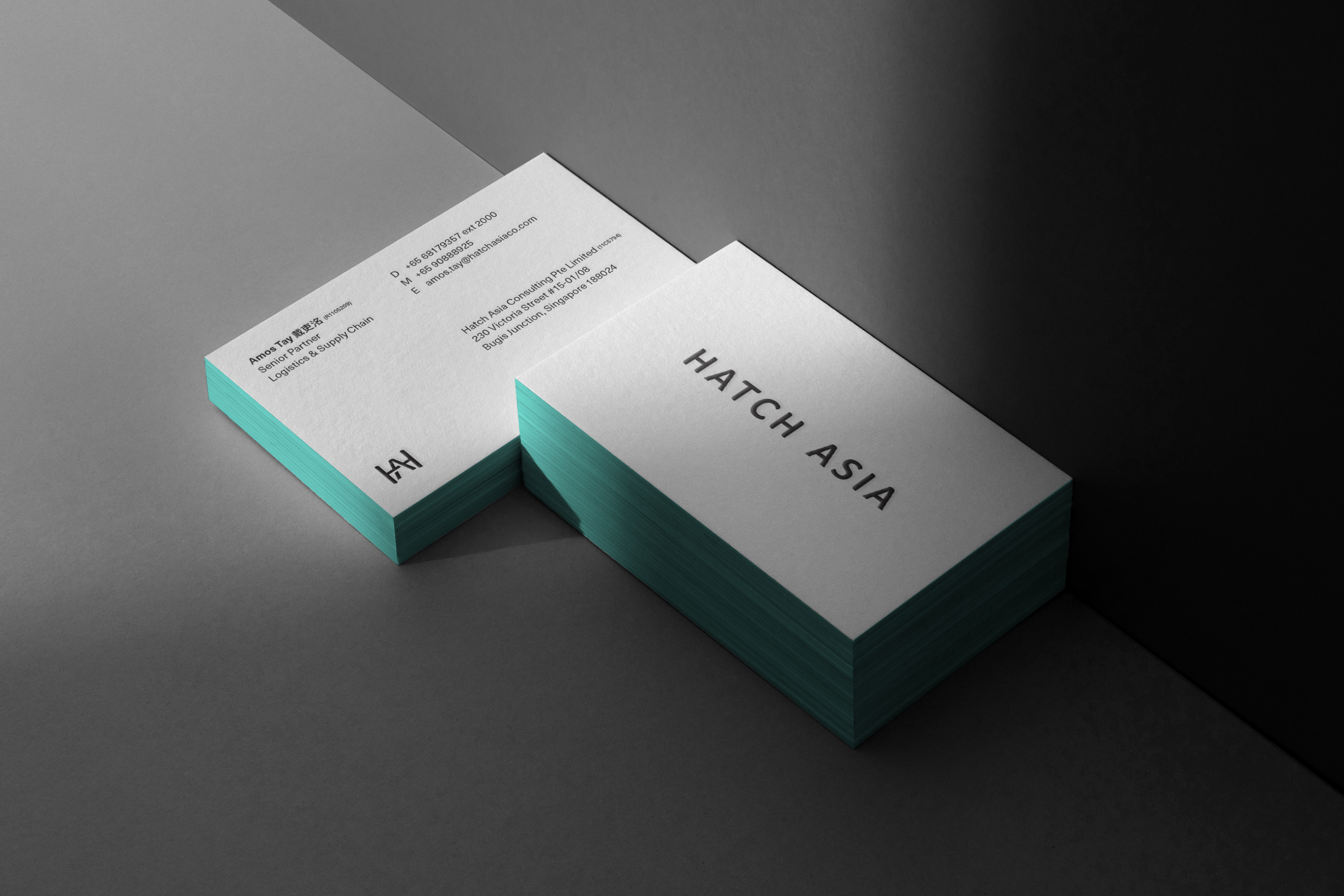
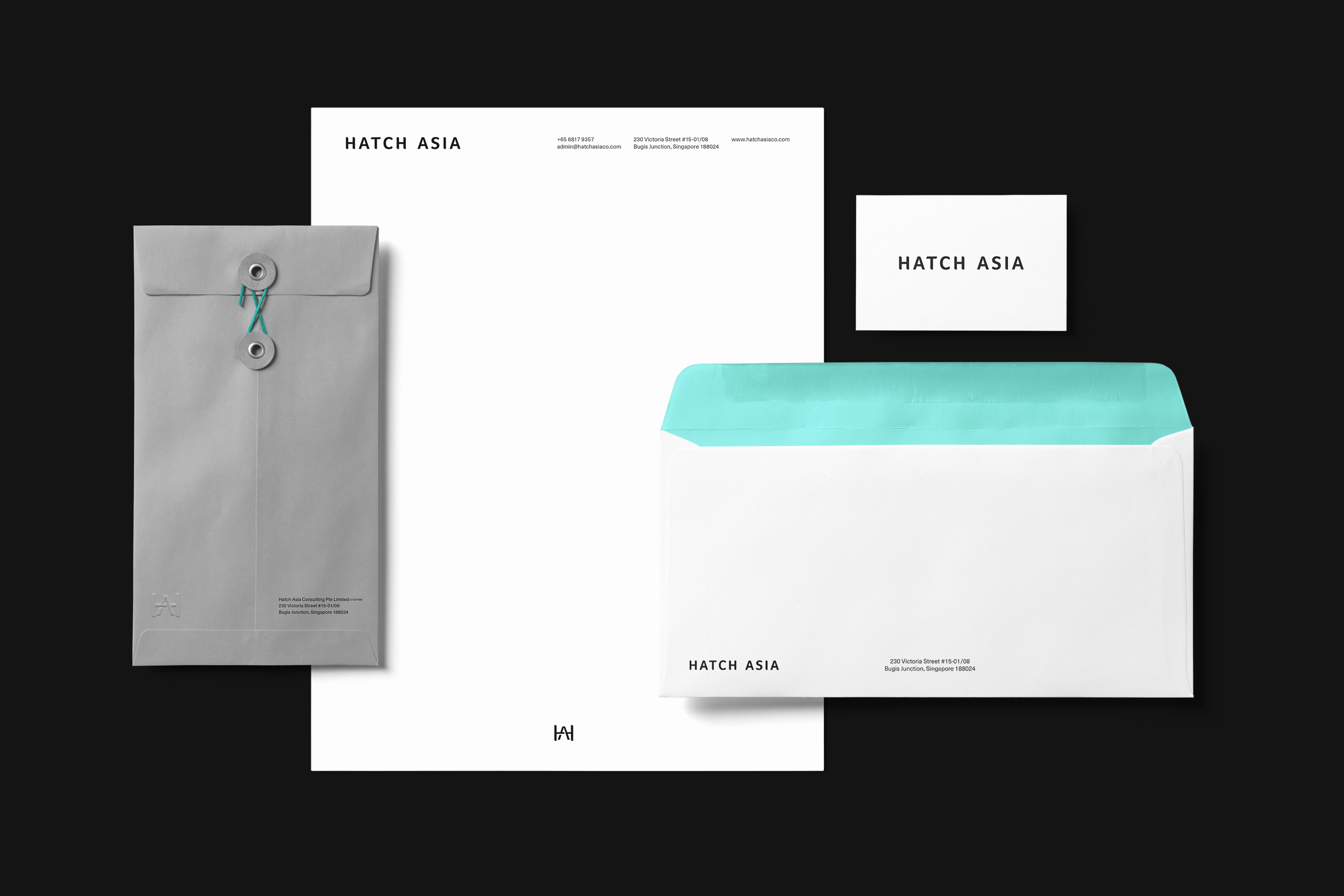
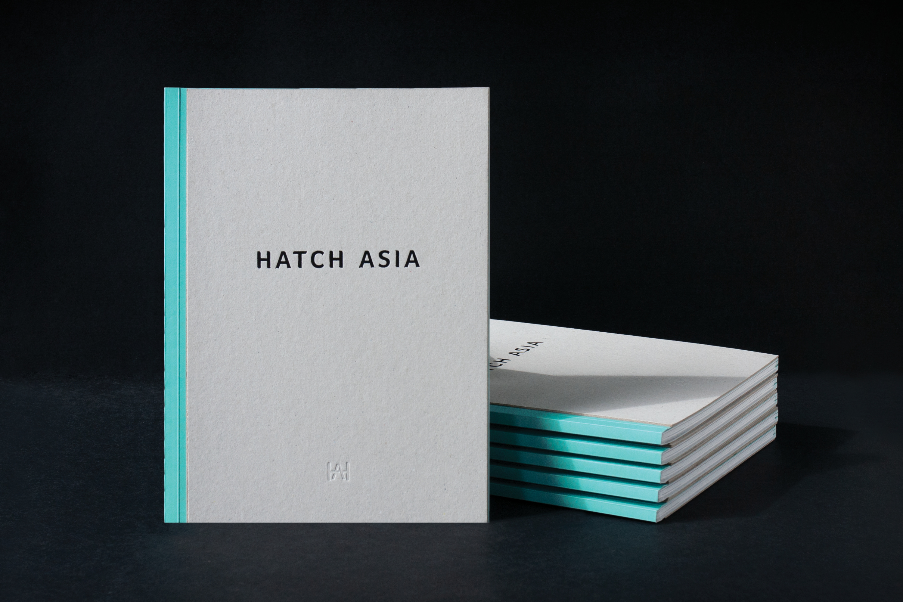
HATCH ASIA
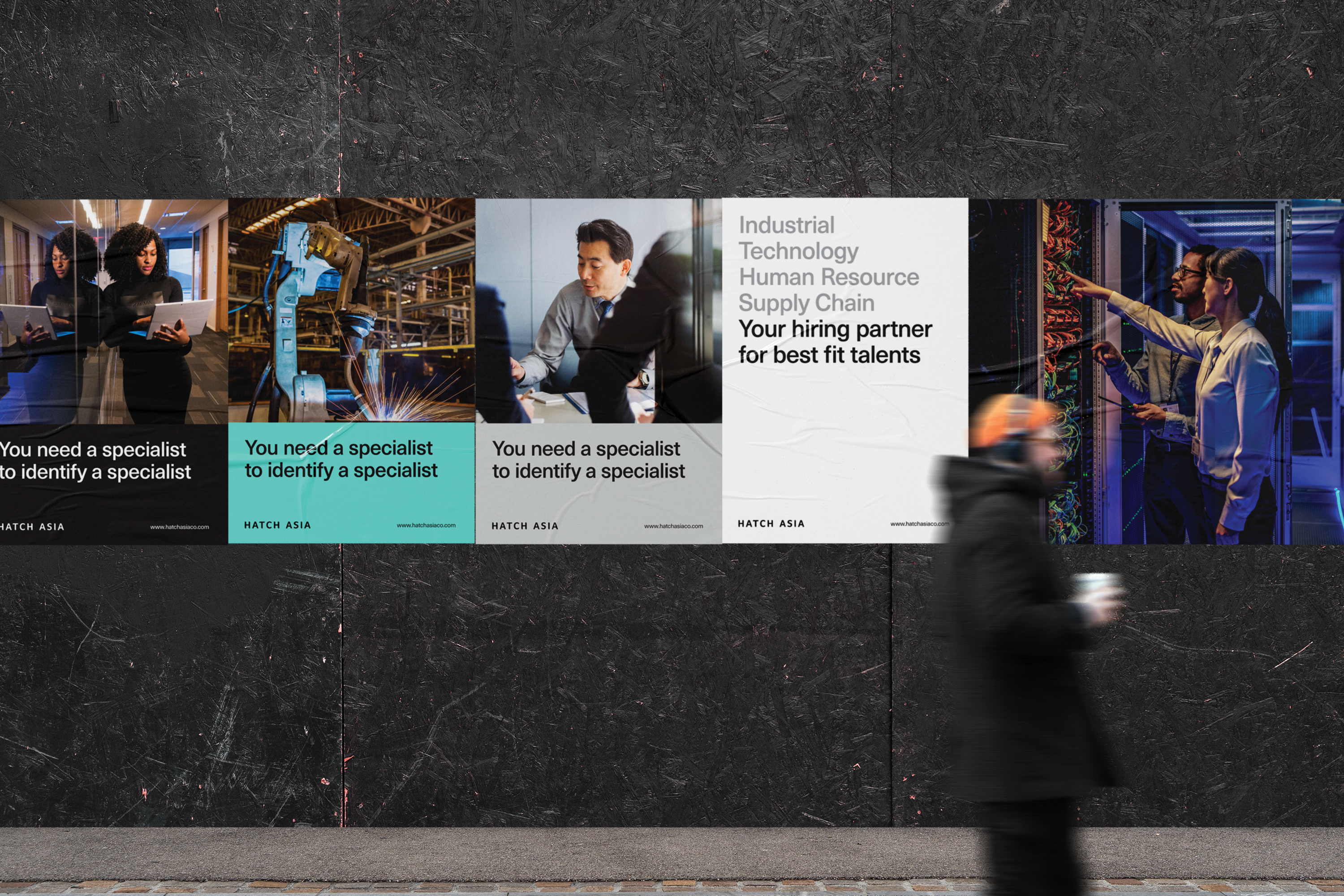
Hatch Asia is an award winning executive search and leadership consulting company that combines talent acquisition and management strategies to help brands identify, assess and integrate most befitting talents into their organization. As part of repositioning the company, and trying to reach new avenues and digital lifestyle platforms, TE PERSPECTIVE updated the visual identity of Hatch Asia to reflect their positioning and the true breadth of their offerings.
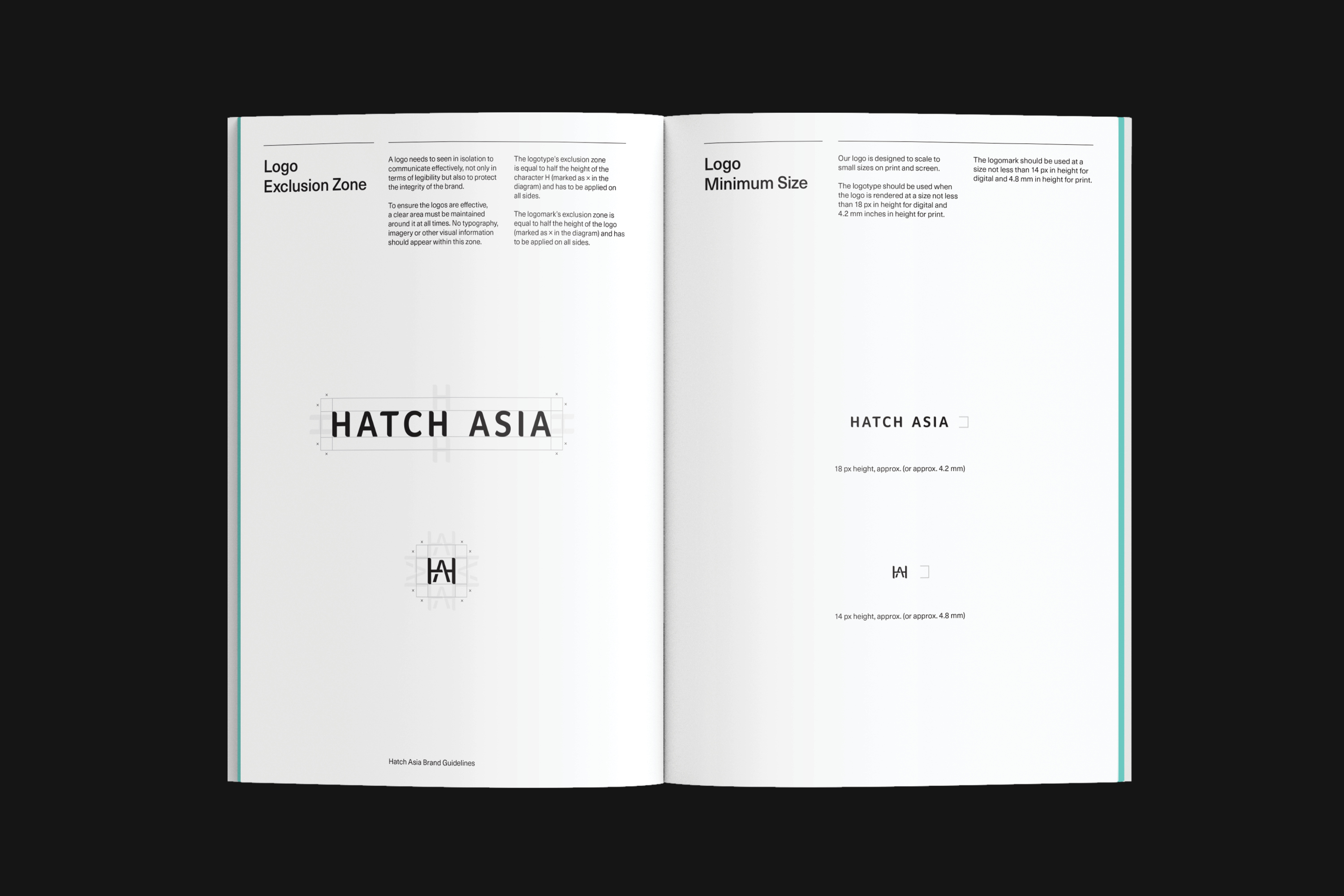
The new logo opts for a more minimalistic design. The geometric and half curved shape inspired by the philosophy of the company—resilience yet versatile. It gives the logo a professional and refined appearance in line with their quality service.
The unique shapes of the wordmark becomes a design element for the branding, where the shapes can be used to create icons that can represent a broad range of subjects.
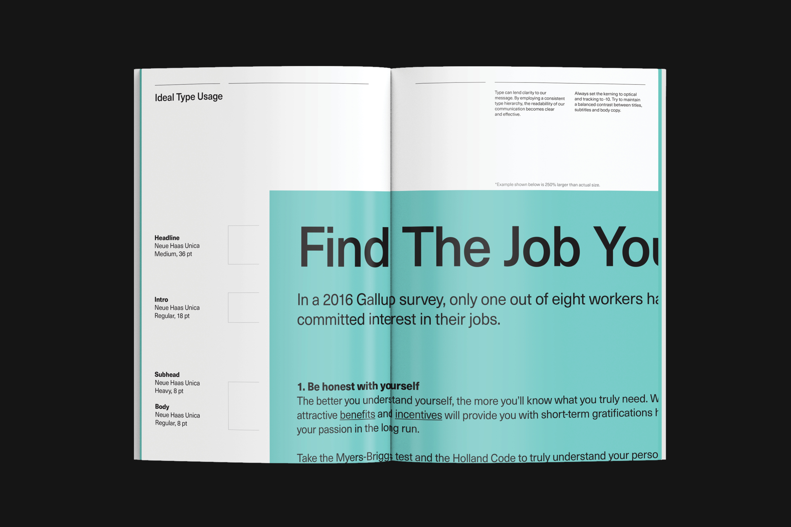
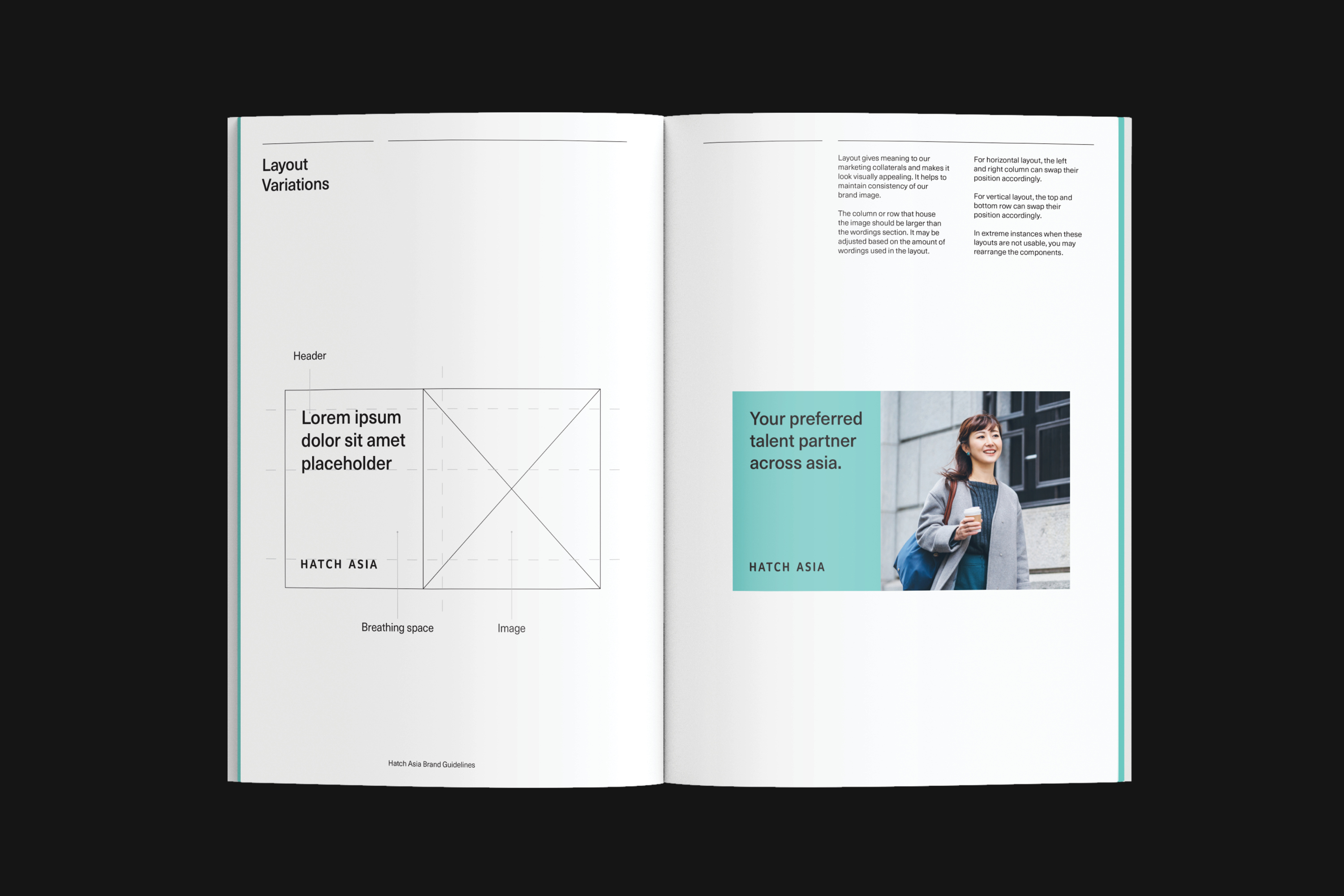
To create clarity for customers and align the messaging with new brand identity, we simplified the visual language into a modular system that allows the grid to change depending on the content and media. In contrast to the logo, the visual language maintains an editorial feel, and photography plays an important role by featuring the people, partners and candidates.
The new brand identity perfectly matches Hatch Asia’s positioning and industry experiences, helping both current and future customers feel confident in its business offer.